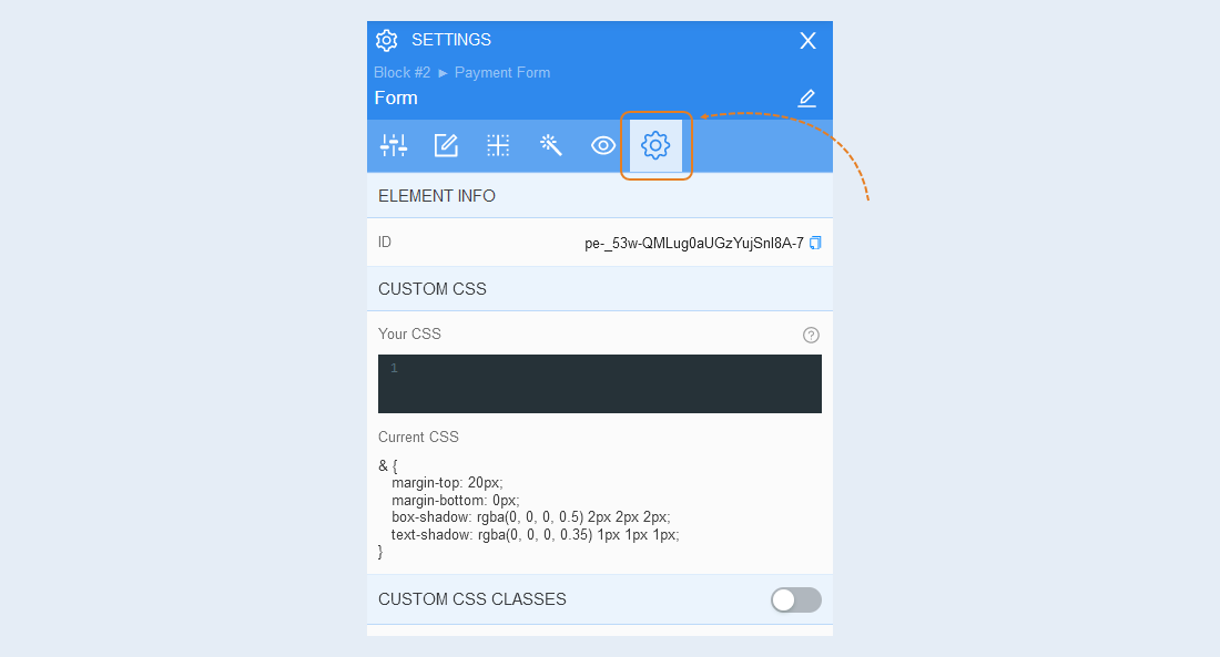
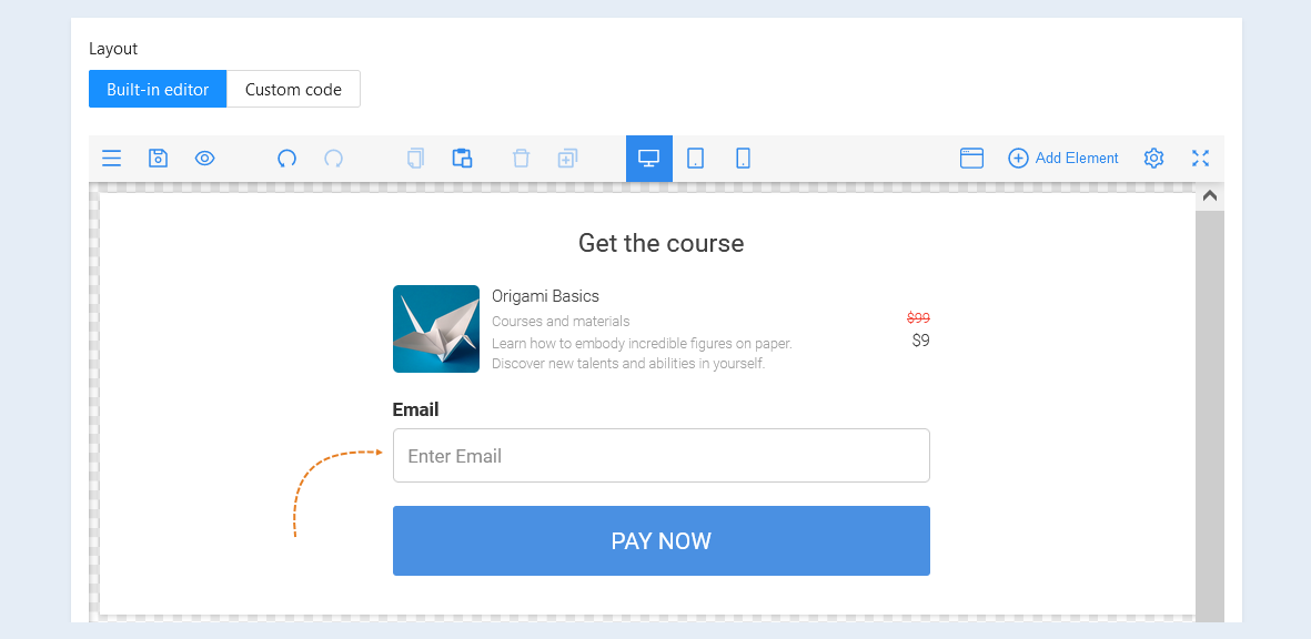
The form component. A form is an element that collects the contact details of a visitor to the payment form page.
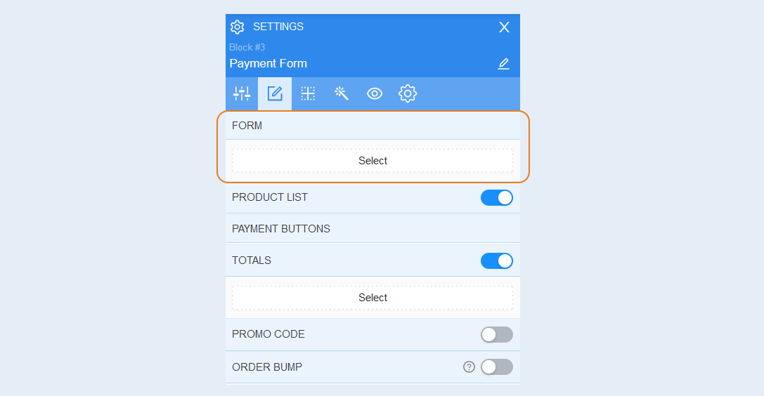
To open the advanced form settings, click the "Select" button in the payment form settings window. Set the settings you need.
General Settings
Highlight the form element within the payment form, and the extended settings of the form component will open on the right. Open the "General Settings" tab.
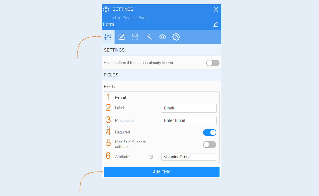
Settings. You can hide the form if user data is already known. To do this, toggle the slider to the active position.
Fields. The standard email form will open. The payment form will prompt the visitor to fill in the email field. Customize the form fields:
- Email. Field name is shown.
Label. In this line, you can change the label name. Double-click on the label text to make it editable. Enter the desired text.
Placeholder. This is the text displayed in the answer field to help the user better understand what type of answer should be entered.
Required. Toggle the slider to the active position to make the field mandatory for the user to fill in. Toggle the slider to the inactive position to make the field optional.
Hide field if user is authenticated. Toggle the slider to the active position to hide the field for authenticated users. If the user has logged in, this field will not be displayed in the form.
Attribute. Attributes in the list are associated with the contact. When the form data is filled out by the user and submitted, these data will be recorded in the corresponding contact for further interaction with that contact, such as sending emails or processing orders. You can write your own custom attribute and use this attribute name in the future.
If necessary, add additional fields by clicking on the "Add Field" button.
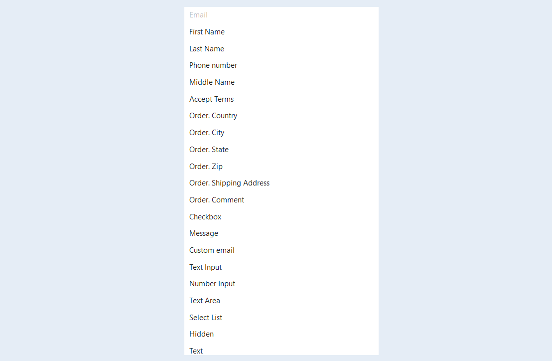
A list of additional fields opens. Add the necessary fields to the form, they will also be offered to the user to fill in.
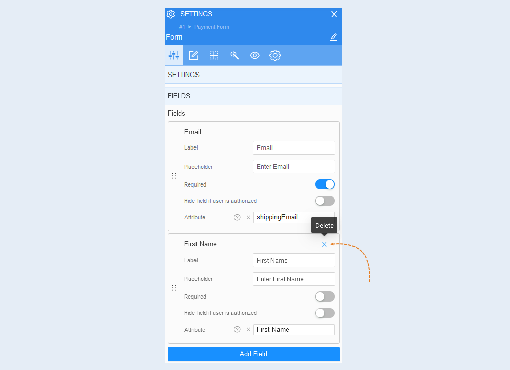
In the upper-right corner of the field, click the Delete button to delete the field from the form.
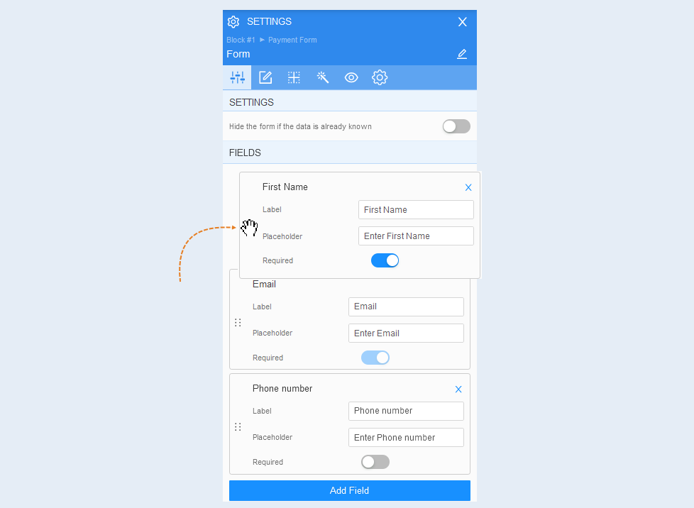
Hover the mouse cursor over the button to move the field, grab the field by clicking the left mouse button. Drag a field up or down relative to other fields to change their order in the list.
Thus, create a list of fields to be filled in by the user in the form.
Fields style
Open the "Fields Style" tab of the form.
Labels. Labels are an attribute of a contact inside the form: name, e-mail, phone, etc. You can control labels inside the form: change the position (top or left), change the color of labels, font size, line height, alignment (left, center, right).
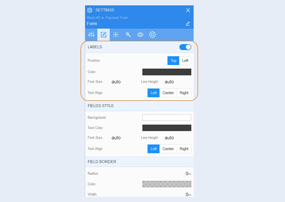
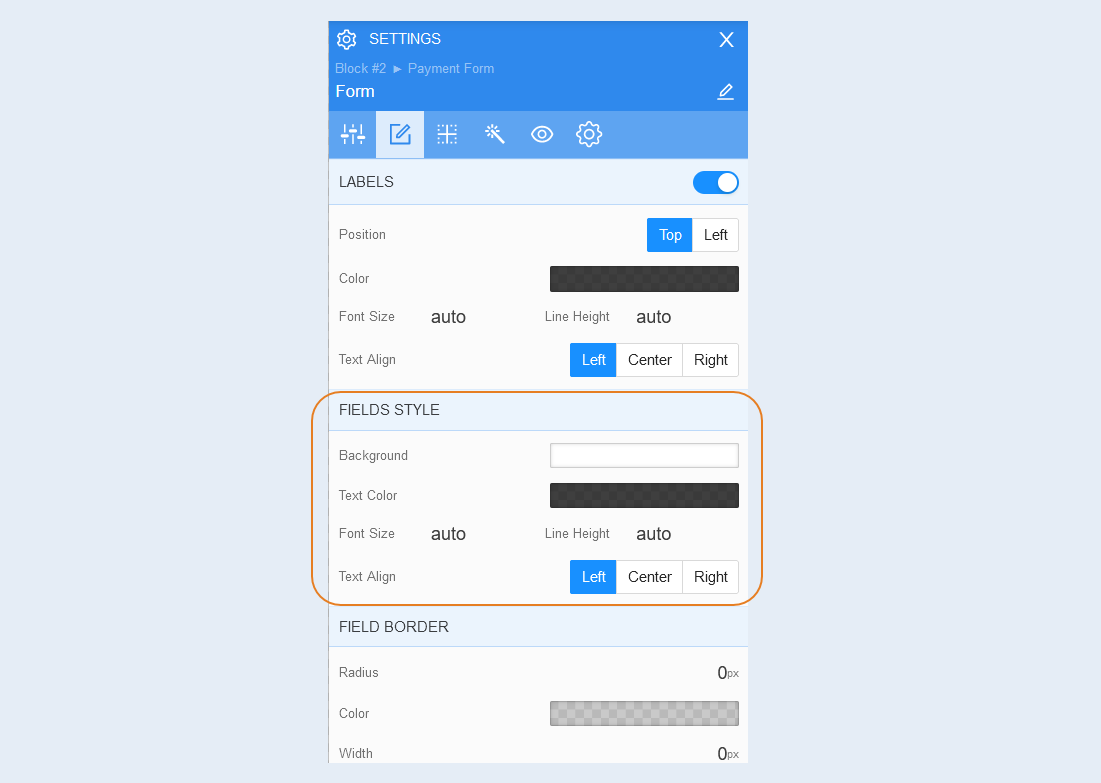
Fields style. You can change the fields of the form: the background color of the fields, the color of the text inside the field, font size, line height and alignment of the text inside the field (left, center, right).
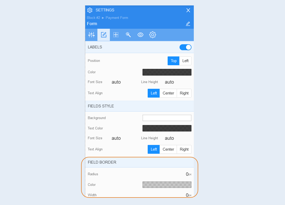
Field border. You can customize the frame around the shape: the radius of the frame (rounds the corners of the margins), the color of the frame and the thickness.
Positioning
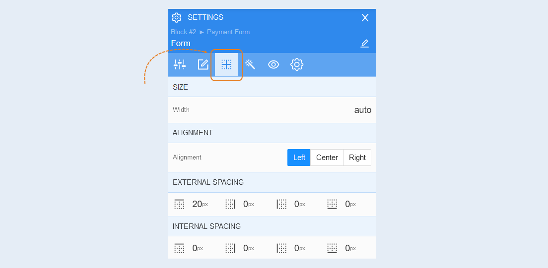
Read more about the settings of this section in the article "Positioning".
Style
Open the "Style" tab of the form.
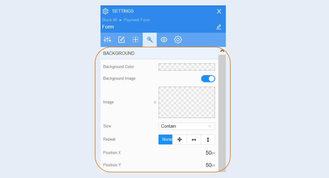
Background. You can change the background color of the form, as well as add a background image to the form. Additional image settings are opened for the background image: image selection, size, image repetition and image position inside the form.
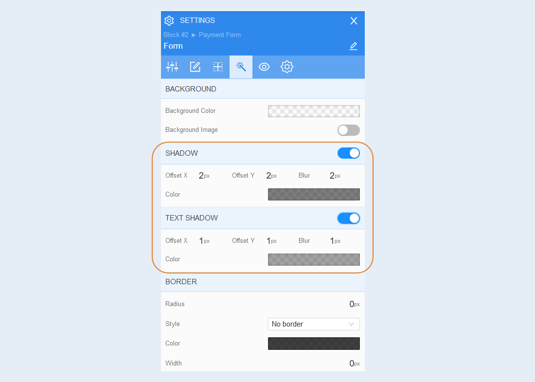
Shadow. Add a shadow around the shape, you can adjust the shadow offset (left, right, up, down) and blur (bright or transparent shadow). And also the color of the shadow.
Text shadow. Add a text shadow, you can adjust the shadow offset (left, right, up, down) and blurriness (bright or transparent shadow). And also the color of the shadow.
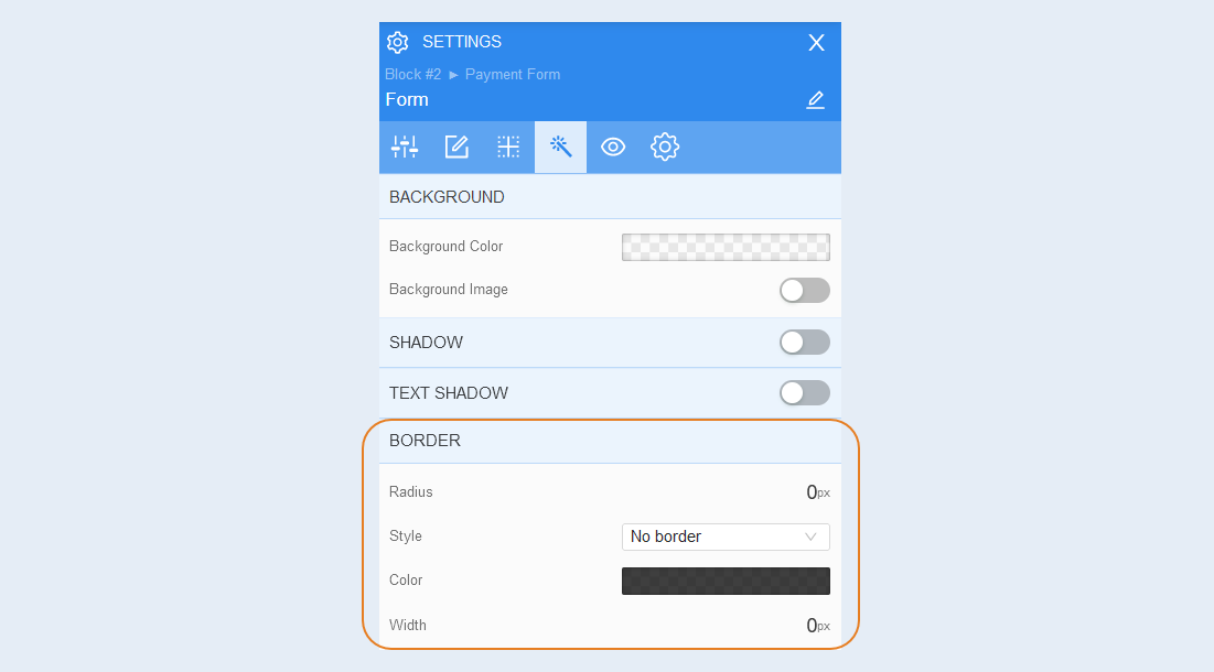
Border. You can customize the fborder around the payment form: the radius of the border (rounds the corners of the fields), the color of the frame and the thickness.
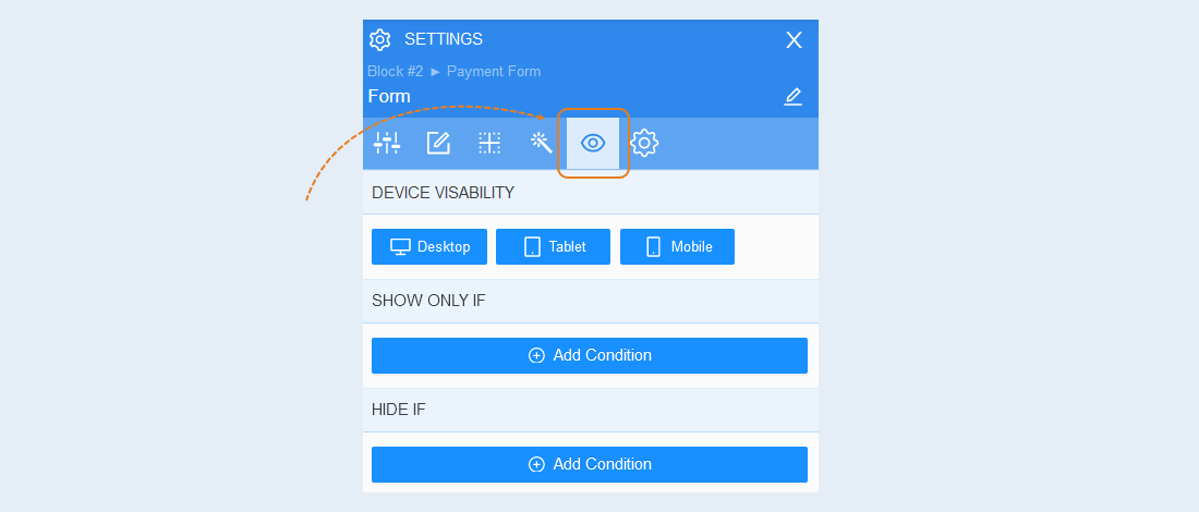
Conditional show / hide
Read more about the settings of this section in the article "Conditional show / hide".
Advanced settings
Read more about the settings of this section in the article "Advanced settings".