The "Timer" element is an element that allows you to add a countdown timer to a webpage. It is one of the functional capabilities of the editor designed to create interactive elements on website pages, facilitating more convenient and efficient user interaction with the content.
The timer can be used for the following purposes:
- Time tracking for task completion. For example, on a knowledge testing page, you can add a timer that counts down the remaining time for completing the test or a specific question. This helps maintain discipline and organization in task completion.
Time-limited access. In cases where there is content on the website that needs to be restricted by time access (e.g., access to a course or a specific section of materials), the timer can be used to set time limits. This allows for controlling access and preserving the value of the content.
Motivation for action. On a page dedicated to promotions, advertisements, or sales, a timer can display the remaining time until the end of the promotion or discount. This creates a sense of urgency and can stimulate users to make a decision or a purchase.
Examples of using the timer element on website pages:
- Knowledge testing page. The timer counts down the remaining time (e.g., 30 minutes) for completing the test, allowing users to assess their performance and stay within the given time frame.
Course with limited access. On the course page, the timer displays the number of days remaining until the access to the materials expires. This creates a sense of exclusivity and encourages users to purchase or register for the course.
Page with limited-time promotion. The timer counts down the remaining time until the end of the promotion or discount, aiming to attract users' attention and encourage them to make a purchase within the set deadlines.
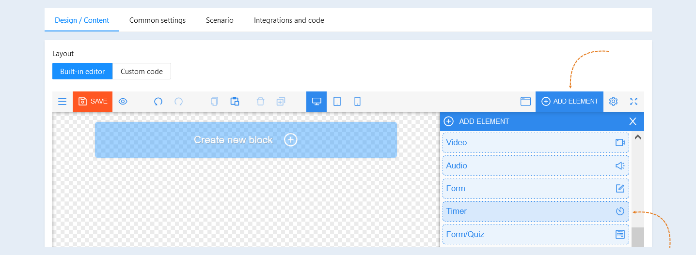
To add the element to a page, click the "Add element" button and select the "Timer" element. Then proceed with configuring the element.
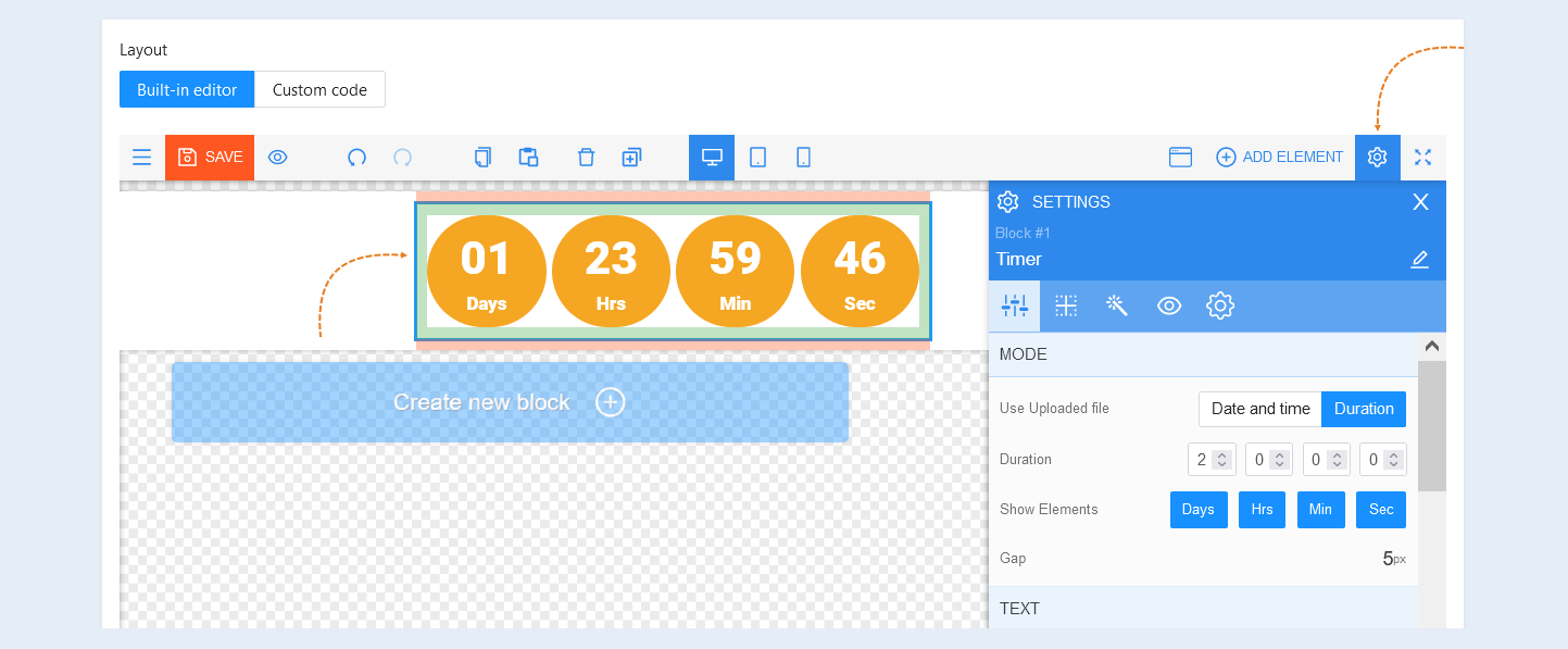
To access the settings for the specific element, select the entire element, which will open the tool panel on the right.
General settings
Mode. In this field, you can set the type of timer.
Use Uploaded file. In this section, select the timer mode:
- "Date and Time" mode - This mode will show the countdown to the selected date. In the field below, set the timer expiration date and time.
- "Duration" mode - This mode shows the countdown during the selected time. For example, the timer will count down the time for two days from the moment the site page is opened. In the field below, set the timer duration in days, hours, minutes, or seconds.
Show Elements. Select the timer elements that will be displayed on the site page: days, hours, minutes or seconds.
Gap. The gap is the distance between the timer elements. Set the size of the gap between the elements in px (pixels).
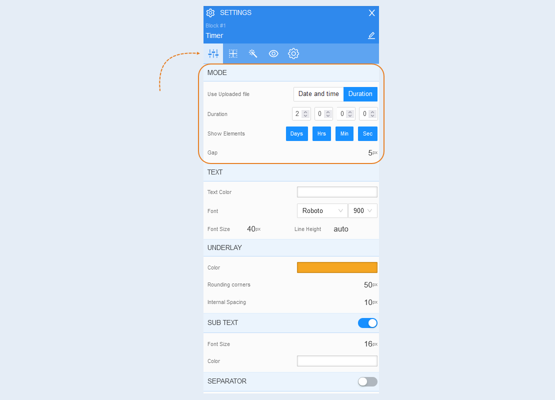
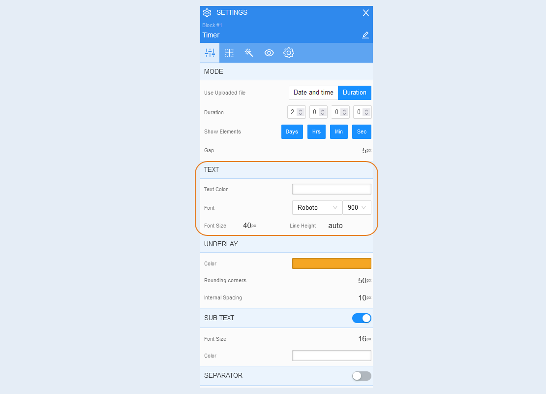
Text. You can change the text color, font, font size, and line height.
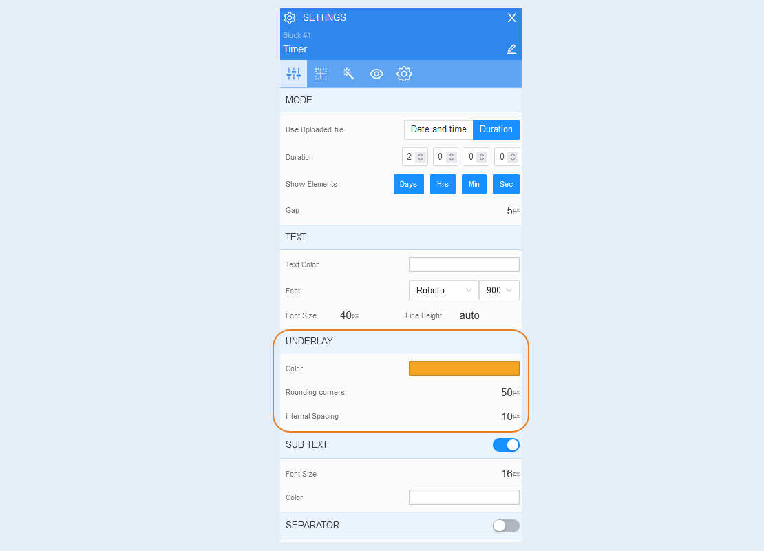
Underlay. The background is the background around the timer element. In this field, you can change the background color, set the rounded corners and the inner indentation. The inner margin is the distance between the digital value of the timer and the border of the substrate.
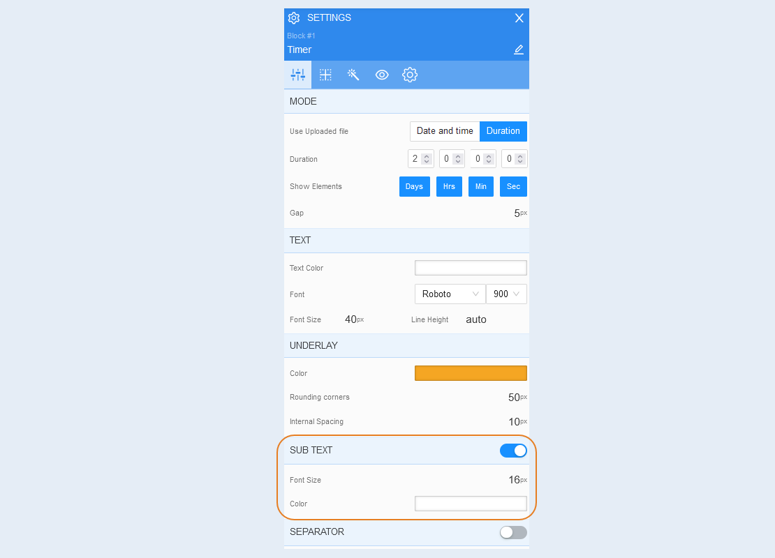
Sub text. The subtext is the text under the digital timer value describing the contents of the field. Such subtext as: days, hours, minutes, seconds. Move the slider to the active position to display the subtext on the site page.
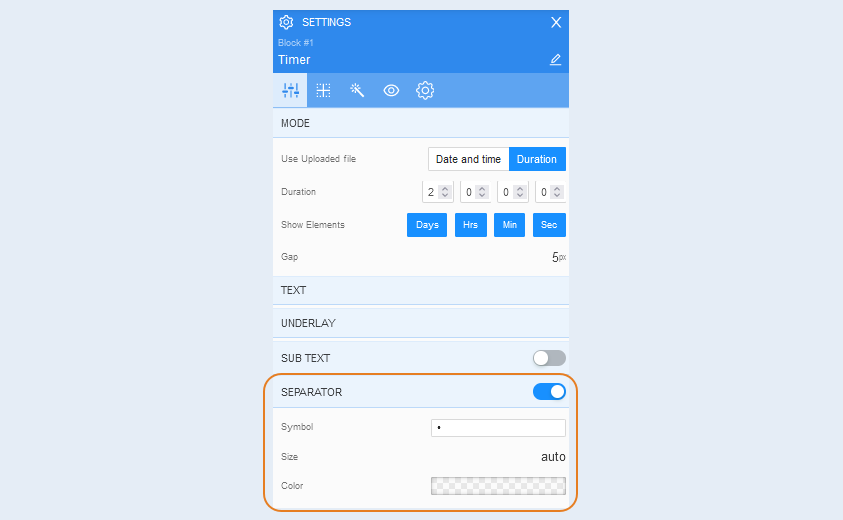
Separator. The separator is the icon between the timer elements. Move the slider to the active position to show the timer separator. You can change the separator character by selecting it from the suggested options. And also set the size and color of the symbol.
Positioning
For more information on the settings in this section, refer to the article "Positioning".
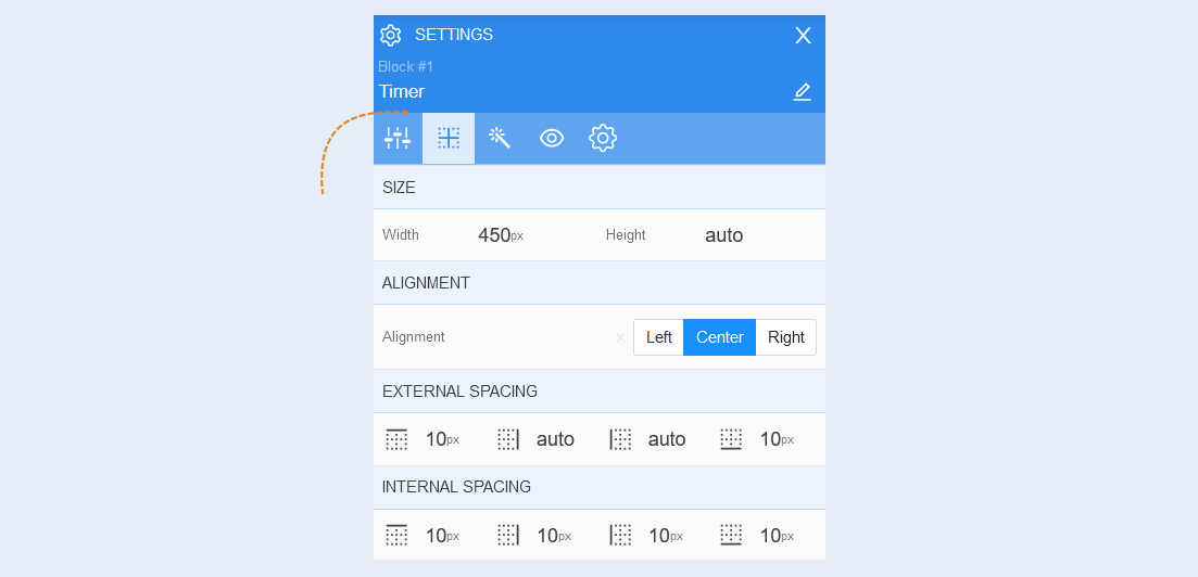
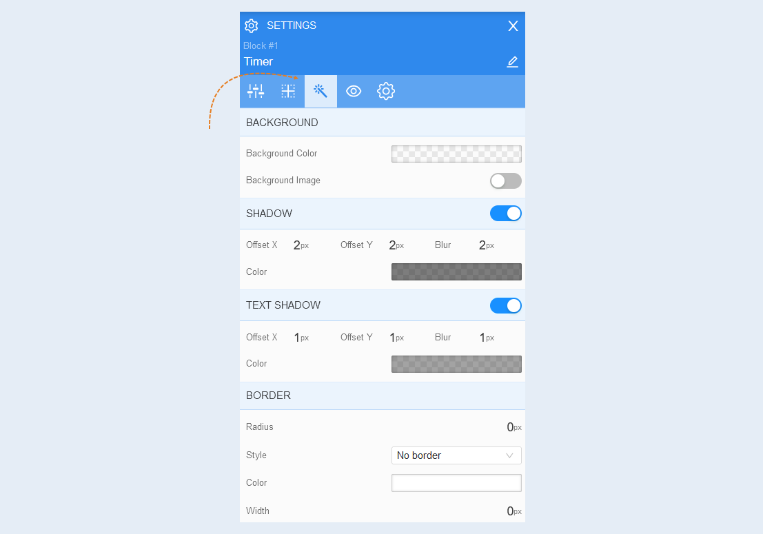
Style
Background. You can change the background color of the form, as well as add a background image to the form. For the background image, additional image settings are opened: image selection, size, image repetition and position of the image within the form.
Shadow. Add a shadow around the shape, you can adjust the shadow offset (left, right, up, down) and blur (bright or transparent shadow). And also the color of the shadow.
Text shadow. Choose the color of the text shadow, the direction of this shadow (left, right, up, down) and blur (make the shadow bright and clear or transparent). This effect is used if the background is not uniform and the text is poorly read in some places. And also to make the text more voluminous.
Border. You can customize the frame for the element: radius (rounding the corners of the frame), frame style (without frame, solid, dotted, dotted), frame width, color.
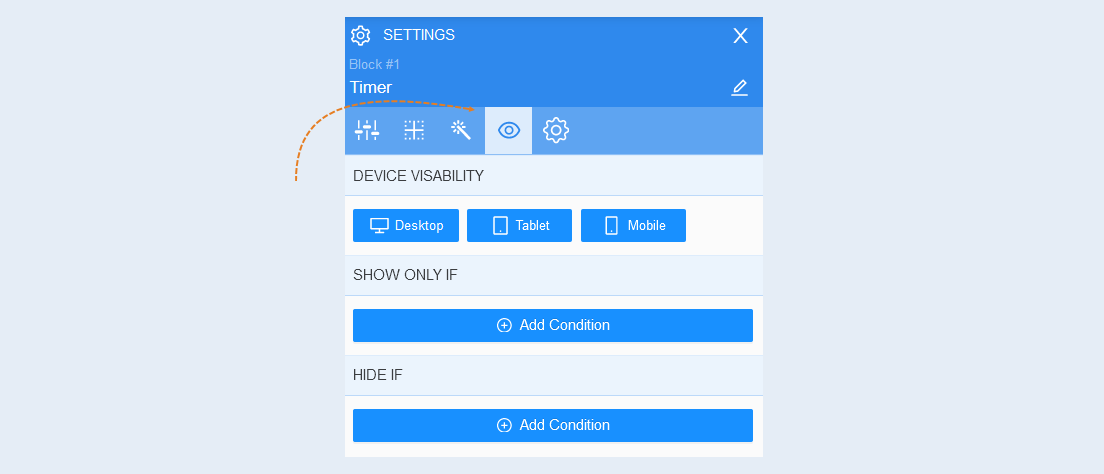
Conditional show / hide
For more information on the settings in this section, refer to the article "Conditional show / hide".
Advanced
For more information on the settings in this section, refer to the article "Advanced settings".