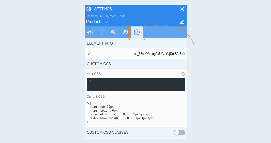
The product list component. This is a list of products available for purchase by the user in the form of payment.
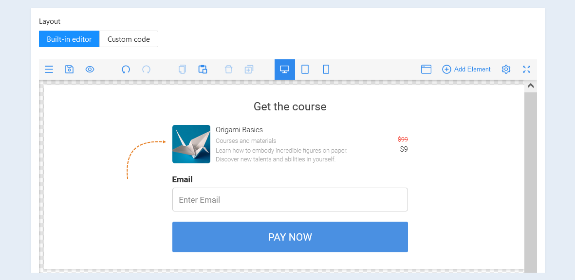
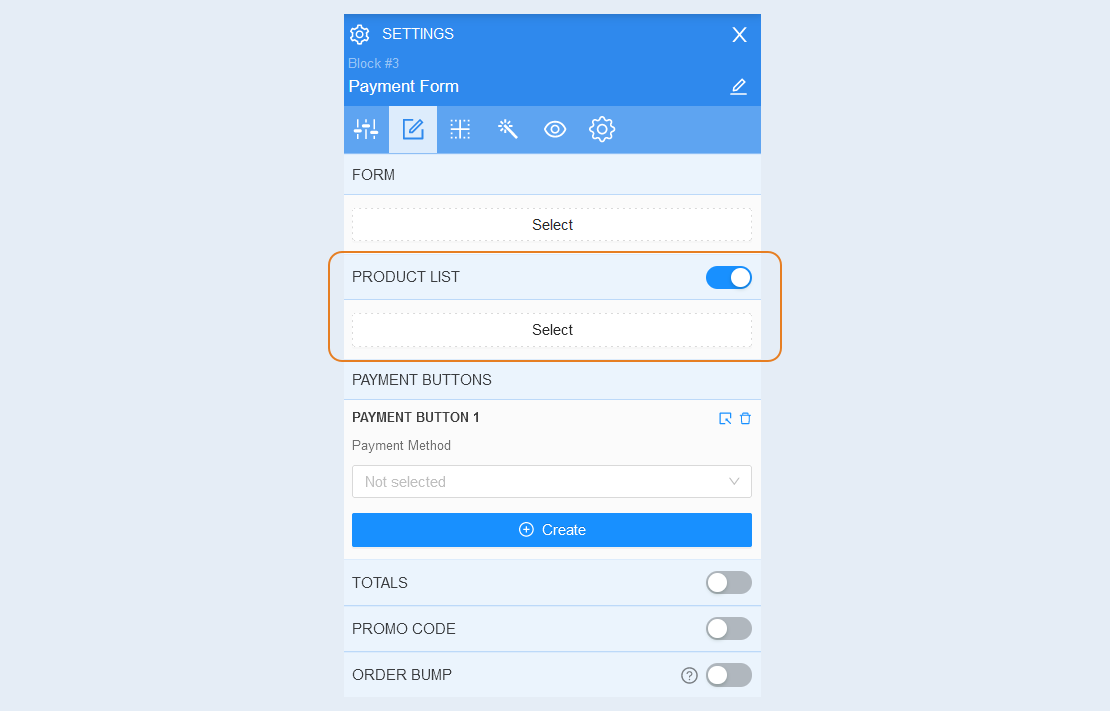
This component is shown on the default payment form page. You can also hide the list of products in the form by moving the slider to the inactive position. To add and configure the component again, move the "Product List" slider to the active position and click the "Select" button.
General Settings
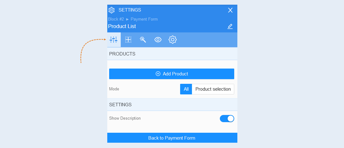
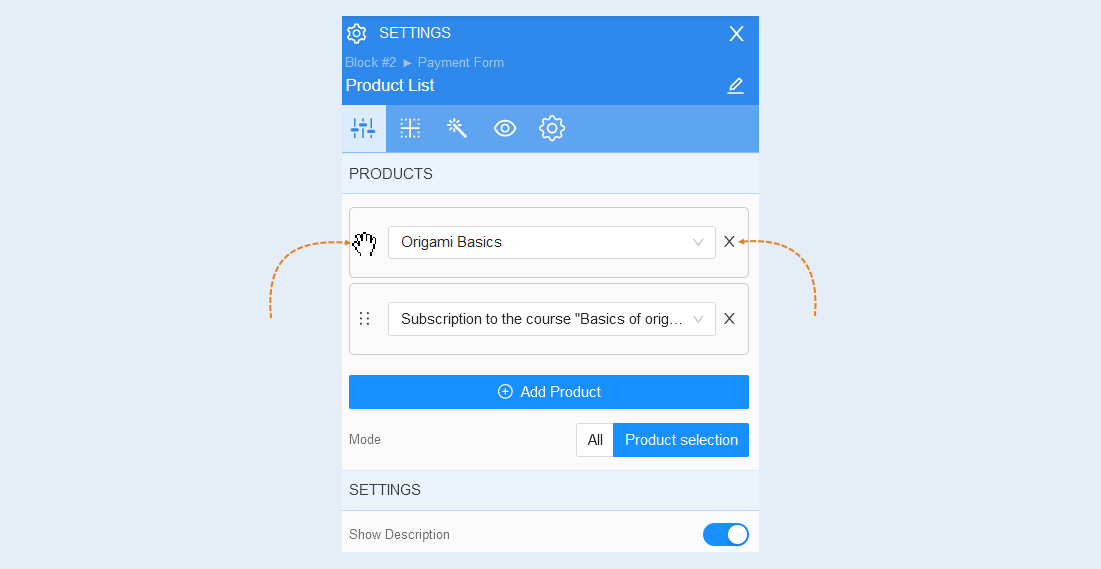
Select the list of products item inside the payment form, the advanced settings of the list of products component will open on the right. Open the "General Settings" tab.
Products. In this section, add one or more course products from the list of products. When selecting multiple products, they must be in the same currency. Read about how to create a product on the AXL platform in the article "Products and offers".
Mode. If you add several products to the payment form, set the selection mode. The “Product Selection” mode allows the user to select only one of the suggested products. When selecting the "All" mode, the user will buy all the products added to the form, without being able to select one from the list.
Settings. You can add a product description to the form by moving the "Show description" slider to the active position. You can add a description to the product in the product settings. For more information about the product settings, read the article "Common settings of the products and services section".
Hover the mouse cursor over the button to move, grab the product by clicking the left mouse button. Drag a product up or down relative to others to change their order in the list.
To remove a product from the list, click the "Delete" button next to the product name.
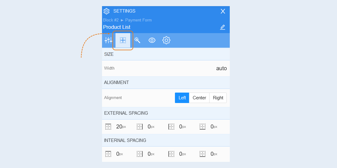
Positioning
Read more about the settings of this section in the article "Positioning".
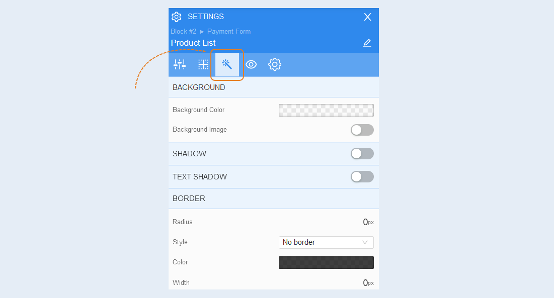
Style
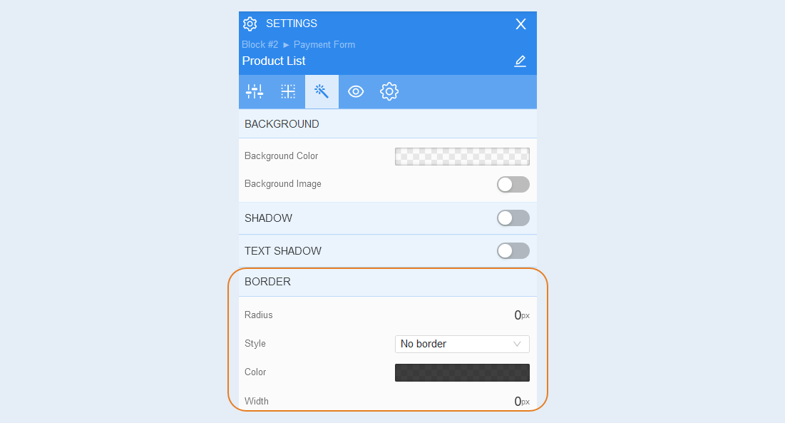
Background. You can change the background color of the form, as well as add a background image to the form. Additional image settings are opened for the background image: image selection, size, image repetition and image position inside the form.
Shadow. Add a shadow around the shape, you can adjust the shadow offset (left, right, up, down) and blur (bright or transparent shadow). And also the color of the shadow.
Text shadow. Add a text shadow, you can adjust the shadow offset (left, right, up, down) and blurriness (bright or transparent shadow). And also the color of the shadow.
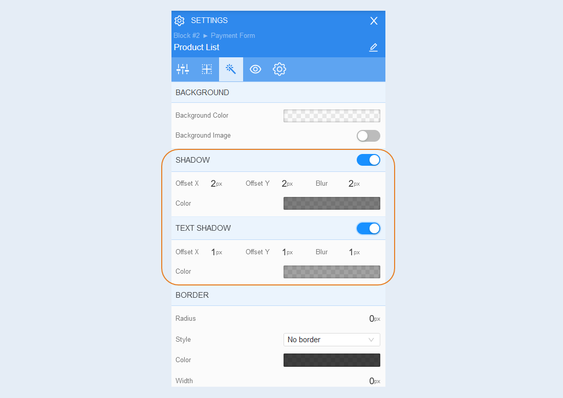
Border. You can customize the fborder around the payment form: the radius of the border (rounds the corners of the fields), the color of the frame and the thickness.
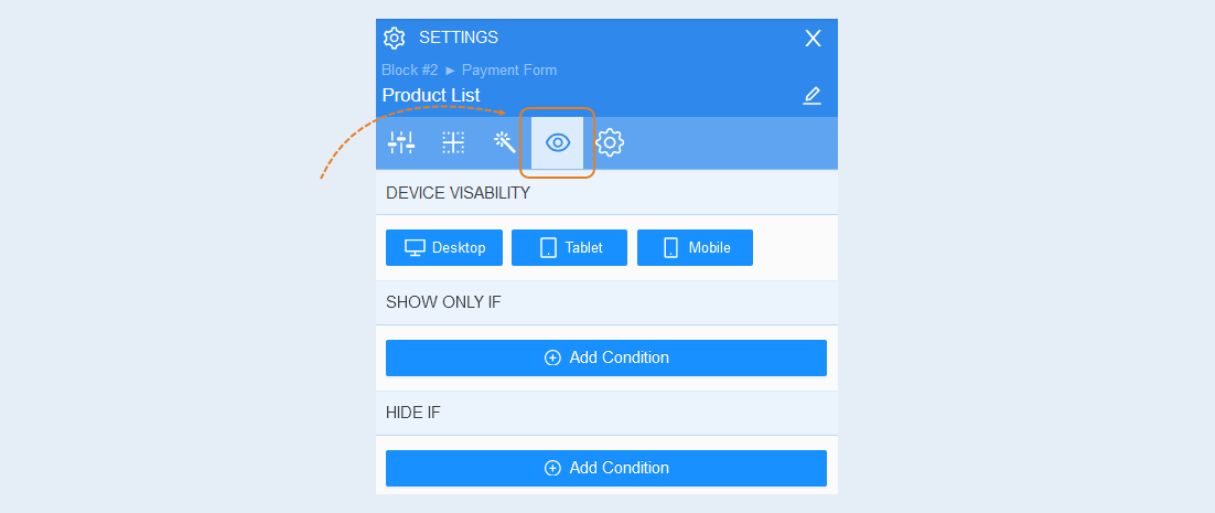
Conditional show / hide
Read more about the settings of this section in the article "Conditional show / hide".
Advanced settings
Read more about the settings of this section in the article "Advanced settings".