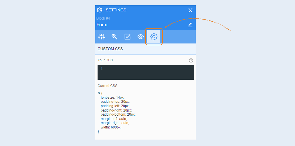
Form element is an element that collects contact information of a page (website) visitor. The form looks like a table with fields to fill in. Form fields are contact attributes (name, email, phone, etc).
General settings
Highlight the entire form to open settings for this element. A toolbar will appear on the right.
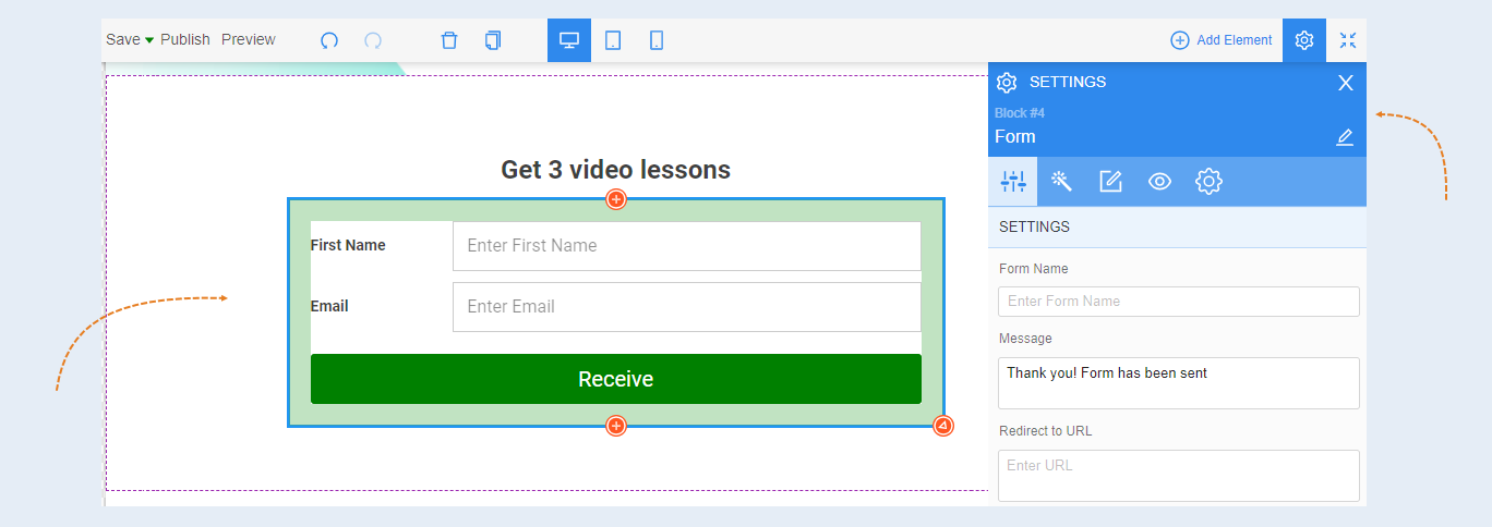
Settings. In this section, specify the name of the form, message for the site visitor, and URL address for redirecting the contact after filling out the form. When the visitor completes the form, a message will appear (e.g. "Form submitted").
Run JS code. JS code is a code block designed to perform a specific task. When the user clicks on the element, the configured JS function will be executed. Set the toggle to active and enter the JS code.
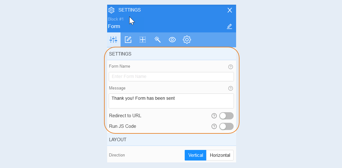
Layout. Choose the layout of the form fields: vertical or horizontal.
Fields
In this section, you can customize the form fields. By default, you have two fields: contact name and email. You can delete fields or add new ones, as well as customize them. Each field has identical settings.
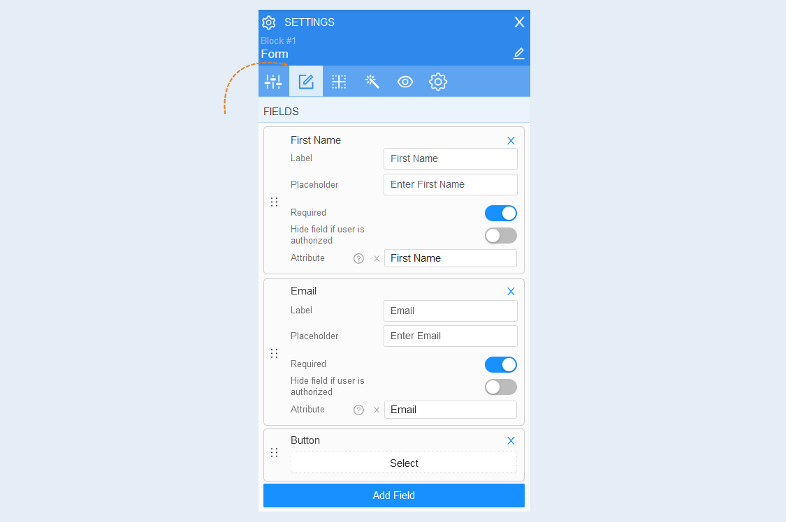
Field Name:
- Name. Next, write the name of the field - this is a label that will be displayed outside the boundaries of the field.
- Aggregate. Write a placeholder - this is the text inside the field that the visitor of the page will see, and which will disappear when the field is filled.
- Necessary. Set the necessary icon: if the icon is disabled, then the field is optional and the visitor may not fill it in; if the icon is enabled, then the field is required and the site visitor must fill it in to send the form.
Hide the field if the user is logged in. Move the slider to the active position so that this field is hidden for the authorized user.
- Attribute. Select from the list provided or enter a new attribute for the field.

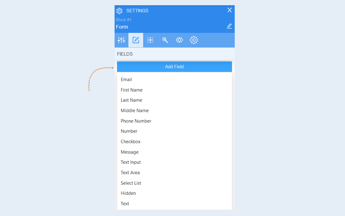
Add field. Click the button to create a new field inside the form and select the field type from the list. Then the field settings will open.
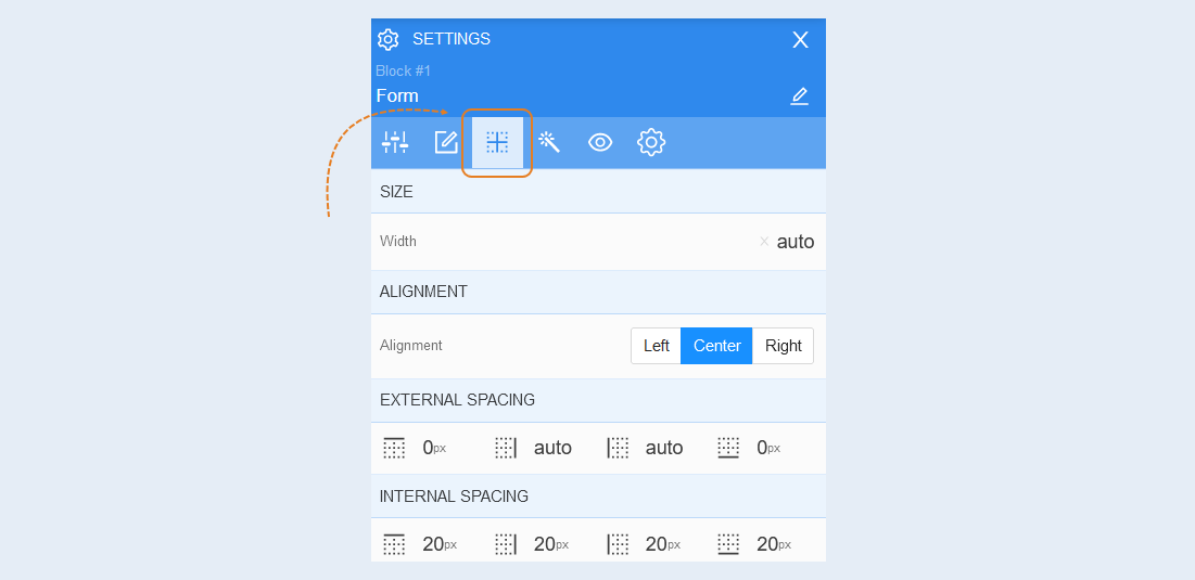
Positioning
For more information on the settings in this section, refer to the article "Positioning".
Style
Background. You can change the form's background color and add a background image. Additional settings for the background image include image selection, size, repeat, and position within the form.
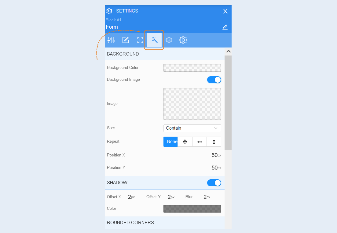
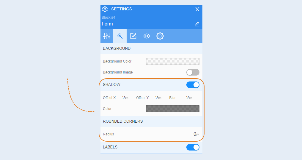
Shadow. Add a shadow around the form, adjusting the shadow offset (left, right, top, bottom), blur (light or transparent shadow), and shadow color.
Rounded corners. You can adjust the rounding of corners for the entire form.
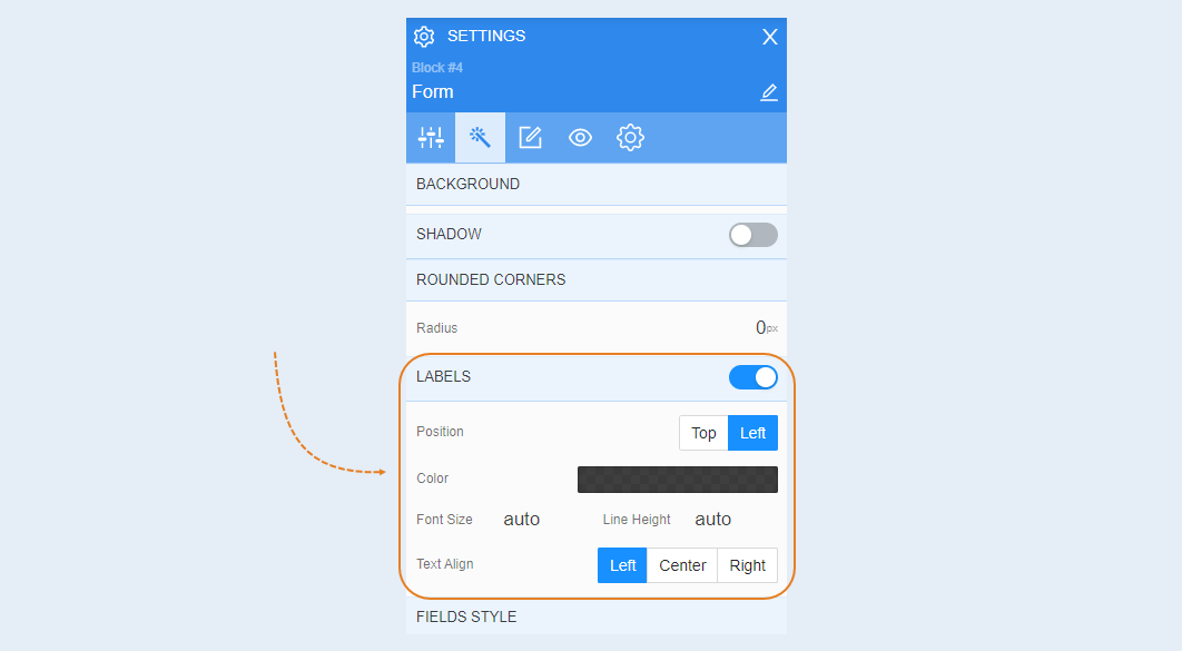
Labels. Labels are contact attributes inside the form: name, email, phone, etc. You can manage the labels inside the form by changing the position (top or left), color, font size, line height, alignment (left, center, right).
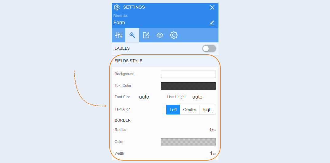
Field style. You can change the form fields: background color, text color inside the field, font size, line height, and text alignment inside the field (left, center, right).
Frame. You can customize the border around the form: border radius (rounds field corners), border color, and thickness.
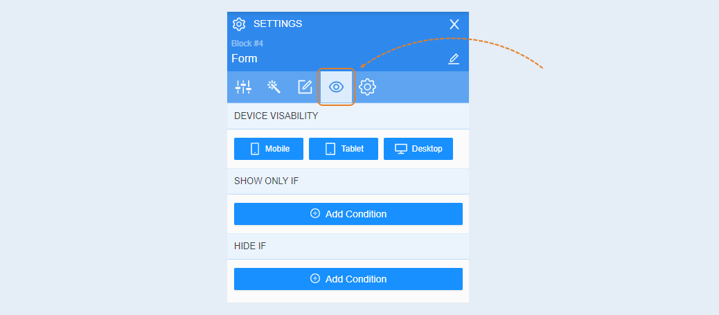
Conditional show / hide
For more information on the settings in this section, refer to the article "Conditional show / hide".
Advanced
For more information on the settings in this section, refer to the article "Advanced settings".