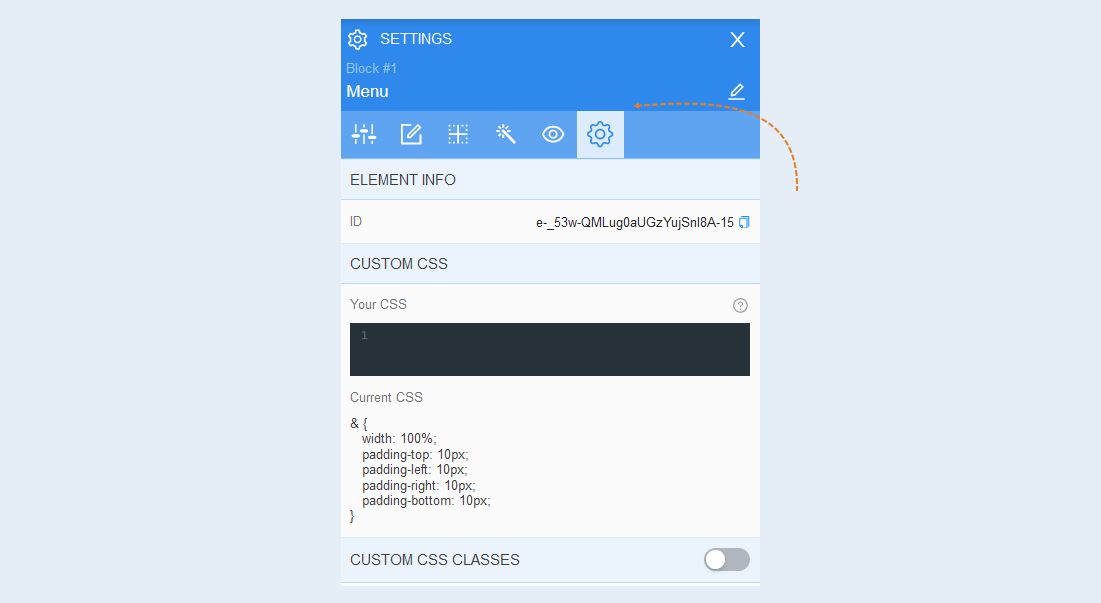
The menu is a separate interactive element that includes many functions.
Click the "Add Element" button and select the "Menu" item. Next, perform the element settings.
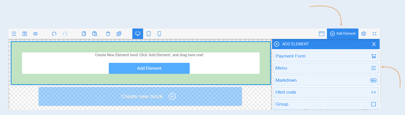
Select an item to edit by clicking on it with the mouse. The settings of this element will open on the right.
A panel with the following tools opens for the "Menu" items:
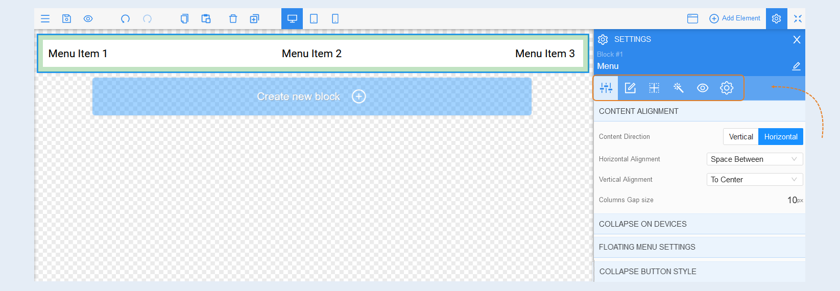
Element Settings
Content alignment. In this section, you can change the location of the components of the "Menu" element: horizontally and vertically. And align the location of the buttons inside the element, as well as set the gap distance between the buttons.
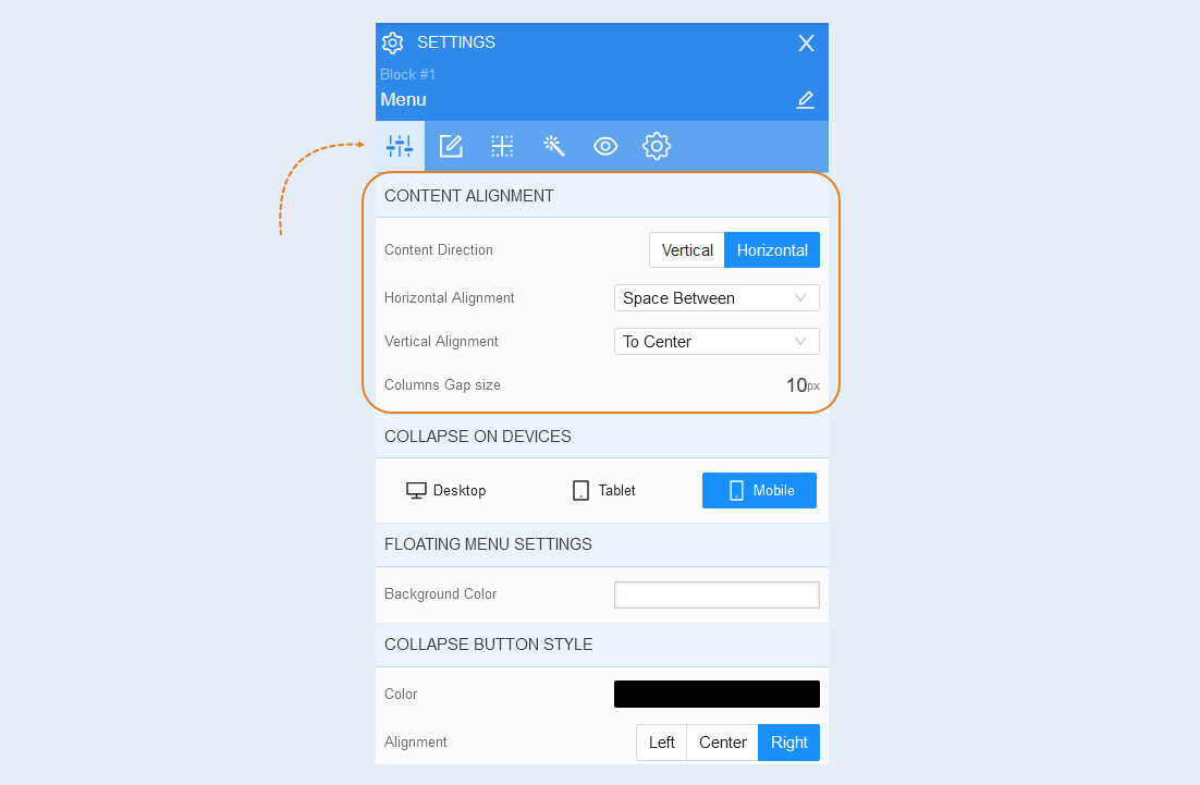
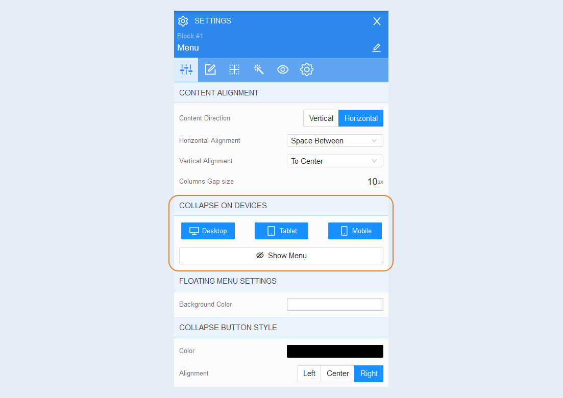
Collapse on devices. You can select the device on which the Menu item will be displayed in full or select the device on which this item will be displayed in a collapsed form.
Highlight in blue the devices on which you want to collapse the element. On the selected devices, only the Collapse button will be displayed (a button consisting of three parallel horizontal lines symbolizing the menu list). Click the "Show Menu" button to display the floating menu.
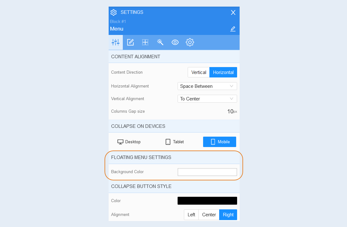
Floating menu settings. In this section, you can change the background color of the floating menu.
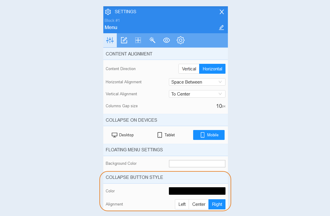
Collapse button style. In this section, you can change the color of the Collapse button and its location on the page: left, center, right.
Menu Items
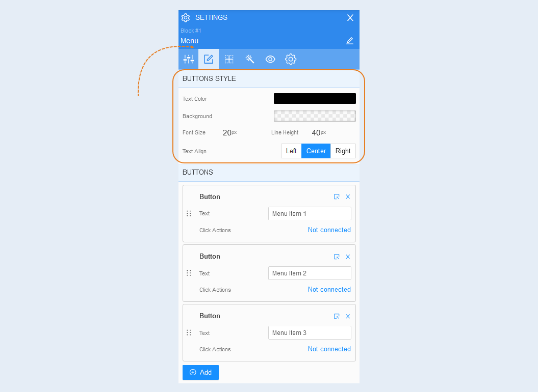
Buttons style. In this section you can customize the general style of the Menu buttons. You can change the color of the buttons, set the background color around the buttons, change the font size of the text inside the button and the line height, as well as change the location of the text inside the buttons: left, center. on the right.
Buttons. This section presents the settings of each button of the Menu item. You can change the name of each button and link the action on click. You can also swap buttons by dragging them higher or lower in the list.
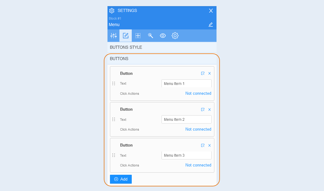
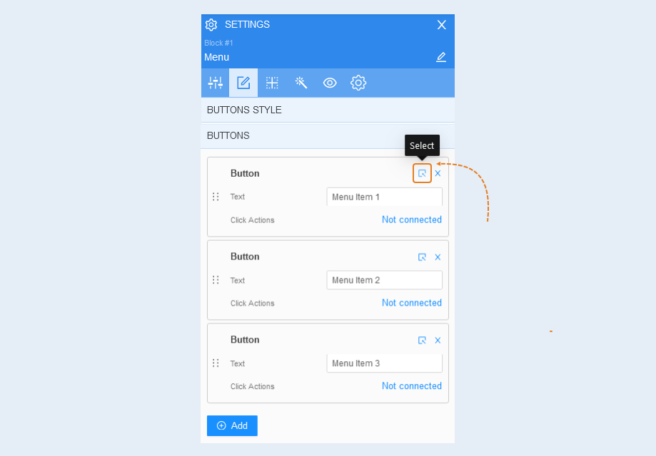
Click the "Select" button to open the advanced settings of each button. For more information about button settings, see the article "Element Button".
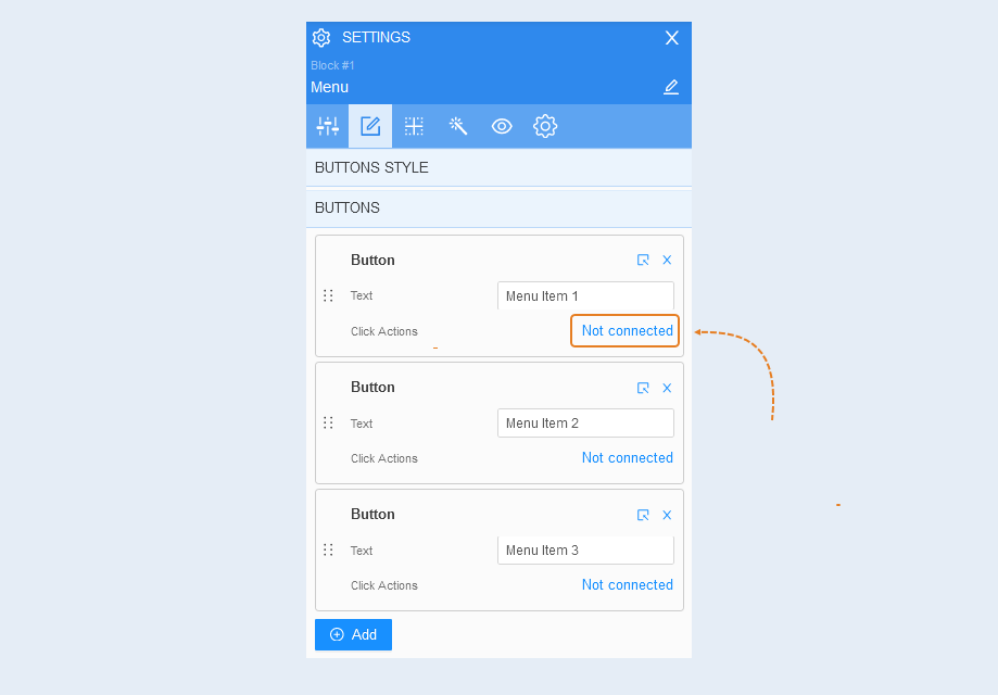
A button is an interactive element that a visitor clicks on to follow a link. Click the "Not connected" button to add a click action to each Menu button.
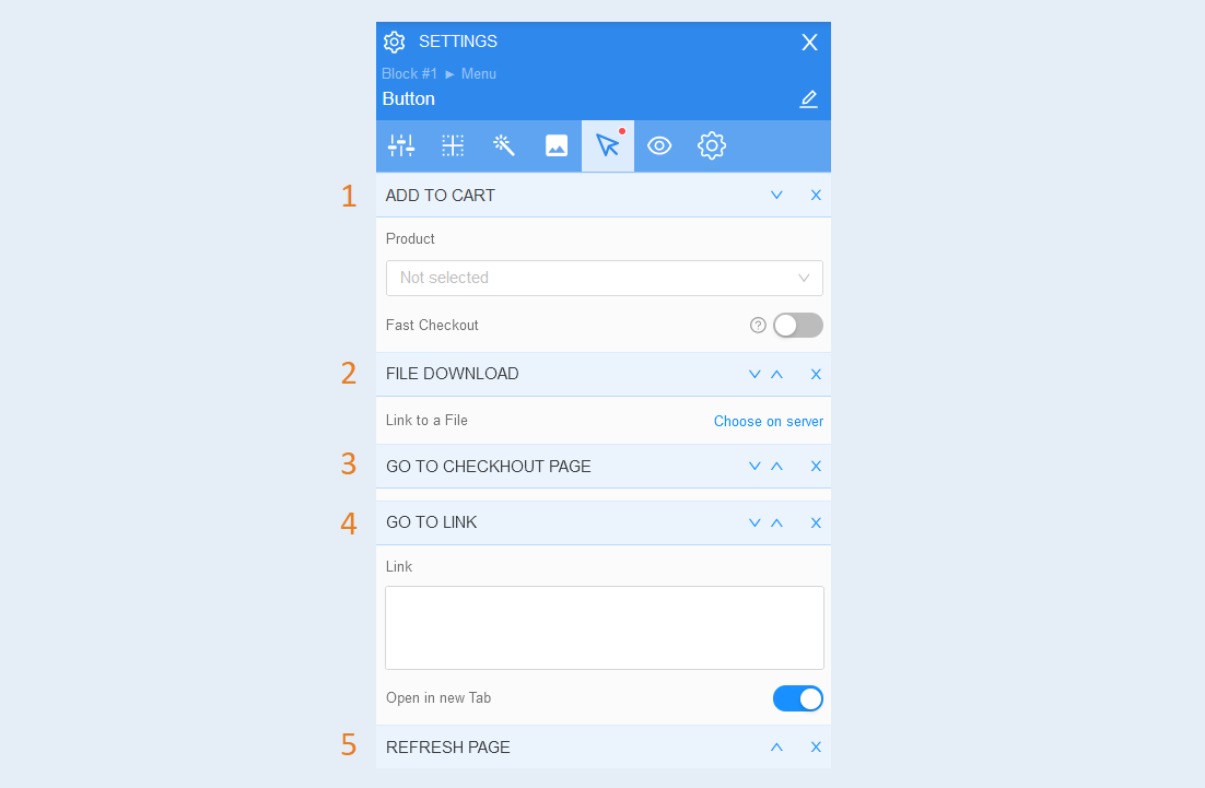
Click on the "Add click action" button and choose from the suggested options:
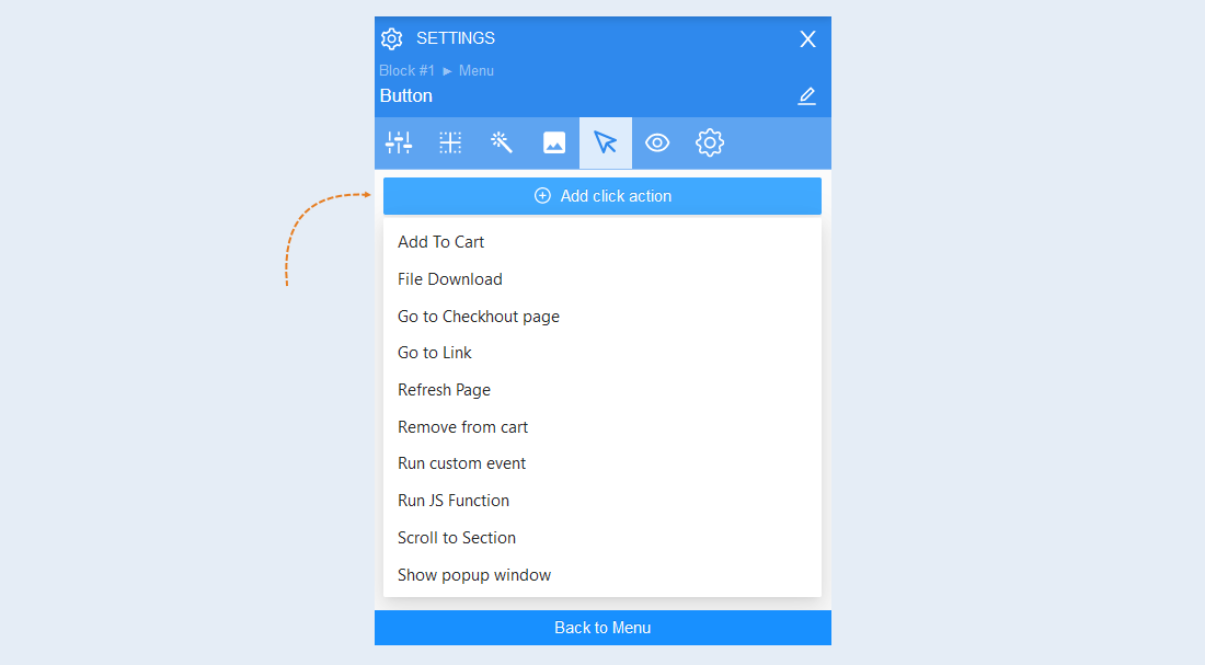
- Add to cart. When the user clicks on the item, the product will be automatically added to the cart. Specify the desired product by selecting it from the list of products. In order for the checkout process to start immediately after the user adds the order to the cart, move the “Quick Payment" slider to the active position.
File download. This action automatically starts downloading the selected file to the user's device. Attach the file by clicking the "Select on the server" button. And download the file from your computer.
Go to checkout page. The user will be instantly redirected to the checkout page. This action has no additional settings.
Go to link. When clicking on the element, the user will be redirected to the selected page. To select this action, paste the link into the field and move the "Open in a new tab" slider to the active position.
Refresh the page. When you click on the element, the user's page will be updated. This action has no additional settings.
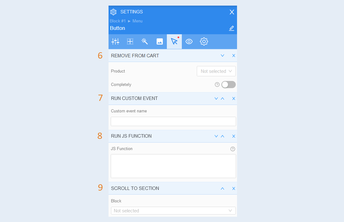
Remove from cart. When the user clicks on this item, the product will be automatically removed from the shopping cart. Select the desired product and turn the slider to the active state to completely remove the product from the basket.
Run custom event. You can create any event that will trigger the script. In the configuration settings, write the name of the event. To learn how to set up a custom event, read the article "Types of events in the scenario".
Run JS function. A JS function is a block of code designed to perform a specific task. When the user clicks on the element, the configured JS function will be launched.
Scroll to section. This action redirects the user to another block on the same page where this button is located. Select the required block from the list to which the user will be directed.
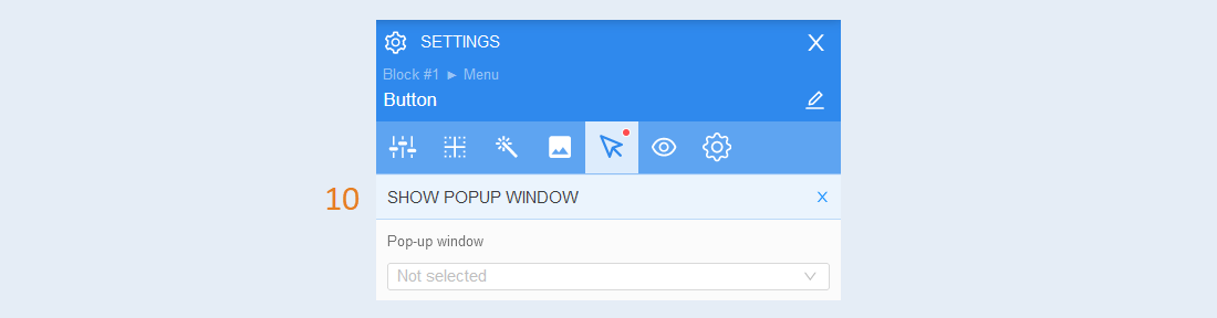
Show pop-up window. When you click on this element, an additional window will be displayed on top of the web page. To learn how to set up a pop-up window, read the article "Pop-up windows".
Positioning
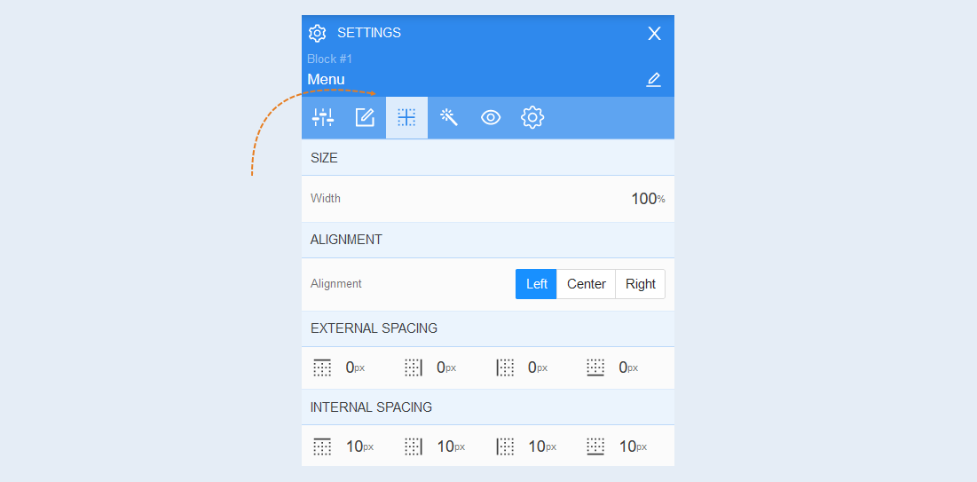
Read more about the settings of this section in the article "Positioning".
Style
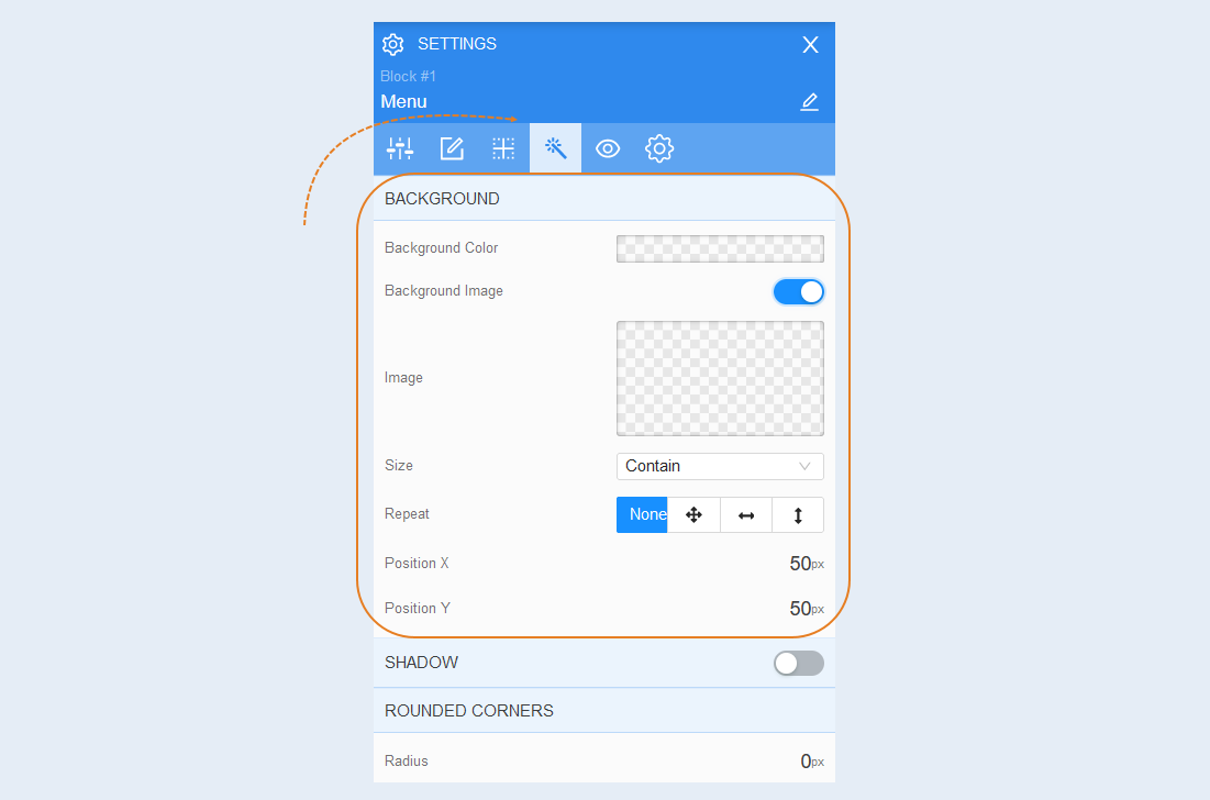
Background. In this section, you can change the background color of the element, as well as add a background image to the element. Additional image settings are opened for the background image: image selection, size, image repetition and image position inside the text field.
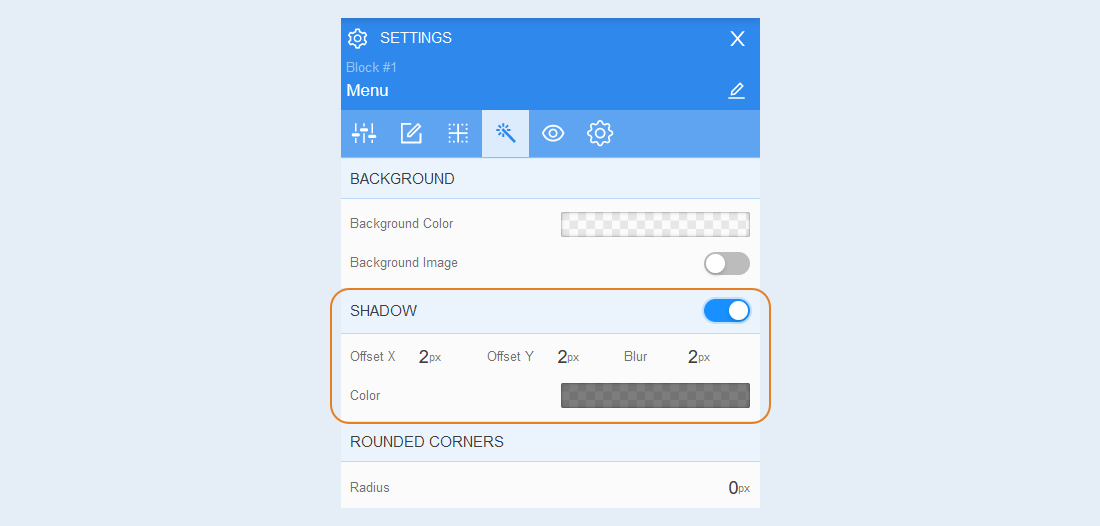
Shadow. Choose the color of the shadow from the element, the direction of this shadow (left, right, up, down) and blur (make the shadow bright and clear or transparent). This effect is used if the background is not uniform, as well as to make the element more voluminous.
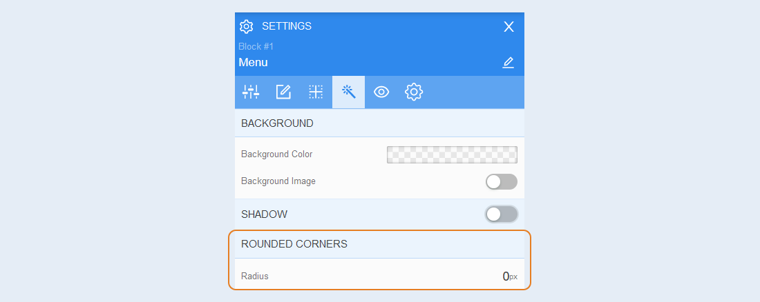
Rounded corners. You can adjust the rounding of the corners for the element. Specify the radius as a percentage or in pixels.
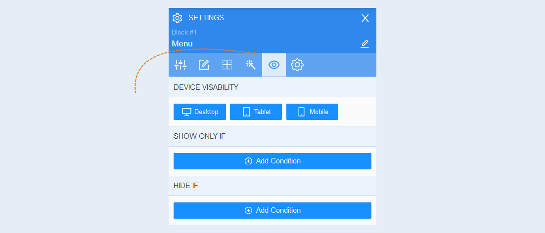
Conditional show / hide
Read more about the settings of this section in the article "Conditional show / hide".
Advanced
Read more about the settings of this section in the article "Advanced settings".