The quiz is a control survey. In Internet marketing, a quiz is called contact forms that are filled out step by step: answered one question, moved on to the next. A quiz can be a separate page (quiz page) or a separate element of the site (quiz form).
This is a useful tool, as it helps the company to work with a warm audience, achieve greater engagement and reduce the cost of leads. And from the point of view of the buyer or user, the quiz helps to easily and quickly find the right product or service, learn more about the company or share your opinion. Quizzes work both ways and benefit both the company and the end user.
Click on the desired section of the article to go to its description:
How to create a quiz form
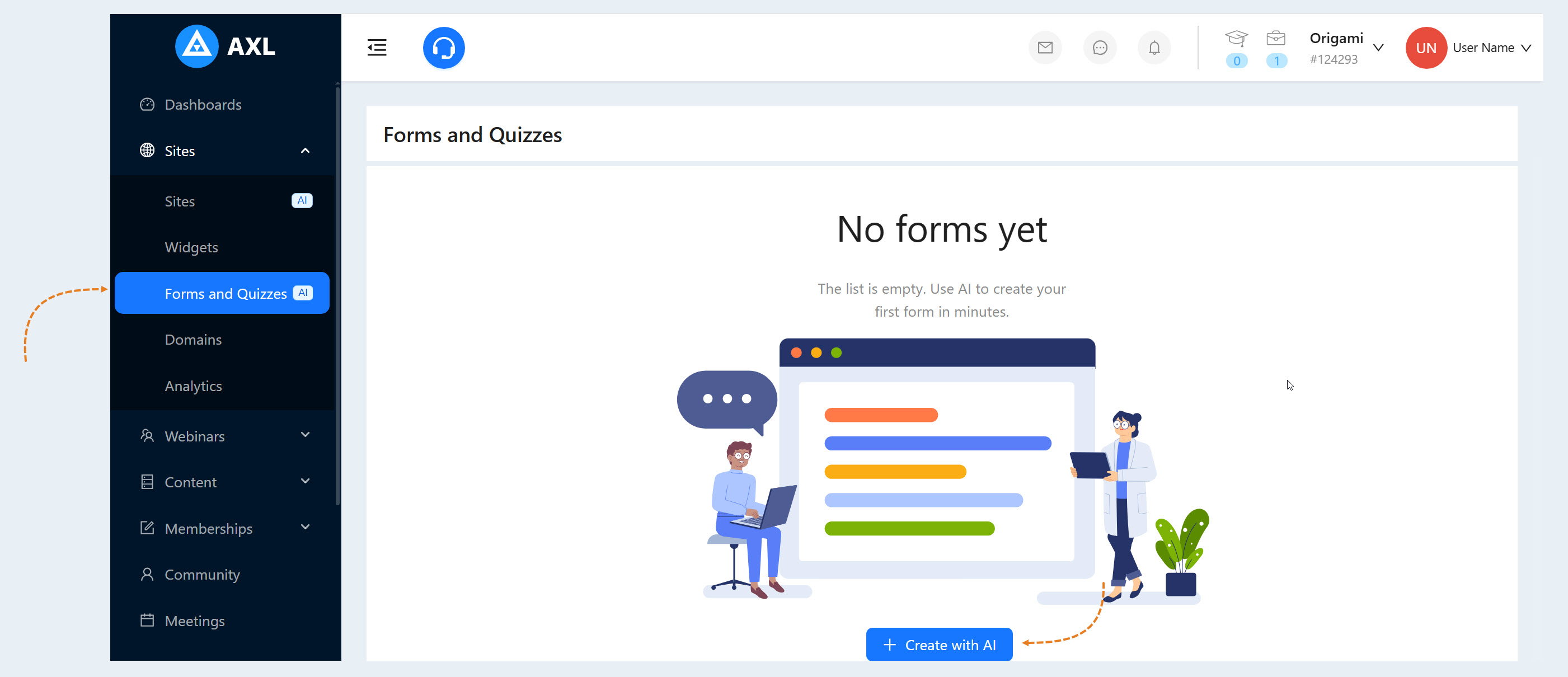
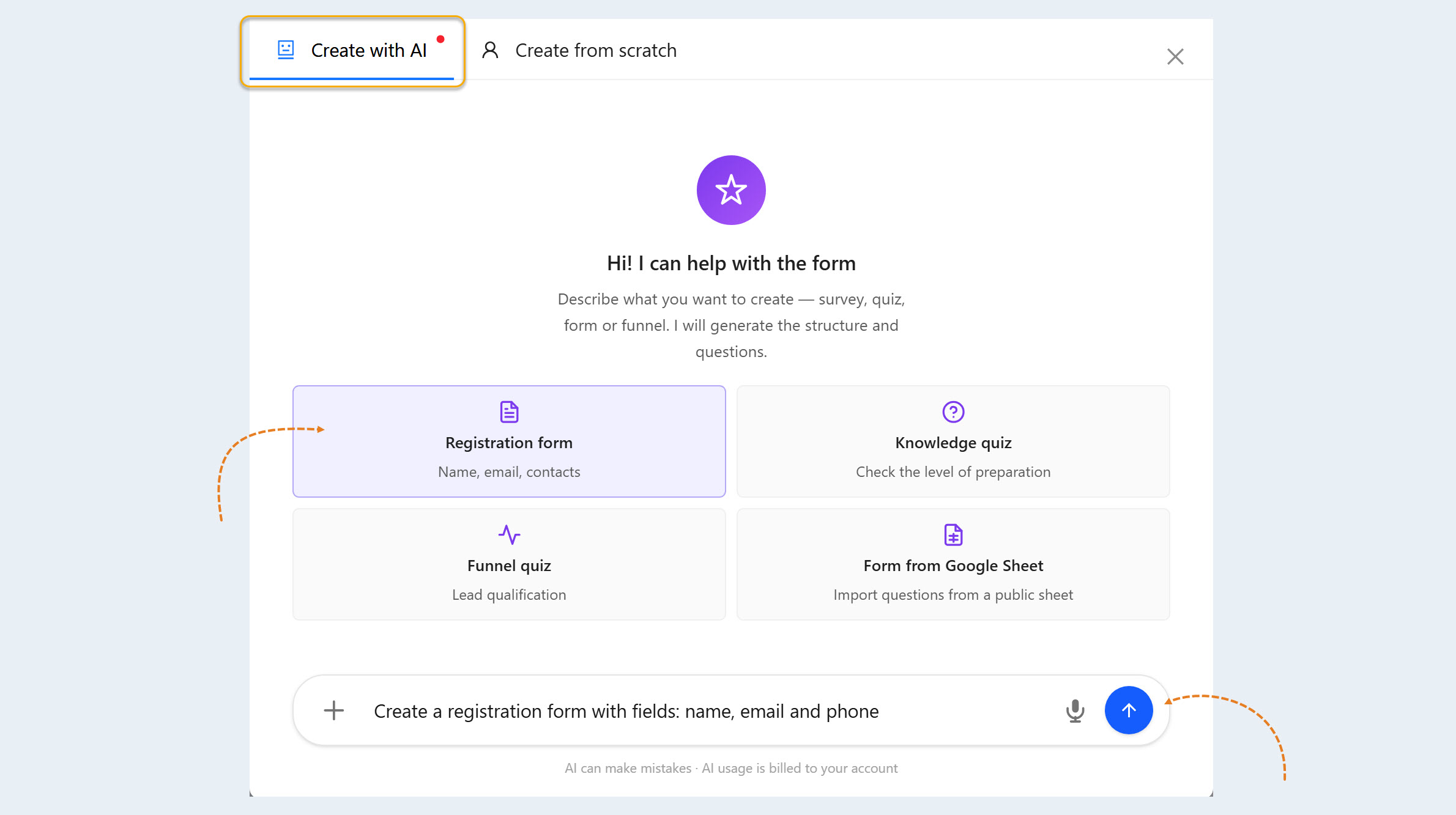
Go to the “Sites” section and select the “Forms and Quizzes” tab. Click the “Create with AI” button.
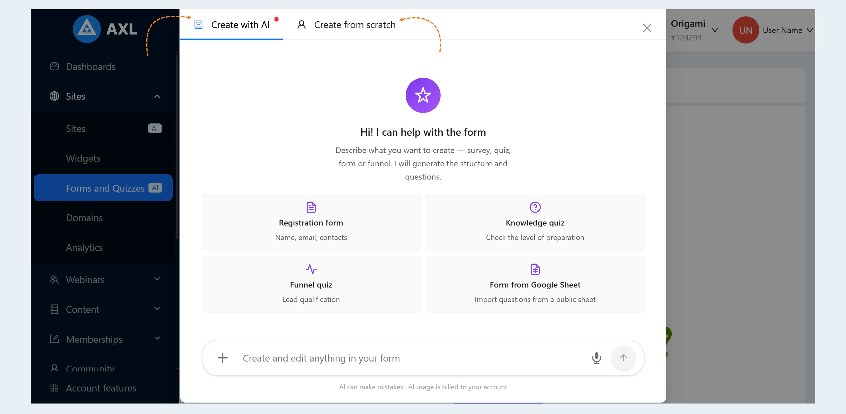
Next, choose whether you want to create a quiz form on your own or with the help of an AI assistant.
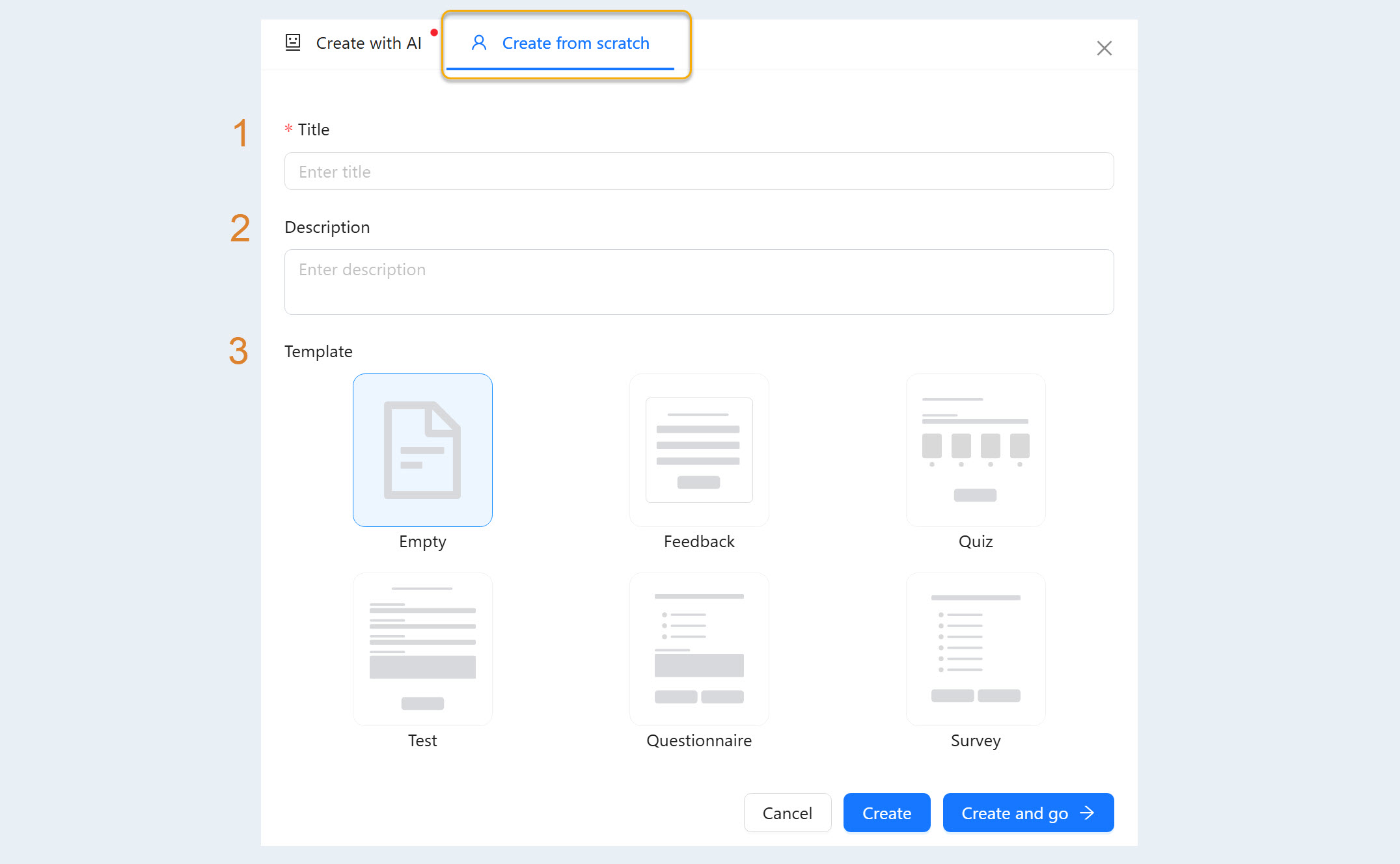
If you select “Create from scratch,” an additional window will open. Fill in the fields:
- Title. Enter the name of the form.
Description. Add a description of the form.
Template. Choose a form from the available templates. You can modify any selected template in the settings section. The choice of template depends on your specific goal. You can take any template and quickly adapt it to your needs. This significantly speeds up the process.
The list of templates includes various forms:Empty. This is a clean slate. You start from scratch, adding all the necessary fields, questions, answer types, and logic. A blank template provides maximum flexibility. It is used when none of the pre-made templates meet your specific requirements.
Feedback. This is a simple form for collecting feedback, suggestions, questions, or complaints from users. The template helps identify problems, improve quality, and increase user satisfaction. It is used to understand customer needs and expectations and identify pain points. For example, it can be used as a feedback form after attending an online course.
Quiz. This is a set of questions designed to assess a user's knowledge, skills, or interests in a specific area. It can be used in education in a gamified manner, to attract audience attention, or to generate leads (marketing quiz).
Test. This is a form designed to collect information about the user and their needs, with the aim of segmenting the audience or assessing compliance with certain criteria. It helps to understand the audience and adapt content. Also, the form can be used to assess skills, abilities, or personality traits. For example, an English language test that determines the level of proficiency.
Questionnaire. A form for collecting information about the user. The template is needed to collect data for research, create a customer profile, or personalize offers. For example, a questionnaire for new users of the platform, containing questions about their education, professional experience, and interests.
Survey. This is a form for collecting opinions, views, and evaluations on a specific topic. It contains questions with multiple-choice answers, allowing you to assess the degree of agreement or disagreement with a statement. The template can be used to identify public opinion, evaluate the effectiveness of activities, and make data-driven decisions.
If you select “Create with AI,” an additional window will open. Select a template:
- Registration form.
- Knowledge quiz.
Quiz funnel.
Google Sheets form.
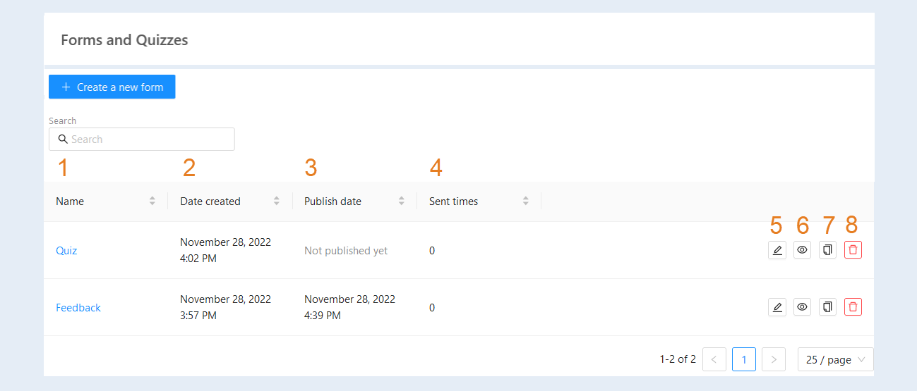
Click the “Create” button if you're creating from scratch, or send a prompt to the AI assistant if you're creating with the help of AI. After creating new forms, they will appear in the "Forms and Quizzes" list. Here you can see the following information:
Name. Here you can see the name of the form.
Date created. Here you can see the exact date and time the form was created.
Publish date. Here you can see the exact date and time of publication of the form. If the form has not been published yet it will be displayed with a column.
Sent times. This column will display the number of publications of the form.
The "Edit" button. This button opens a window for editing the form.
The "Preview form" button. This button opens the form preview window.
The "Copy" button. This button creates a copy of the form and its scenario.
The "Delete" button. This button removes the form from the list.
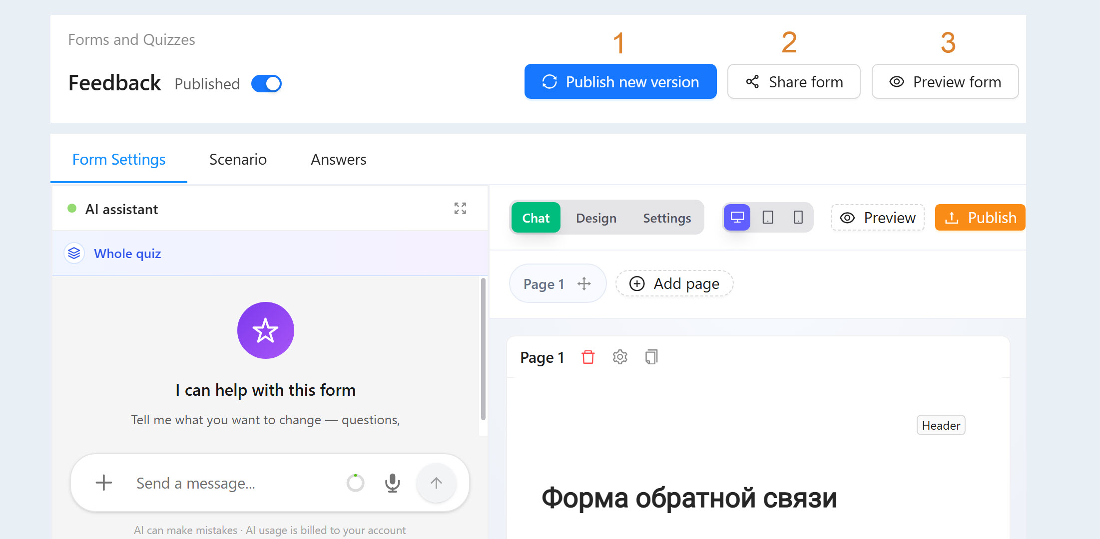
Click on the name of the form or the "Edit" button. You will see a window for setting up a new form. At the top of the settings page you can see three buttons for working with the form.
- The "Publish" button. This button saves the changes made to the form and publishes it.
The "Share form" button. You can embed the created form on the website or course on the AXL platform, as well as on a third-party website. Click the "Share Form" button and copy the direct link or the form code.
The "Preview form" button. To see how the form will look after publication, click the "Preview form" button.
Form Settings
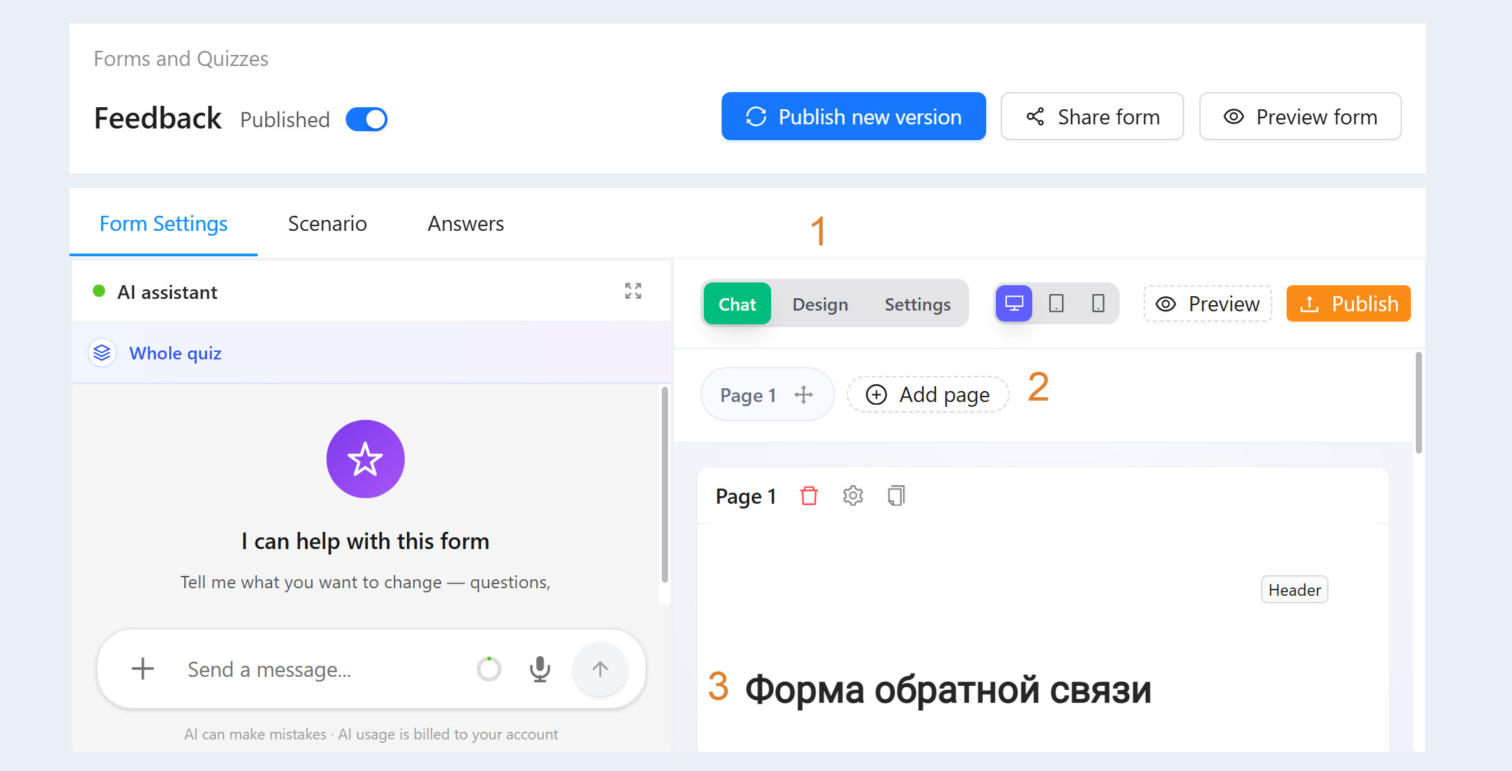
In the Form Settings tab, you can change the form settings, add and remove pages, as well as form elements. The Form Settings tab consists of three blocks:
- Form settings. In this section, you can switch between the chat with the AI assistant, the quiz design, and the quiz settings.
- A list of form pages. This is a block that provides an overview of all the pages of your form/quiz and allows you to manage their order.
The content of the form pages. This is the main block where you create and edit the contents of each page of your form/quiz. Here you add questions, text, and other elements.
Each section is discussed in detail below.
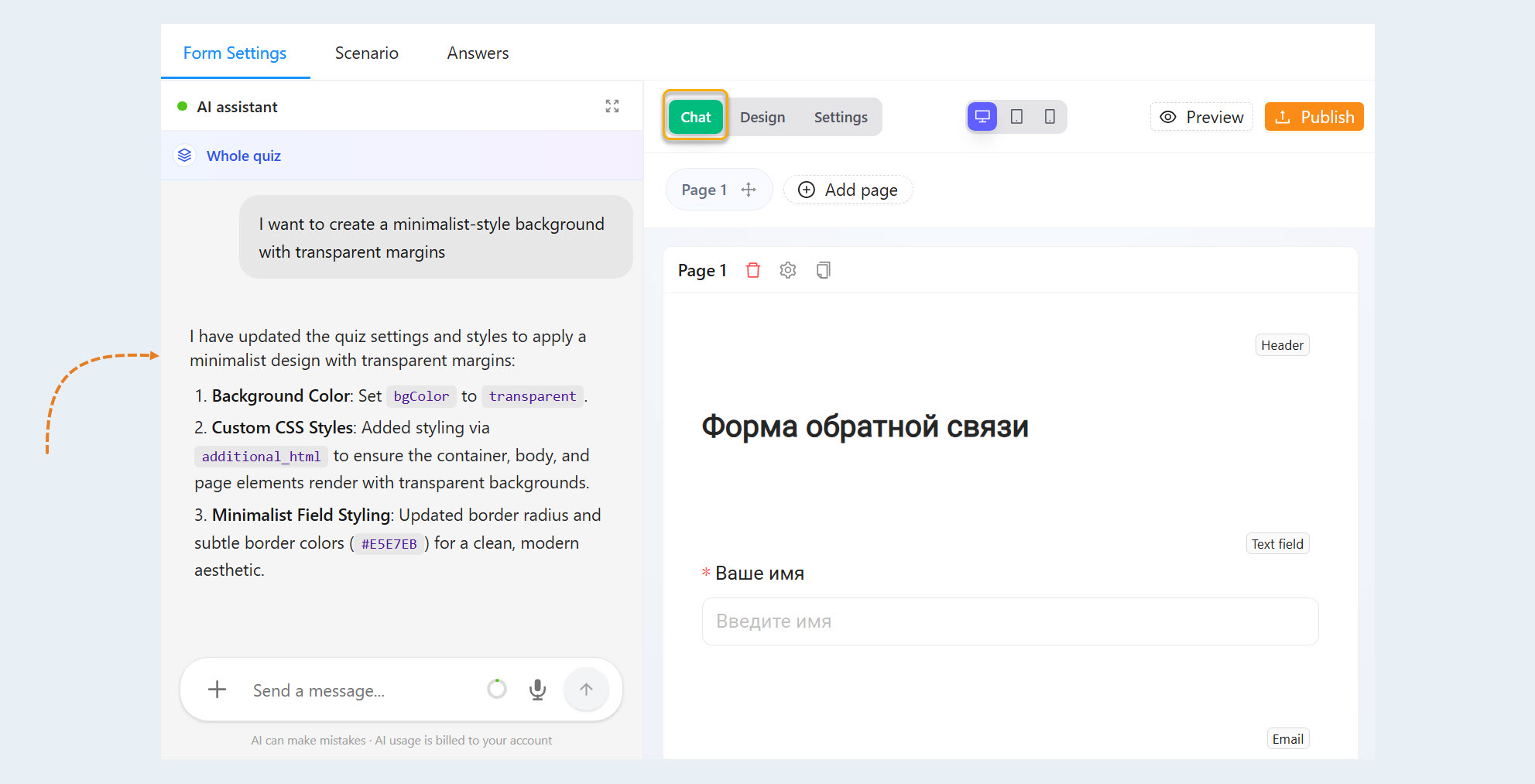
AI Assistant. Interact with the AI Assistant and edit your quiz using text commands. Each request is billed separately, and the cost is calculated on a case-by-case basis.
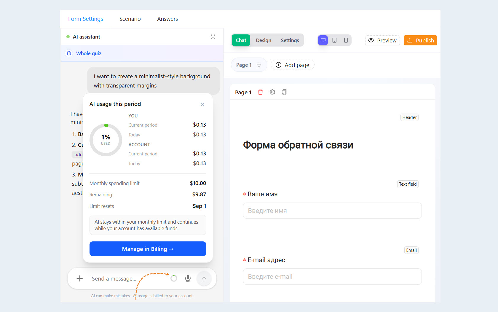
To see how much you've spent on the AI assistant, tap the circle to the left of the voice message button.
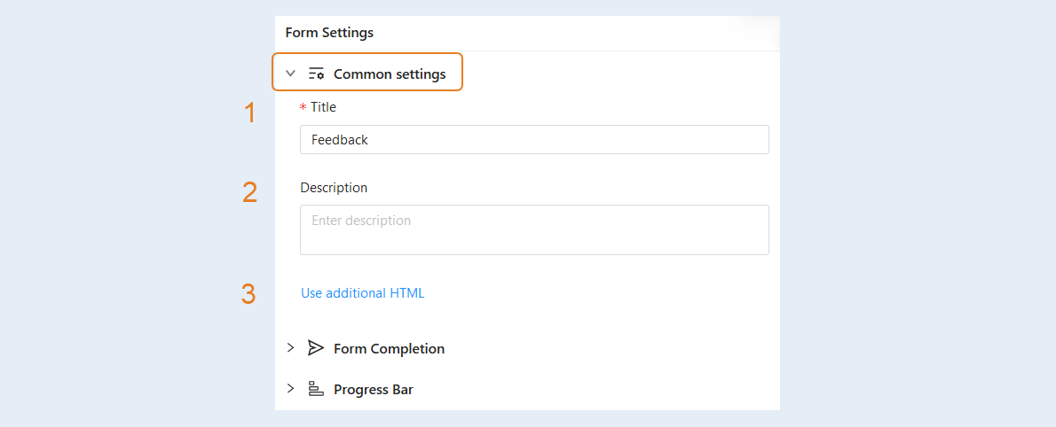
Quiz Design. This section contains the quiz design settings:
- Title. You can change the name of the form.
Description. You can add a description of the form.
Use additional HTML. You can add an additional HTML page.
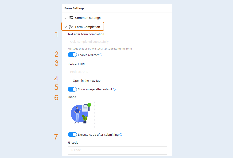
Form Completion. In this section, you can configure the message and image that users will see after submitting the form.
Text after form completion. This is a text message that users will see after submitting the form.
Enable redirect. Redirection occurs immediately after sending the form, regardless of the page on which it happened and its rules.Move the slider to the active position and you will have additional redirection settings. Enter the redirect URL, the user will be sent to this page after completing the form. Check the box "Open in a new tab" and the redirect page will be opened in a new tab.
Redirect URL. Add the redirect URL to the field.
Check the box "Open in a new tab" to open a new page in a new window.
Move the "Show image after submit" slider to the active position to set the image on the form completion page after it has been submitted.
Image. Click on the image and download it from your device (computer, laptop).
Execute code after submitting. Whether to execute JS code on the form completion page after it has been submitted. Move the slider to the active position and insert the JS code into the field.
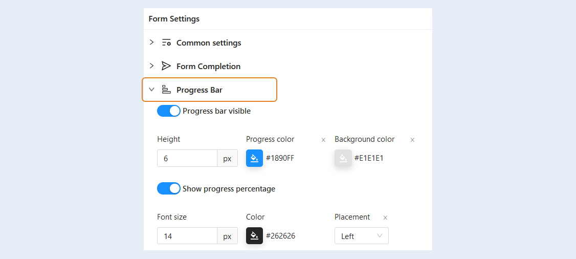
Progress Bar. The progress bar will be displayed as a colored line above the form questions and will change color as the user answers the questions. Such a scale is usually used to provide the user with feedback on the progress of the process. Users can visually understand how much has been completed and how much remains to be completed.
Move the "Progress bar visible" slider to the active position and set the progress scale settings. In this section you can change the height and color of the progress bar.
Move the "Show progress percentage" slider to the active position so that the user can see in percentages which part of the form he has filled out. You can change the font size, color, and location of percentages on the progress bar.
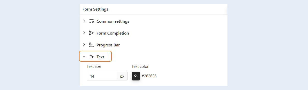
Text. You can change the text color and font size.
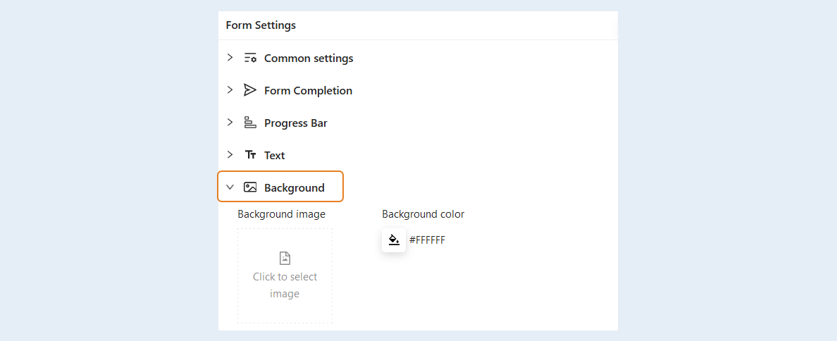
Background. Choose the background color of the form, and you can also add any background image inside the form.
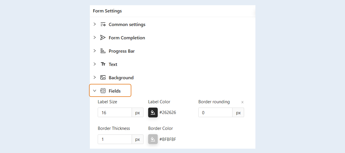
Fields. In this field, you can change the size and color of the question title of the form. You can adjust the rounding of the corners of the field to answer the question. To do this, specify the radius of the rounding in pixels. You can also adjust the width and color of the frame for the response field.
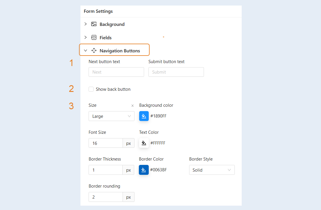
Navigation buttons. In this section, you can customize the text and style of the navigation buttons.
- Text of the button. You can change the name of the "Next" and "Send" buttons.
Show back button. This button returns the user to the previous page of the form. Check the box to make the button available to users.
In this section you can change the style of the navigation buttons: the size of the button, the background color, the font size and color inside the button, the thickness and color of the frame, its style, as well as the rounding of the corners of the button.
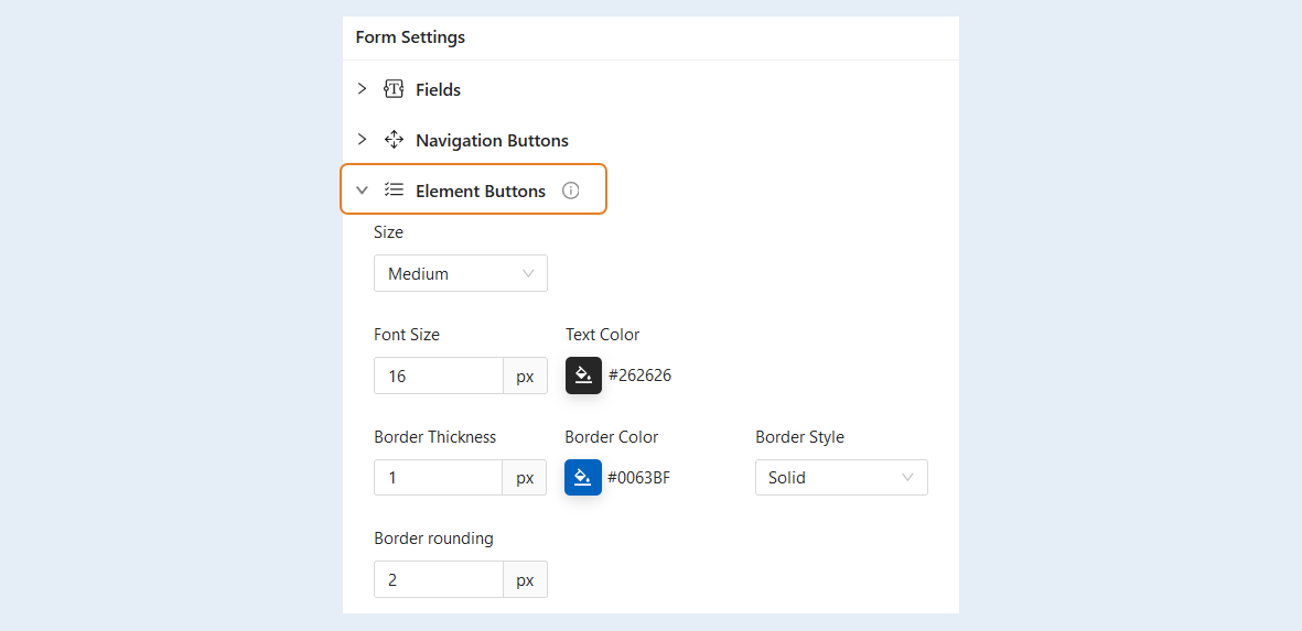
Element Buttons. This section of the settings is used in items with a choice of several list options in button mode. You can change the style of the button elements: the size of the button, the background color, the font size and color inside the button, the thickness and color of the frame, its style, as well as the rounding of the corners of the button.
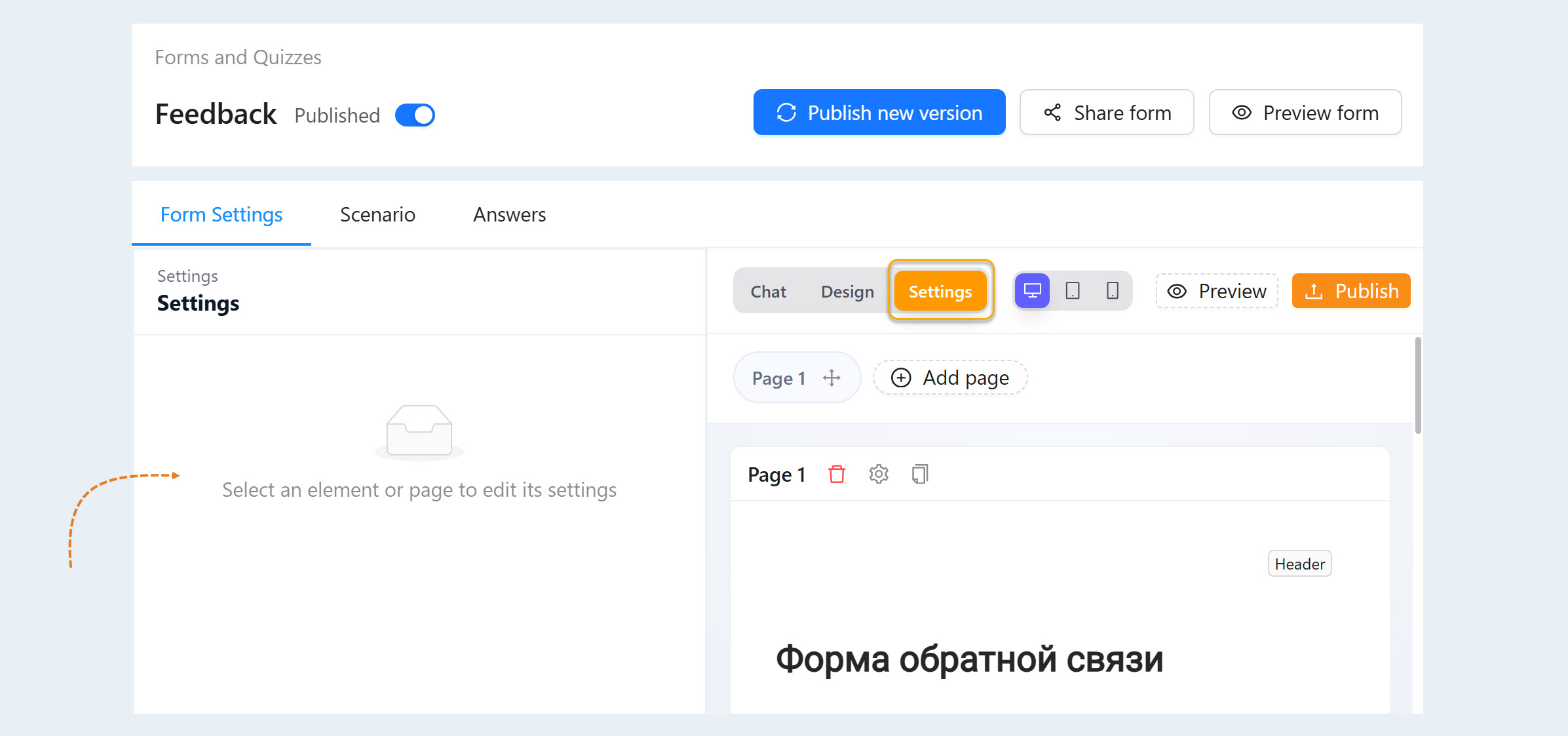
Settings. The “Settings” tab displays the settings for the selected quiz item.
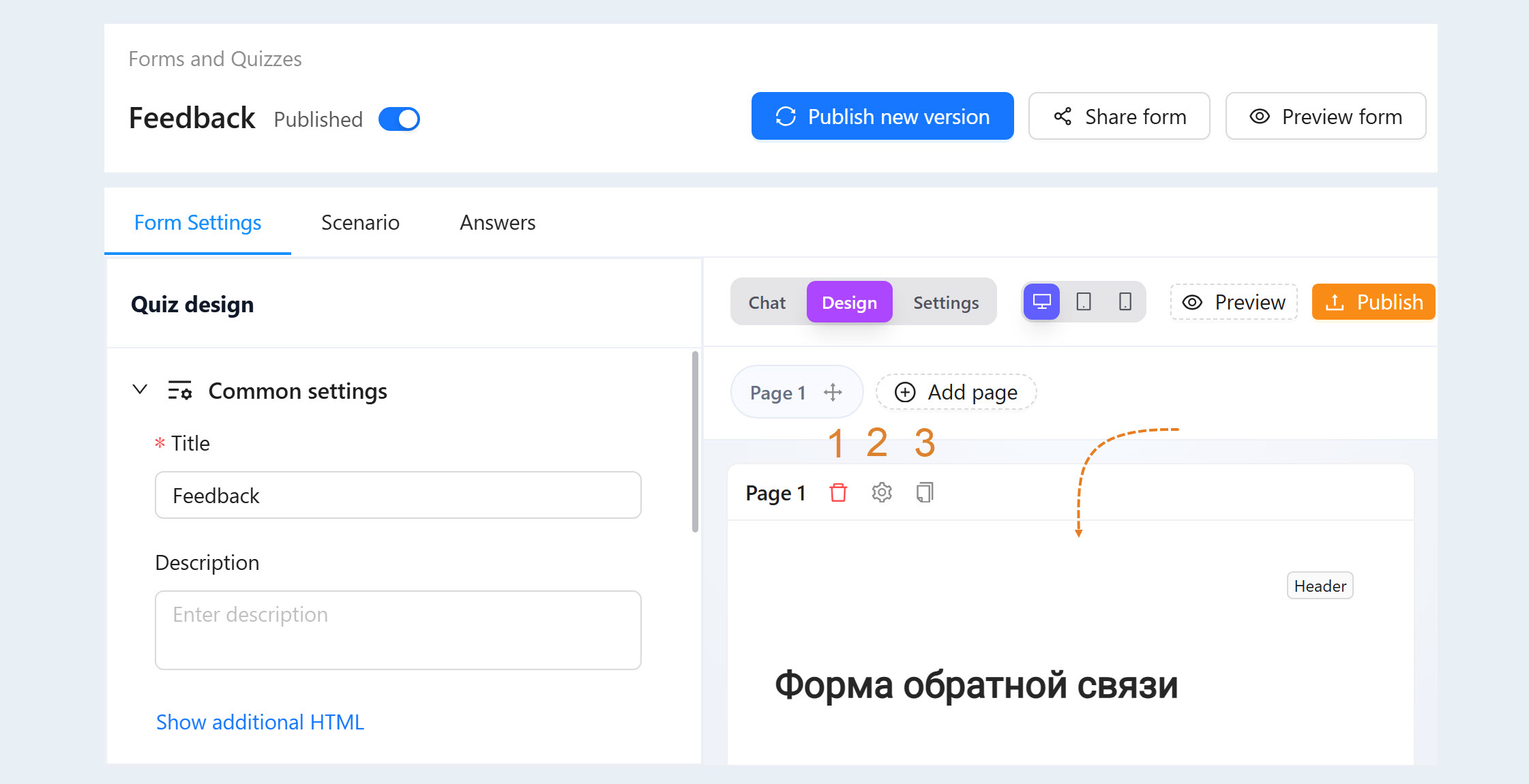
The content of the form pages
This section of the form settings contains all the pages of the form and their contents. You can add and remove form elements and customize each element.
There are three buttons in the upper corner of the page content section:
The "Delete" button. The button deletes the form page.
The "Setup navigation rules" button. You will have an additional window where you can add a rule for going to the next page or a rule for submitting a form. The navigation rules settings are discussed below.
The "Copy Page" button. This button copies and adds a similar page to the form.
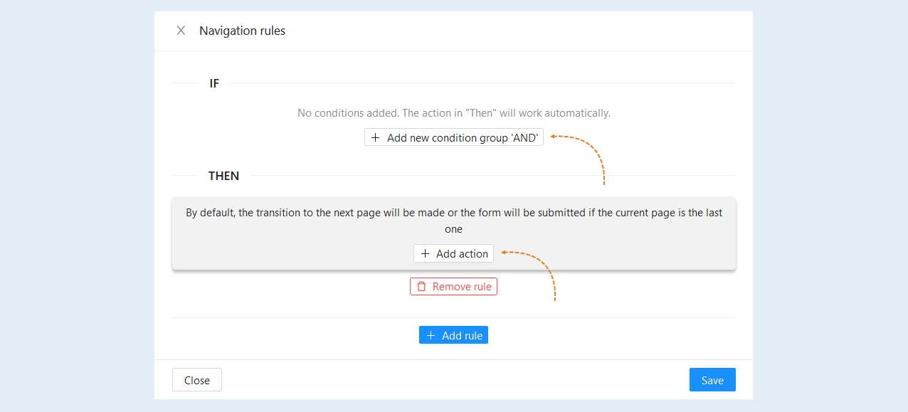
When you click the "Setup navigation rules" button, a new window will open for you. The navigation rules settings contain the "If" and "Then" conditions.
Add the "If" condition by clicking on the "Add new conditions group AND" button and select the desired condition or several conditions that will trigger the action. Add the condition "Then" by clicking the "Add Action" button and select the desired action. You can add an action that will redirect the user to the selected page of this form, to another form or to another URL page.
In this way, you can configure the user's path for the questions and answers of the quiz form. Depending on the answers that the user chooses, he will be redirected to the next page with a question corresponding to the previous answer.
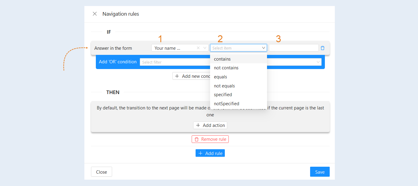
The "Answer in the form" condition is available for the form/quiz. This condition is used to segment users based on their responses in the forms.
Filter Conditions:
Selection of Form Field. This allows you to select a specific field in the chosen form, such as name, email, question, or any other requested value.
Condition:
- Equals. Selects users whose response in the specified field exactly matches the provided value. For example, "Name equals Ivan" will find users who specified the name Ivan.
Does not equal. Excludes users with the specified response value. For example, "Age does not equal 25" will exclude all users who stated they are 25 years old.
Contains. Finds users whose response partially matches the specified substring. For example, "Comment contains help" will find those who mentioned "help" in their comments.
Does not contain. Excludes users whose response contains the specified substring. For example, "Review does not contain negative" will exclude all who left negative reviews.
Specific. Finds users who provided a response in the specified field. For example, "Email defined" will show all users who provided their email.
Not Specific. Finds users who did not fill in this field. For example, "Phone not defined" will show all users who did not provide a phone number.
Field for entering value. Here, a specific value is entered for comparison with user responses.
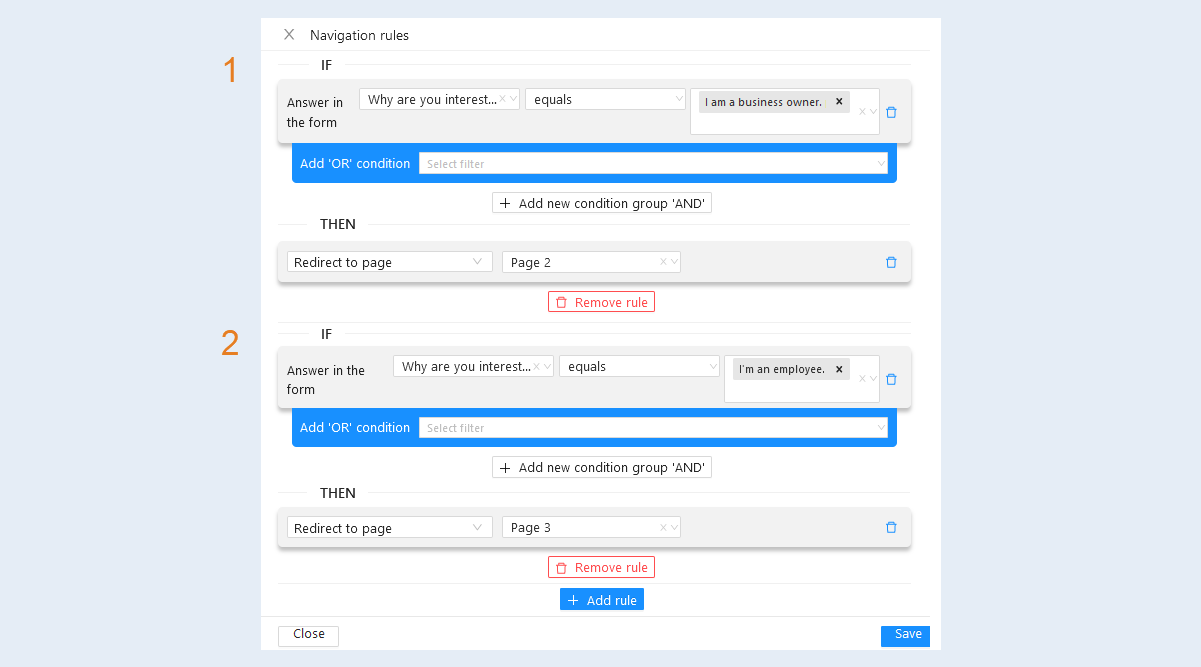
For example:
Rule 1. If in the question "Why are you interested in business systematization?" the user chooses the answer “I am a business owner”, then he will be redirected to page №2 with the question “How many employees do you have in your company?”.
Rule 2. If the user answers the first question “I am an employee”, then he will be redirected to page №3 with a request to specify his Email address, bypassing the question about employees.
Complete the navigation rules settings, click the "Save" button and return to the "Form Page Contents" section.
Each element of the form page has four buttons, they are located in the upper right corner of the element. Hover the cursor over the form element so that the buttons are displayed.
The "Delete" button. The button deletes the form element.
The "Config Item" button. The button opens an additional element settings window.
The "Copy item" button. The button copies and adds a similar element to the form.
The "Hold to drag item" button. Hold this button to drag an item higher or lower in the list.
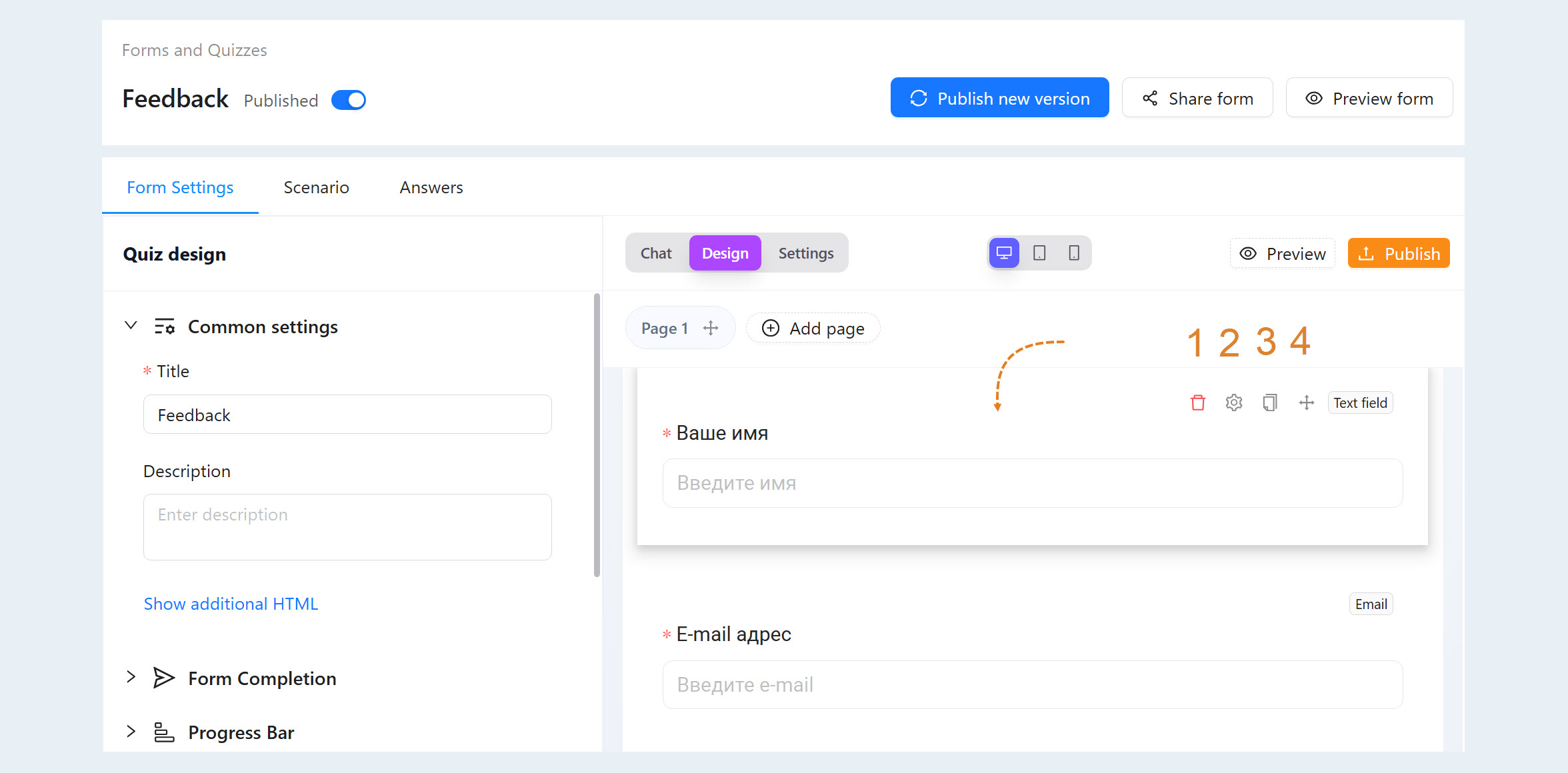
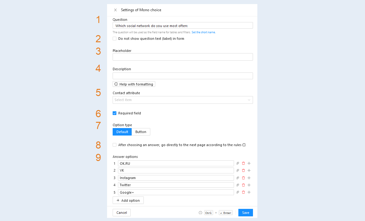
When you click the "Config Item" button, a new window will open for you. The form element settings window contains:
Question. Enter the text of the question that the user will see. The question will be used as the field name for tables and filters.
Click the "Set the short name" button to add a short name. Guests will not see this title. It will be used in the answer table and filters by default.Do not show question text (label) in form. Check the box to hide the question text in the form.
Placeholder. This is the text that is displayed in the field for filling in the answer, it helps the user to better understand what answer needs to be entered in the field.
Description. Add a description of the question. You can use Markdown for formatting by clicking the "Formatting Help" button.
Contact attribute. Select an attribute from the list, for example: name, city, comment, etc. The selected attribute will be recorded or updated in the contact on whose behalf the form is being filled out.
Required field. This is a form field, without filling in which the system will not accept the user's response. Check the box to make the form element mandatory.
Option type. You can choose the default element type (suggested by the program) or in the form of buttons.
After choosing an answer, go directly to the next page according to the rules. Check the box so that after answering this question, the user immediately proceeds to the next page of the form. This function works if there is only one "Mono Choice" element on the entire page. All visual elements are ignored. Navigation buttons will be hidden.
Answer options. Click the "Add Option" button and add the answer options from which the user will choose.
Click the "Save" button and return to the form settings, to the section content of the form pages.
Click the "Add Form Item" button and a list of all possible elements will open in an additional window.
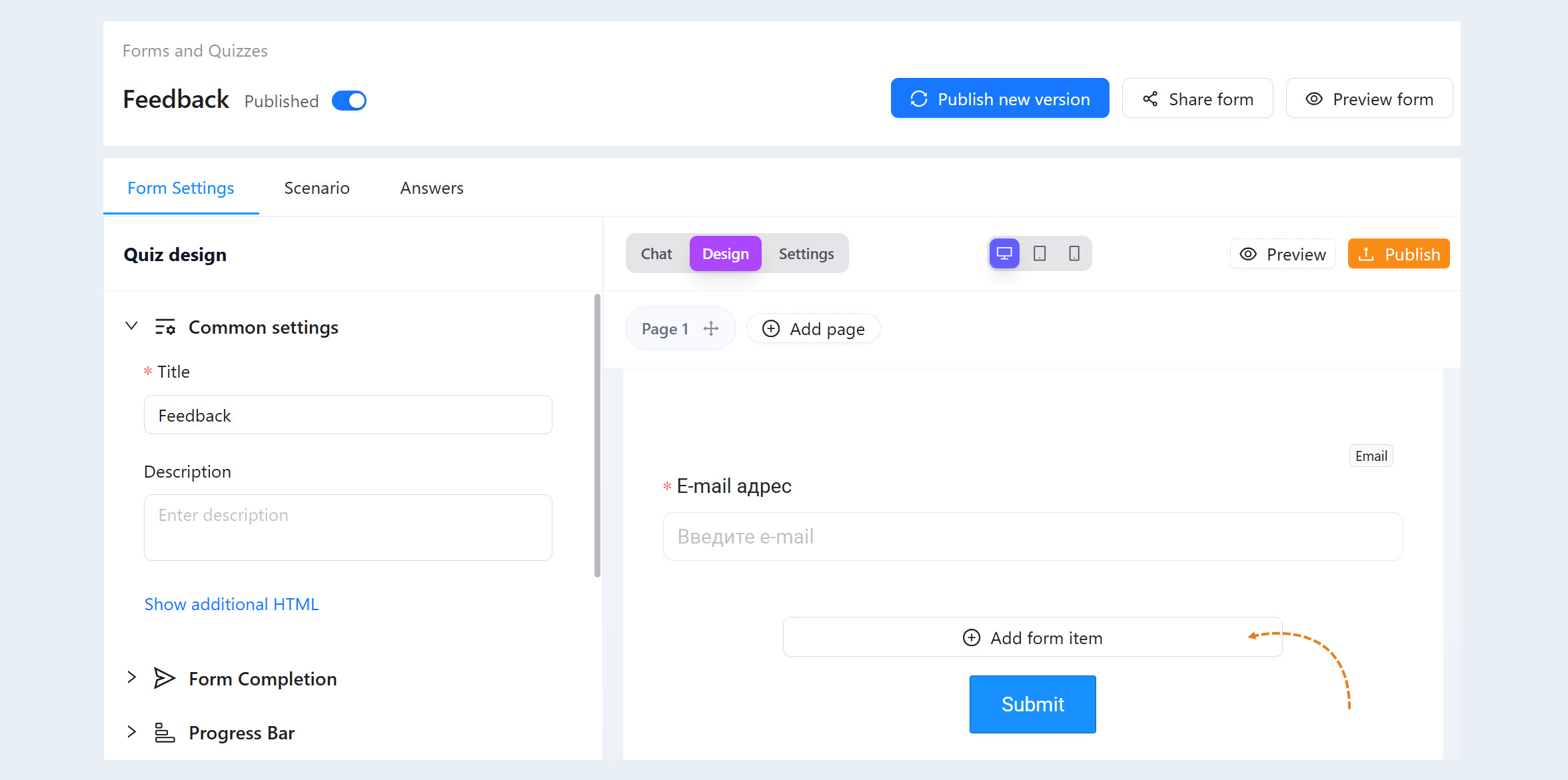
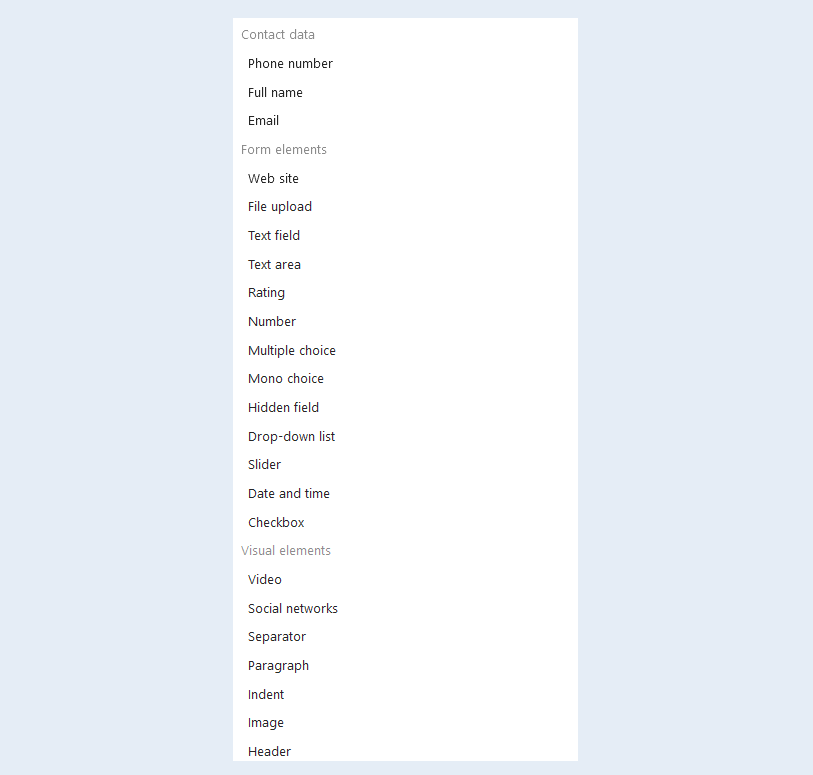
Add new items from the list. The AXL platform offers a wide range of forms containing: contact data, form elements and visual elements.
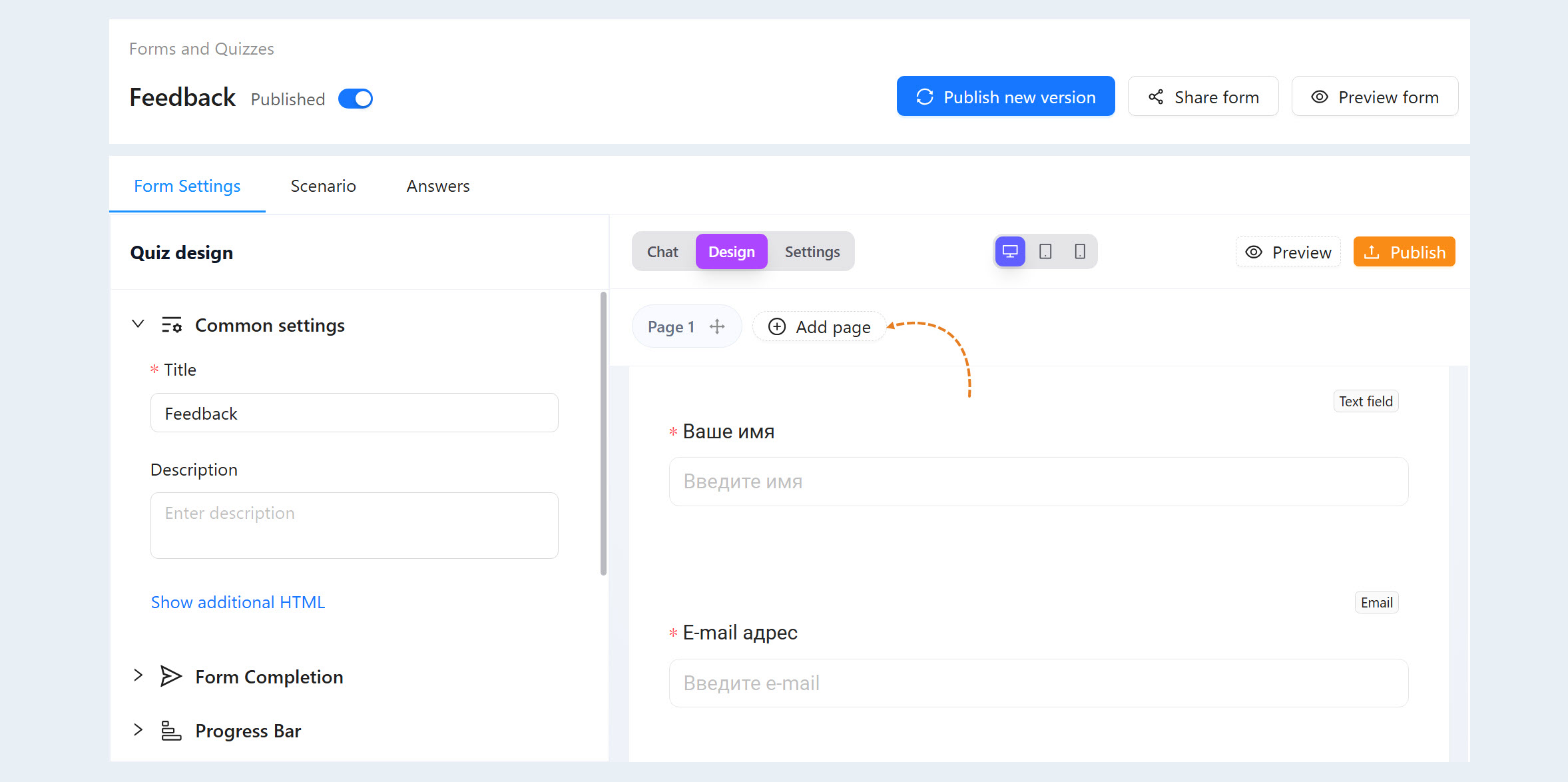
List of form pages
This section displays all the pages of the form. You can add new pages by clicking the "Add Page" button.
Scenario
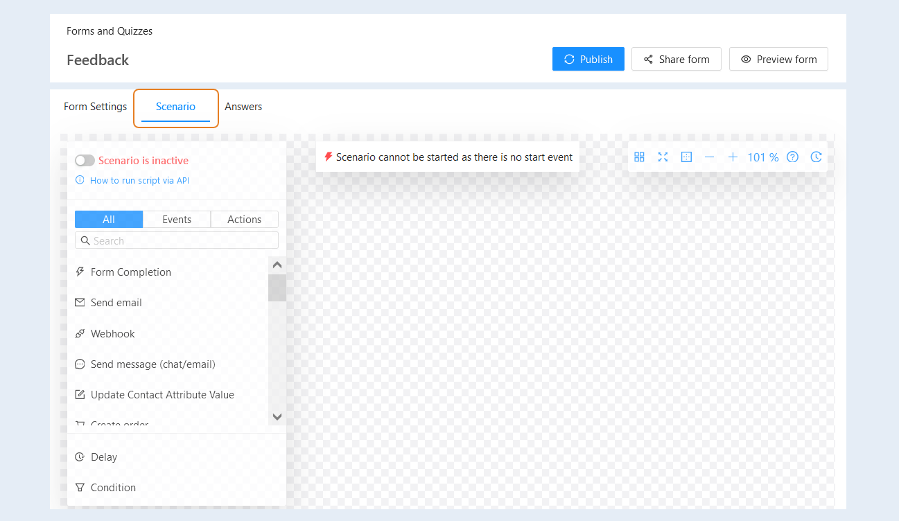
In the Scenario tab, you configure the form script. Add events and actions to the script and make configuration settings. Read more about how to create a form script in the article "Scenario".
Answers
This section displays a list of all user responses. Here you can see all the data that users have provided by filling out the form/quiz you created.
This section allows you to view individual responses, as well as analyze general trends and patterns in responses (for example, which options are chosen most often, who left a specific comment, etc.).
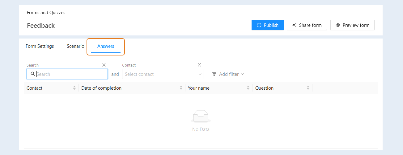
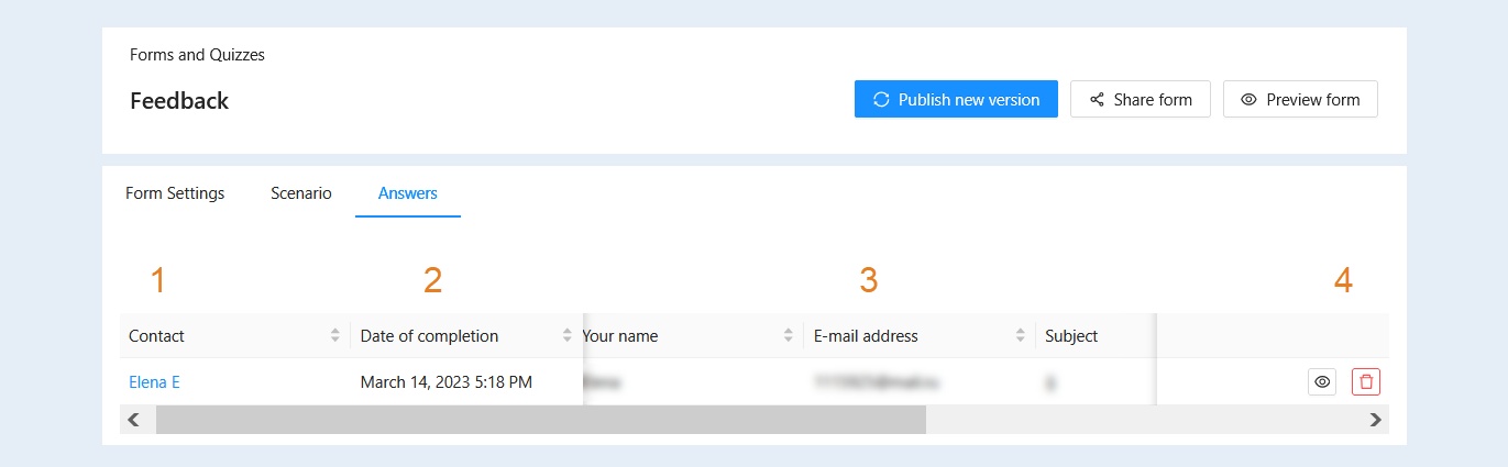
In the list of responses, you will find the following information:
- Contact. Shows the contact of the user who submitted the response. Click on the contact's name to navigate to their CRM contact card.
Date of completion. The exact date and time the user submitted the form.
Form Questions. Represented by multiple columns, each corresponding to a question in the form itself. Each column displays the specific user's answer to that question. This allows you to view all user responses to each question. It's the main source of data for analyzing and understanding how users answered each specific question.
Actions:
- "Preview Form" Button. This button allows you to preview the filled-out form as the user saw it, including all their answers.
"Delete" Button. This button allows you to delete a specific user's response from the table. It is used to remove spam, test, or erroneous responses.
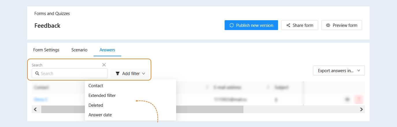
At the top of the page, you have access to a search bar and a filter. Use them to quickly find the desired response.
- Search. Use this bar for free text searches using keywords.
lick the "Add Filter" button and select a filter condition from the list:
- Contact. This condition highlights responses associated with the selected contact.
Extended filter. Select the advanced filter to create various combinations of conditions for selecting responses. An additional window, "Filtering and Search Conditions", will open. Here, you define the conditions for creating a list of responses. For more information about filtering conditions, refer to the article "Filtering and Search Conditions".
Deleted. This condition highlights previously deleted responses.
Answer date. This condition highlights responses that were created within specific dates. Select a date range.
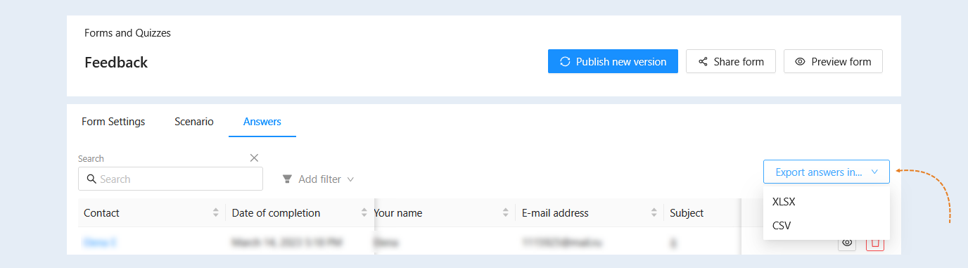
In the upper right corner of the page, you will find the "Export Responses to" button. Exporting responses allows you to save and analyze data outside the platform. Exporting provides a list of data in a format suitable for analysis (XLSX or CSV).
Click the "Export Responses to" button and select the desired file format (XLSX or CSV). You can then download the created file by clicking the "Action" button and selecting the "Download" action.