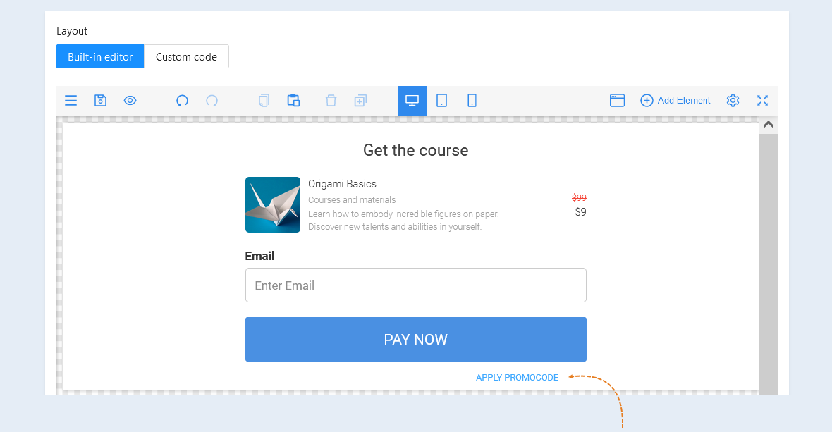
The promo code component. In this section you can add and configure a promo code. Read about how to create a promo code in the article "Promo Codes".
The "Promo Code" button allows the guest to apply a promo code to the order.
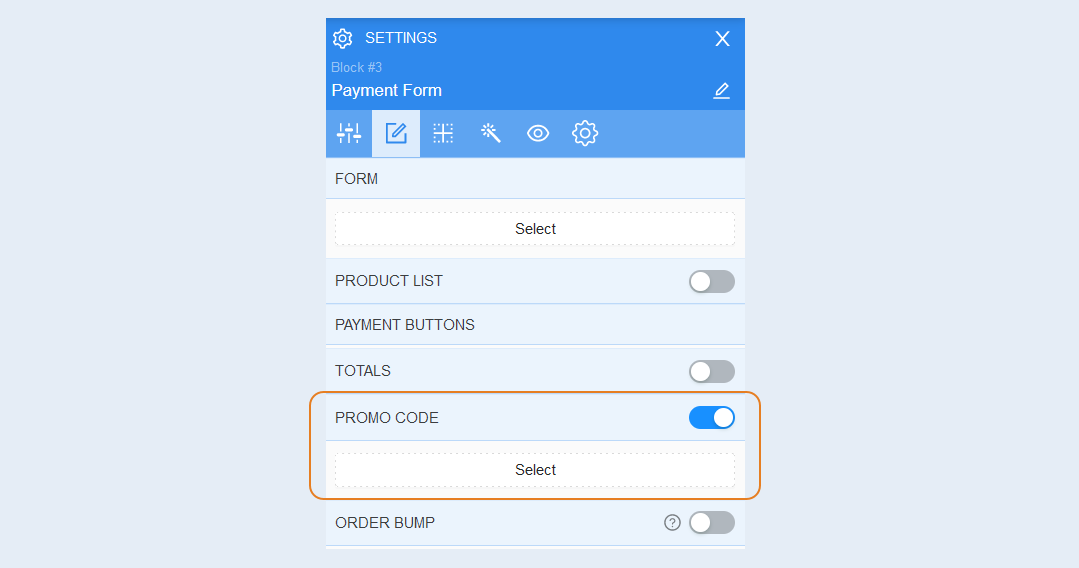
In the payment form settings window, move the "Promo Code" slider to the active position and click the "Select" button.
Element Settings
Select the promo code element inside the payment form, the advanced settings of the promo code button will open on the right. Open the "Item Settings" tab.
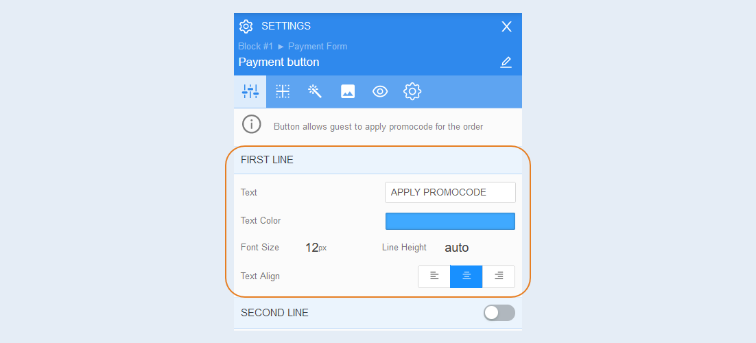
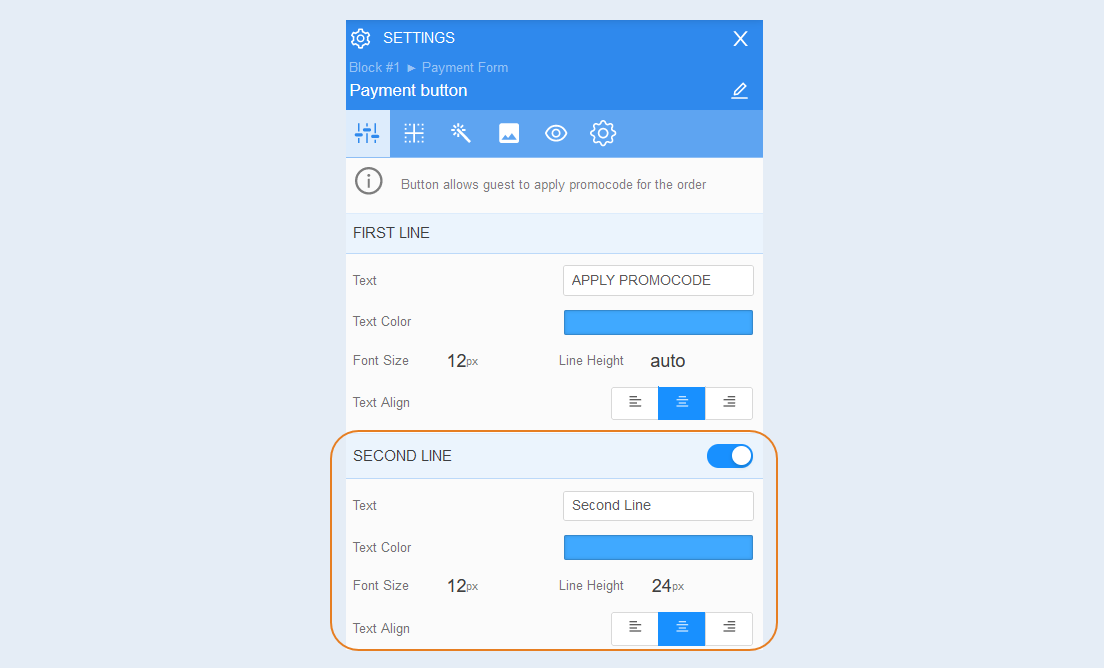
First line. In this section, you can write text inside the button, change the text color, font size and line height.
Second line. If necessary, you can add a second line inside the button - additional text. Click the slider on the right, you will open an additional line on the button. The settings of the second line are identical to the settings of the first line: enter the text, select the text color, set the font size and line height.
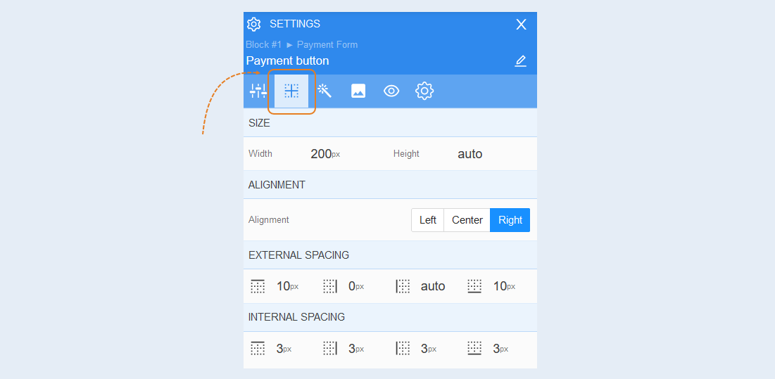
Positioning
Read more about the settings of this section in the article "Positioning".
Style
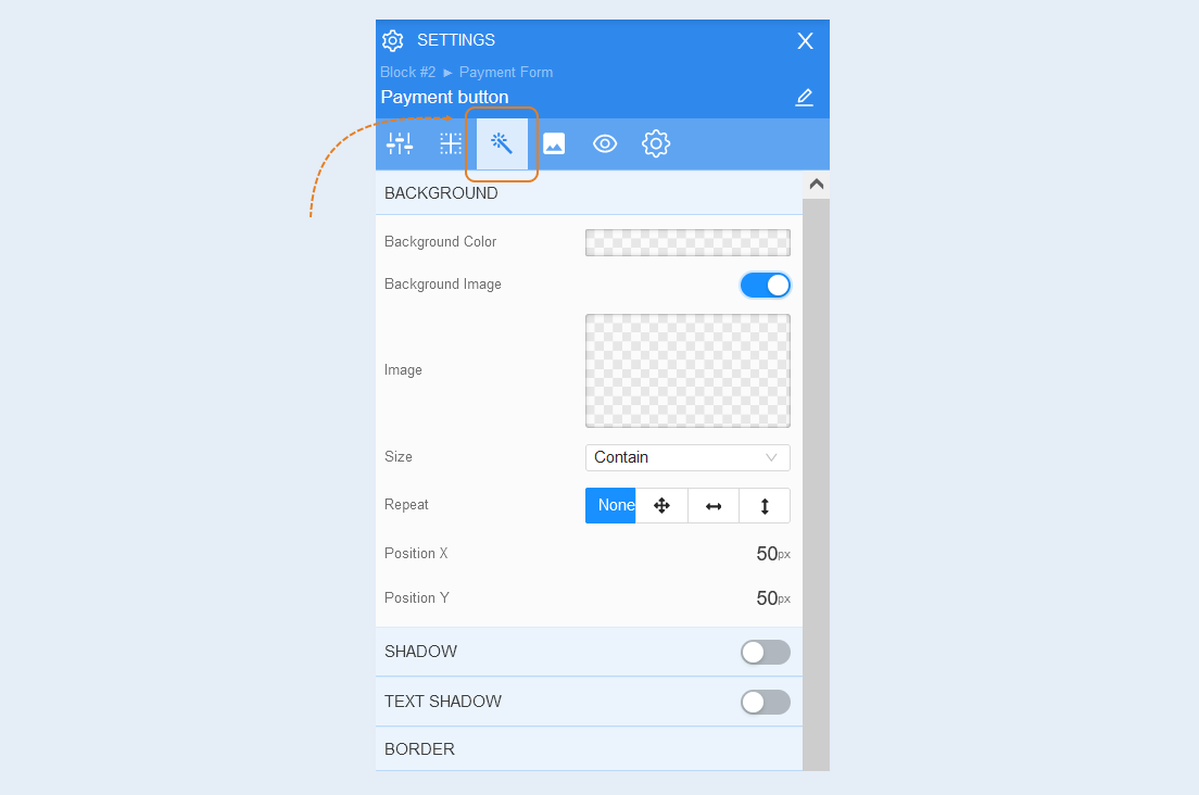
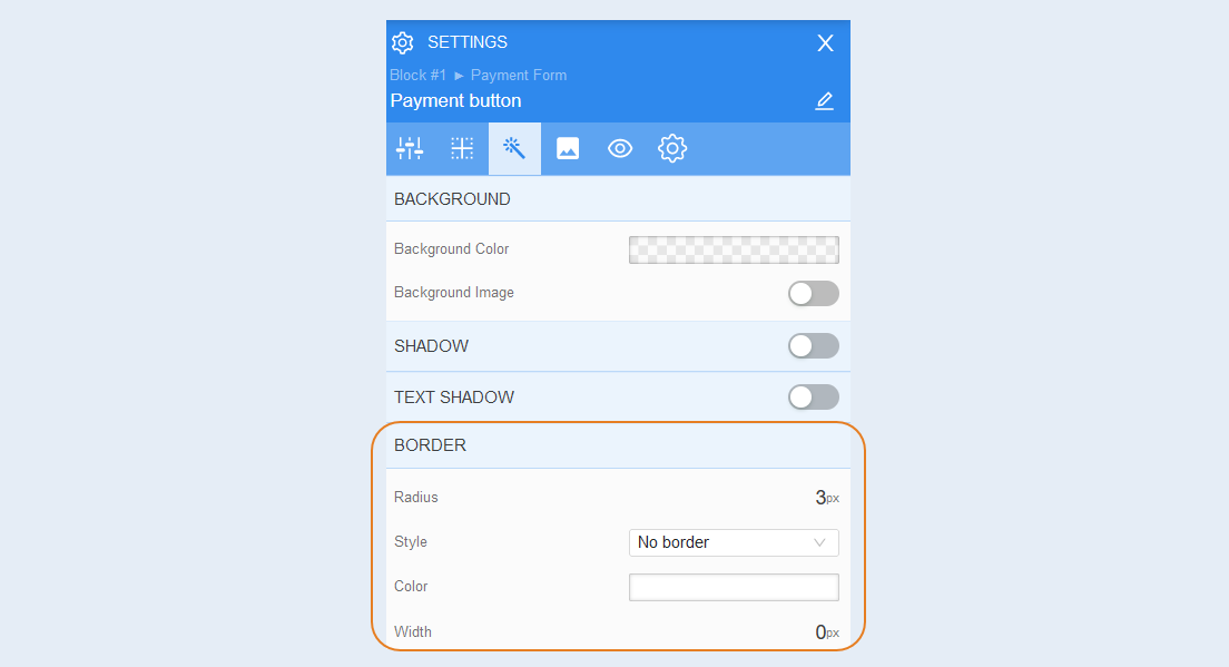
Background. You can change the background color of the button, as well as add a background image to the button. Additional image settings are opened for the background image: image selection, size, image repetition and image position inside the button.
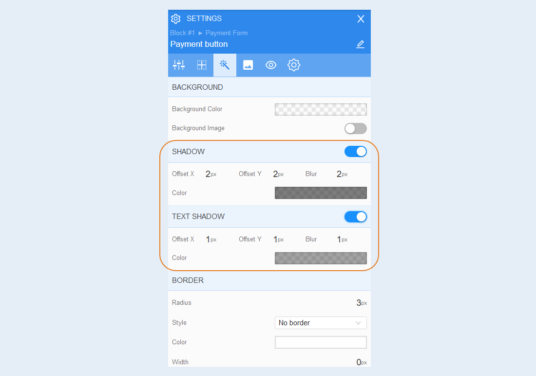
Shadow. Add a shadow around the button, you can adjust the shadow offset (left, right, up, down) and blur (bright or transparent shadow). And also the color of the shadow.
Text shadow. Add a text shadow, you can adjust the shadow offset (left, right, up, down) and blurriness (bright or transparent shadow). And also the color of the shadow.
Border. You can customize the frame around the button: the radius of the frame (rounds the corners of the margins), the color of the frame and the thickness.
Icon
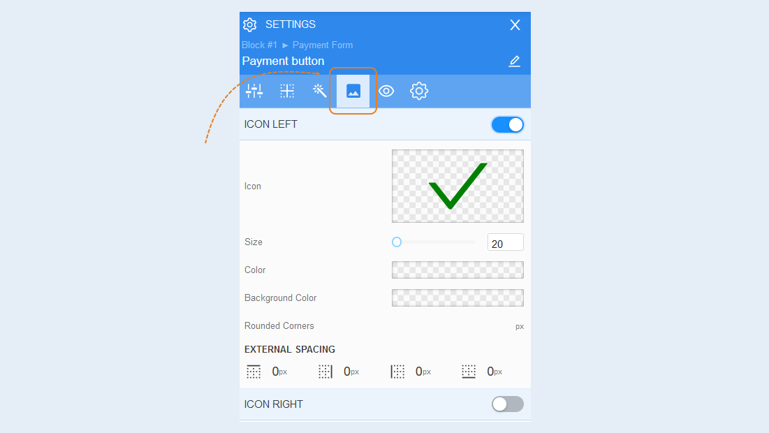
An icon is a ready-made element that you use as a graphic design of a button. The icons are loaded into the AXL editor and are regularly updated. You can choose an icon suitable for you from the suggested ones and use them to the left and right of the text inside the button.
Icon on the left. Click on the slider on the right. Your settings will open. Here you can choose an icon, choose the icon size, color. Set the background color for the icon, round the corners, and adjust the external indentation. This icon will be displayed on the left side of the button.
The icon on the right. Click on the slider. The settings of this element fully correspond to the settings of the "Icons on the left". But the icon will be displayed on the right side of the button.
Conditional show / hide
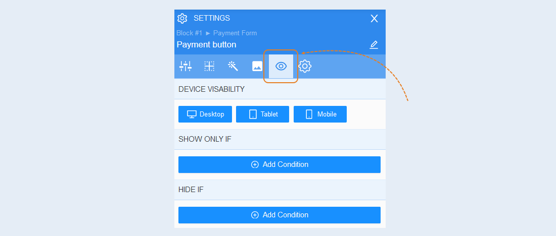
Read more about the settings of this section in the article "Conditional show / hide".
Advanced settings
Read more about the settings of this section in the article "Advanced settings".