Column element is an element that includes other elements (icons, buttons, images, etc.). This element, like a group of elements, combines several other elements so that they can be moved, selected, and grouped.
Highlight the element to open the settings for that element. A toolbar opened on the right.
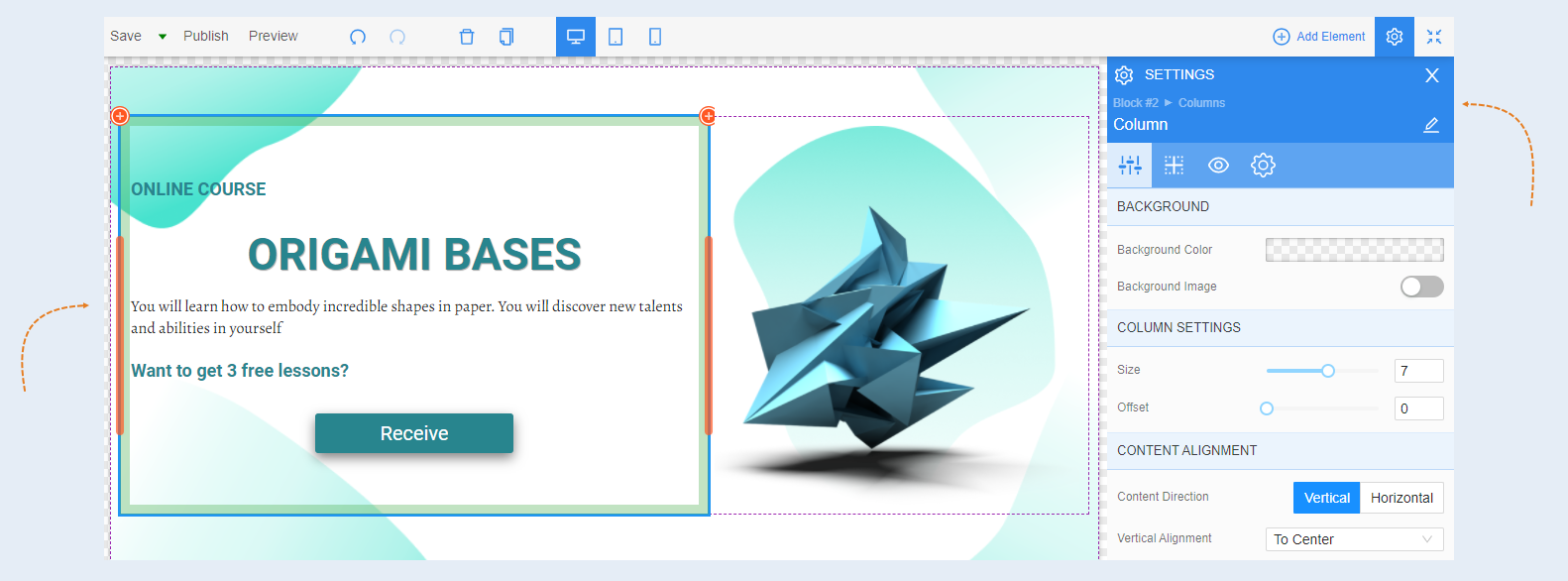
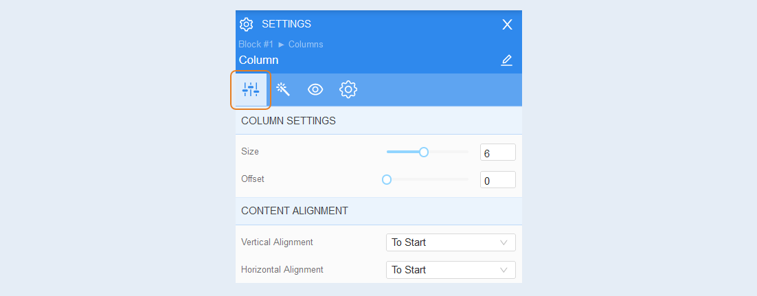
General settings
Column settings. You can adjust the size of the column width and shift it to the right on the page.
Content alignment. You can arrange the content of the column vertically or horizontally. You can also align the content of the column relative to each other vertically and horizontally.
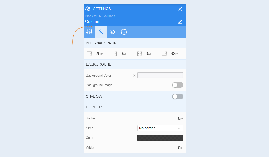
Style
Internal padding. You can change the indentation of the content (text, image, etc.) inside the column. This function is used when the content is inside the column and needs to be moved away from the column boundaries.
Background. In this section, you can change the background color of the column, as well as add a background image for the column. For the background image, additional image settings are opened: image selection, size, image repetition and position of the image inside the column.
Shadow. Create a shadow around the column, adjust the offset and blur of the shadow. And also the color of the shadow.
Border. You can customize the border around the column: radius (rounding the corners of the button), style (borderless, solid, dotted, dotted), border color and width.
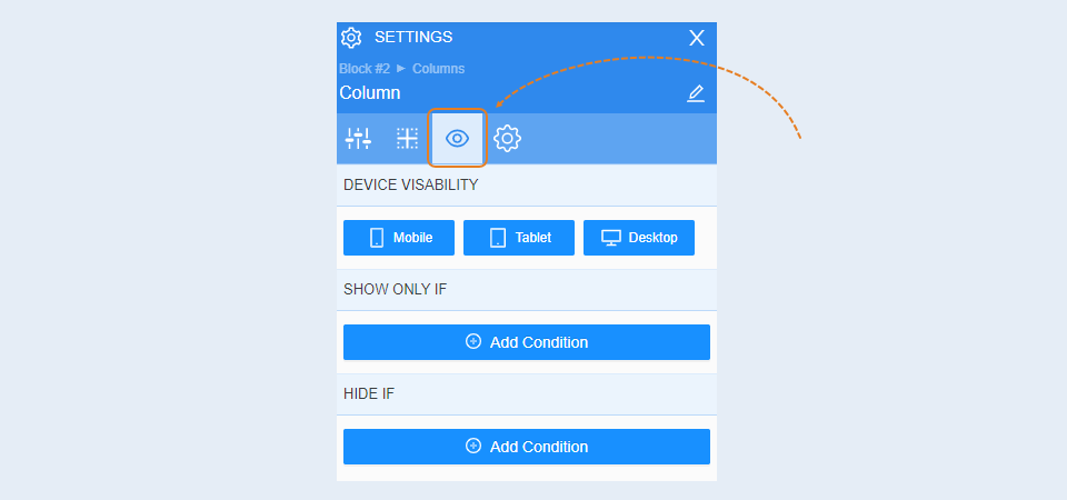
Conditional show / hide
For more information on the settings in this section, refer to the article "Conditional show / hide".
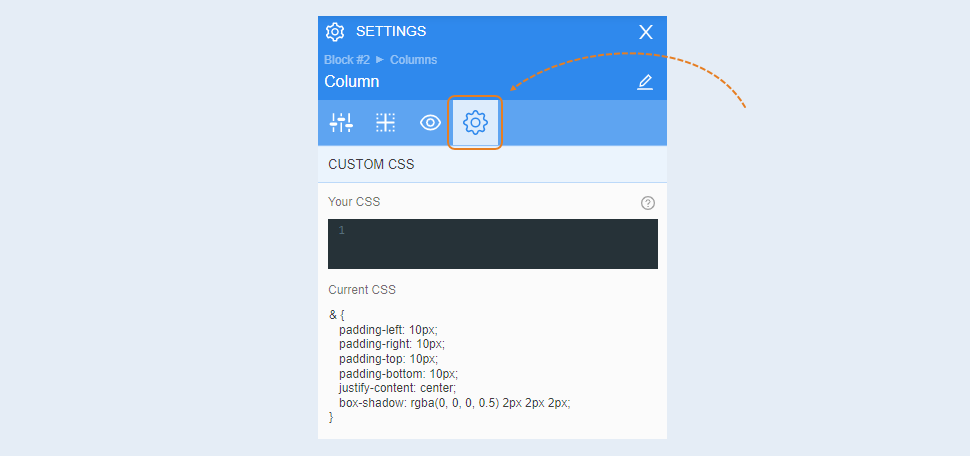
Advanced
For more information on the settings in this section, refer to the article "Advanced settings".