The payment form element is an element that allows you to accept payments for selected products, as well as collects data on the willingness of website visitors to purchase the product or decline it.
Form of payment
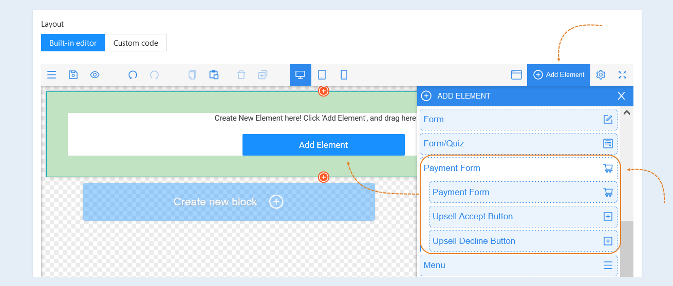
Click the "add element" button and select the "payment form" element. Left-click on the selected element and drag it to the page. Then, configure the element settings.
Select the entire element for editing by clicking on it with the mouse. Settings for this element will open on the right.
For "payment form" elements, a panel with the following tools opens:
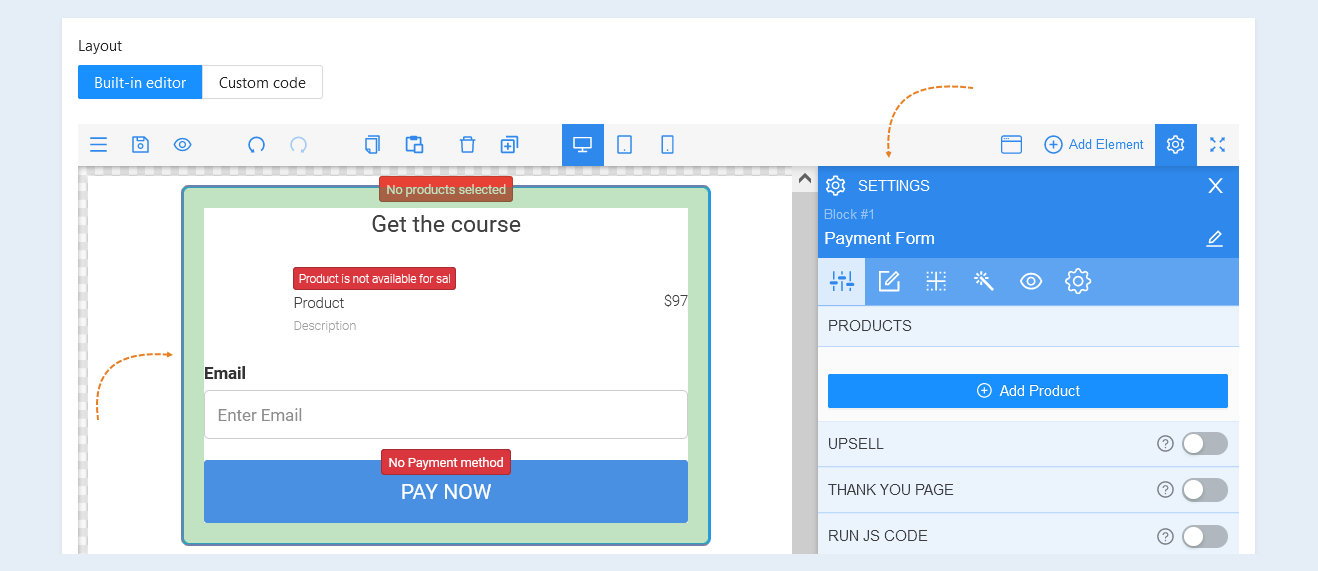
Item Settings
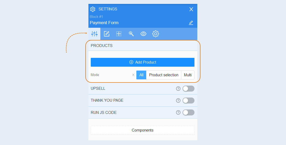
Products. In the Products field, specify one or more course products. Read about how to create a product on the AXL platform in the article "Products and Offers".
If you select multiple products, they must be in the same currency. You can change the sequence of products in the list. To do this, hold down the "Move" button next to the product name and hold it down and drag it to another place in the list.
Mode. If you add several products to the payment form, set the selection mode.
- When selecting the "All" mode, the user will buy all the products added to the form, without being able to select one from the list.
The “Product Selection” mode allows the user to select only one of the suggested products.
The "Multi" mode allows the user to select one or more of the products offered in the form.
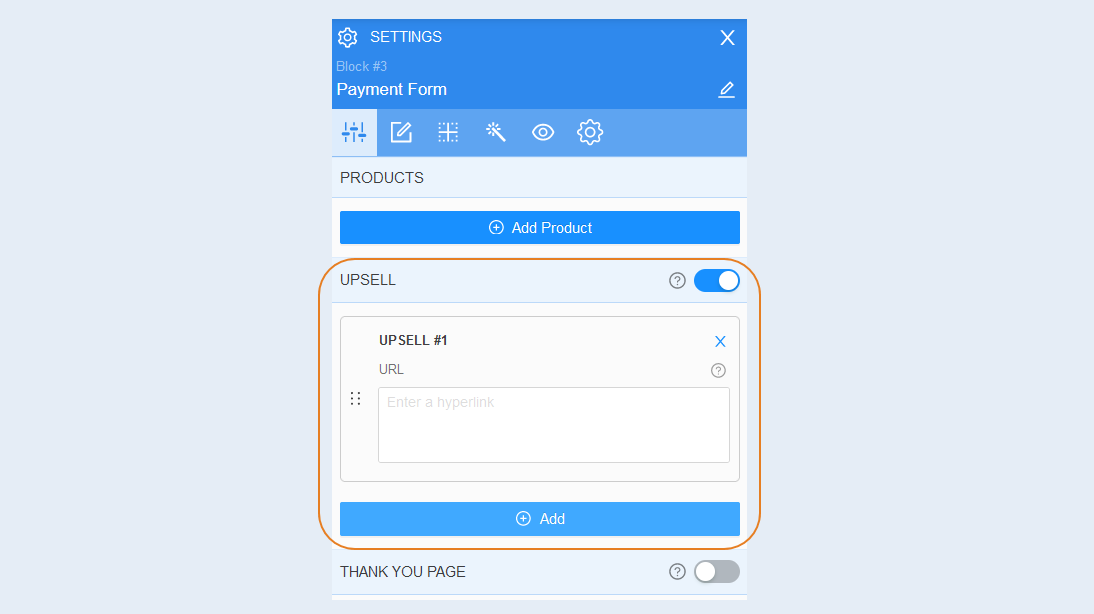
Upsell. This is a sequence of pages to which the user will be redirected after successful payment of the initial order. Move the slider to the active position and add the URL of the upsell page created using the AXL platform. For instructions on creating a upsell page, see the article "Upsell Page".
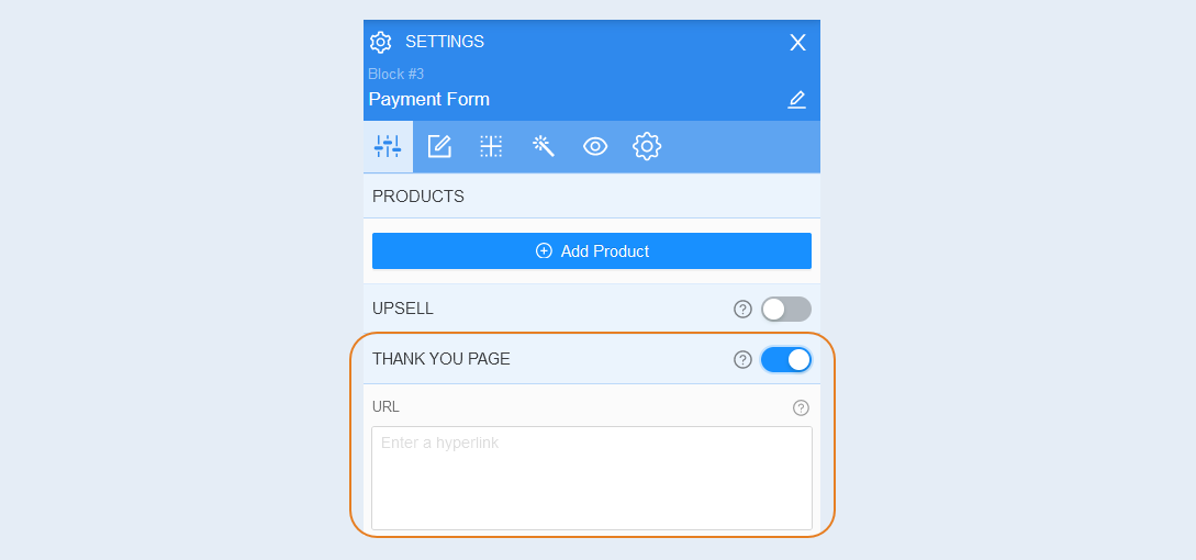
Thank you page. This page will be shown upon successful payment. If you did not create a separate thank you page, the successful payment page created automatically will be displayed. Move the slider to the active position and add the URL of the thank you page created using the AXL platform. Instructions for creating URL of the thank you page can be found in the "Sites" section.
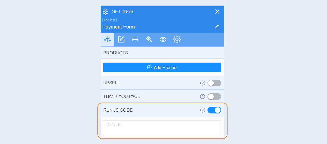
Run JS code. For advanced users. In this field, you can specify your Java script and it will run when submitting the form. You can run the JS code when submitting the form and before the payment itself.
Components
This section presents advanced settings for each component of the payment form separately.
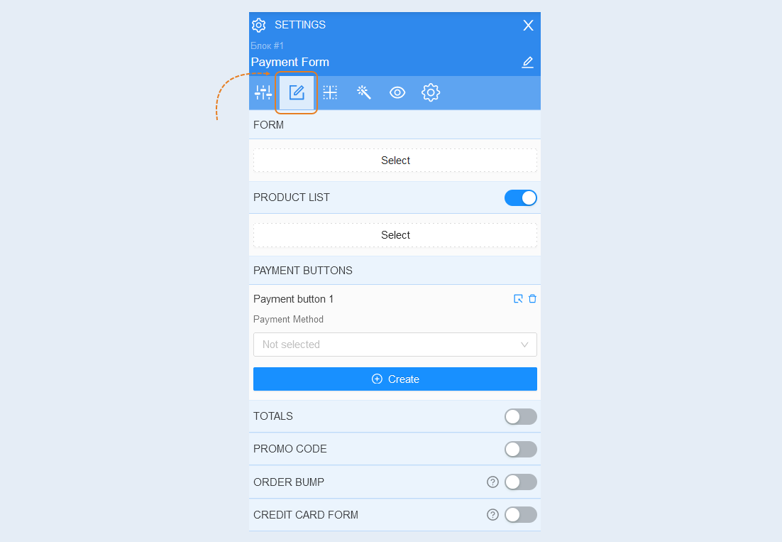
The form component. A form is an element that collects the contact details of a page visitor. Click the "Select" button.
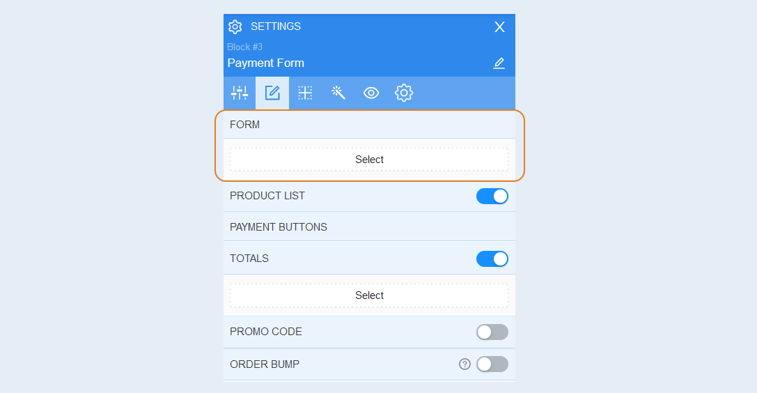
You will see the settings of the form fields. Set the settings you need. For more information on how to configure the form, read the article "Form component".
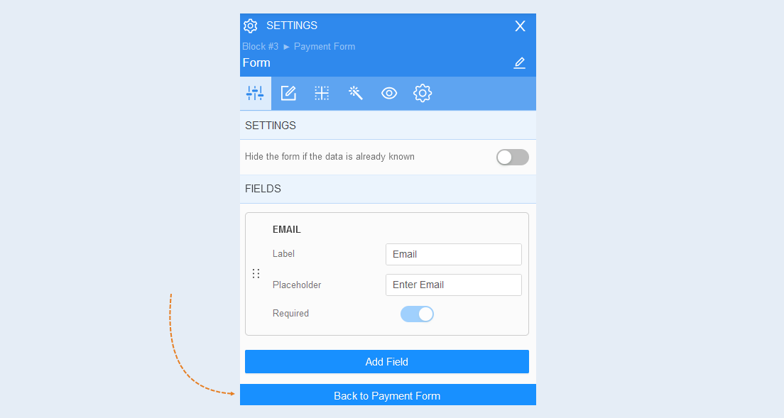
After you have completed the form settings, click the "Back to Payment Form" button.
The product list component. Move the slider to the active position and click the "Select" button.
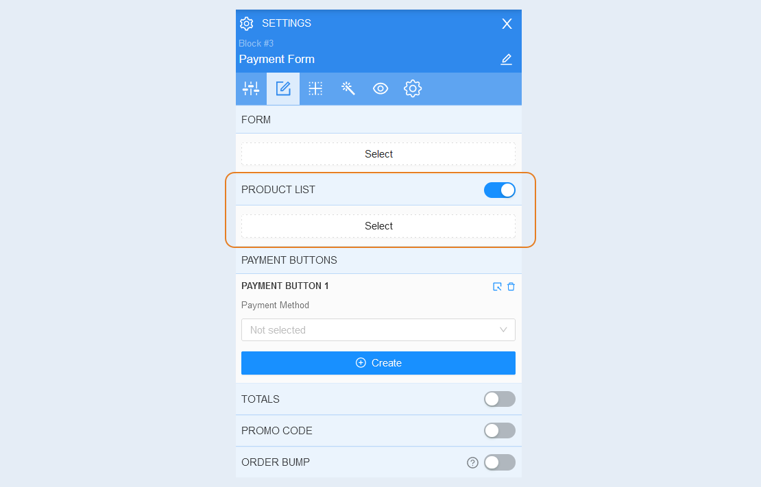
In this section, add one or more course products from the list of products. Add a product description by highlighting the selected product in the form. For more information on how to configure the product list component, see the article "Product List component".
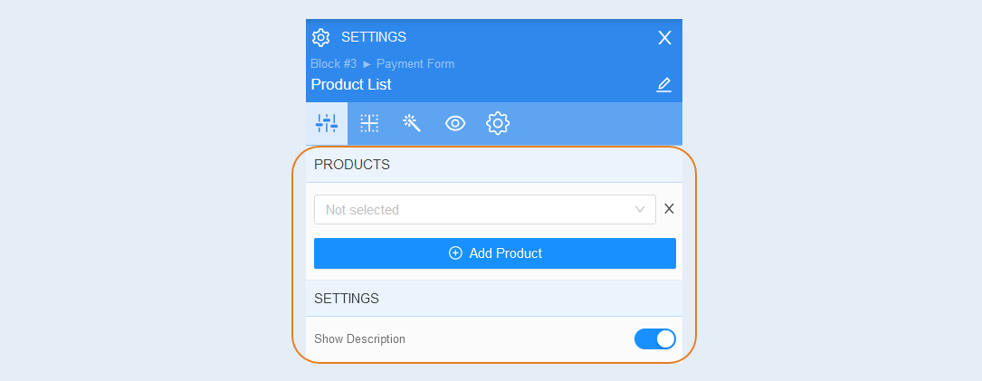
After you have completed the settings of the products component, click the "Back to Payment Form" button.
A component of the payment button. In this section, add one or more payment buttons. Each payment button will be linked to its own payment methods. Link a payment method to each button by selecting it from the list. To learn how to create a payment method, read the article "Payment Settings".
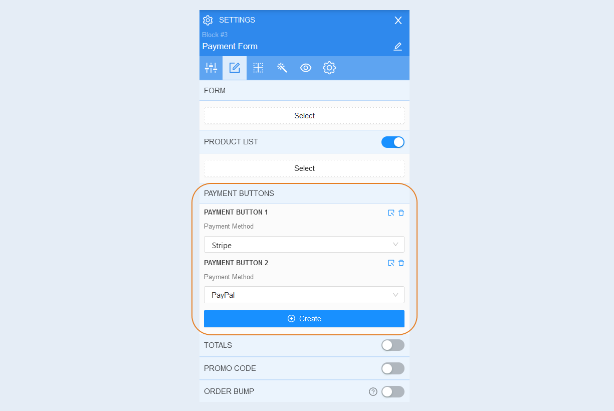
Next, click the "Select" button in the upper right corner of the payment button and you will see the advanced settings of each button. For more information on how to configure the button, read the article "Payment button component".
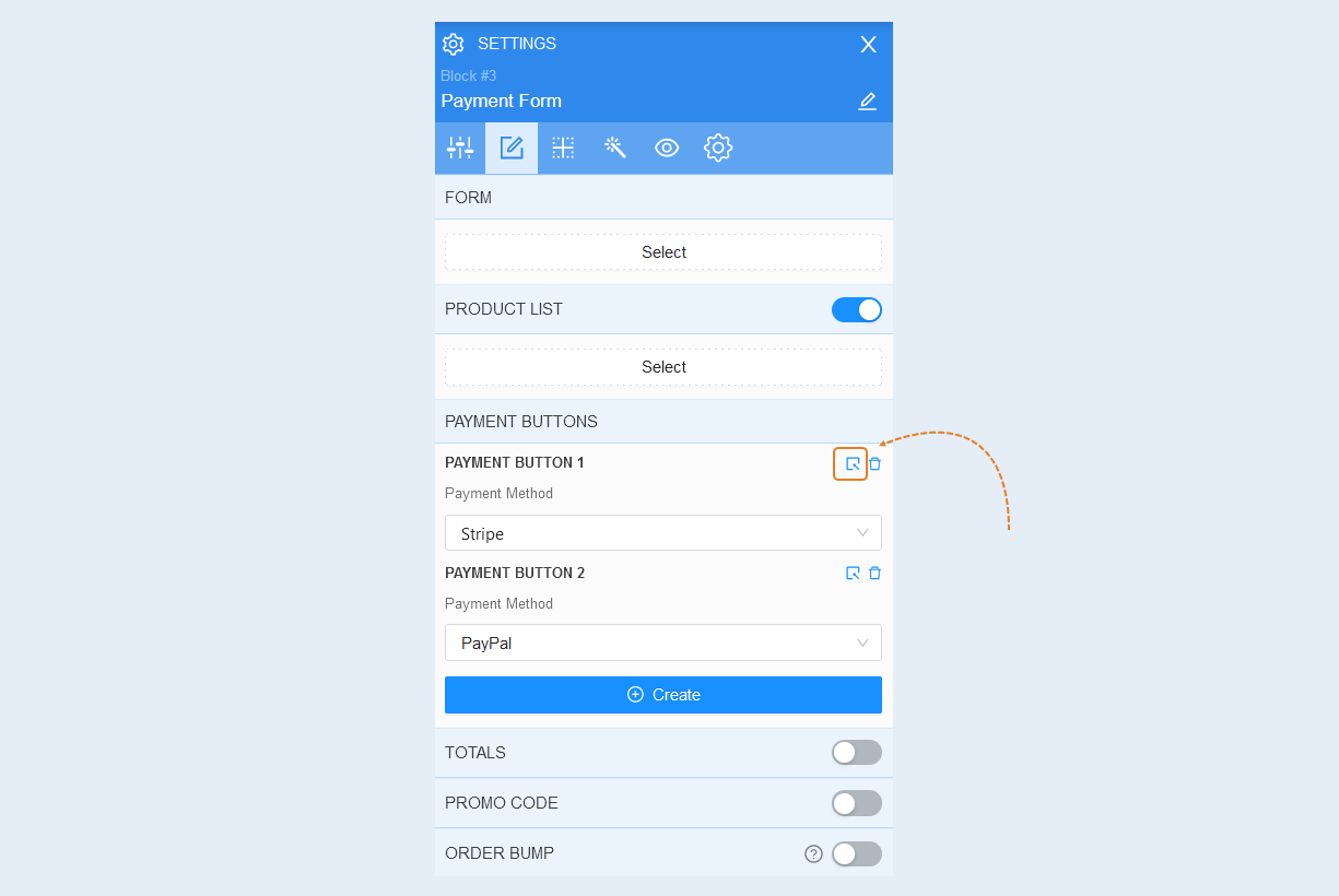
After you have completed the settings of the payment button, click the "Back to Payment Form" button.
The totals component. You can add additional fields: savings, shipping, total. These fields will be displayed in the payment form. Here customers will see the discount amount, the shipping amount and the total purchase amount. Move the slider to the active position and click the "Select" button. To learn how to configure the totals component, read the article "Totals component".
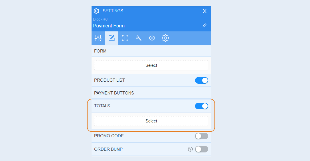
After you have completed the settings of the totals component, click the "Back to Payment Form" button.
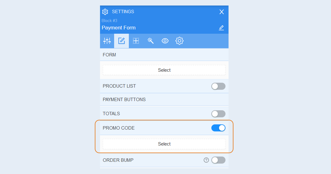
The promo code component. In this section, you can add and configure a promo code. Read about how to create a promo code in the article "Promo Code".
Move the slider to the active position and click the "Select" button. To learn how to configure the promo code component, read the article "Promo Code Component".
The order bump component. The order bump automatically adds or replaces the product in the order. Move the slider to the active position and click the "Add" button.
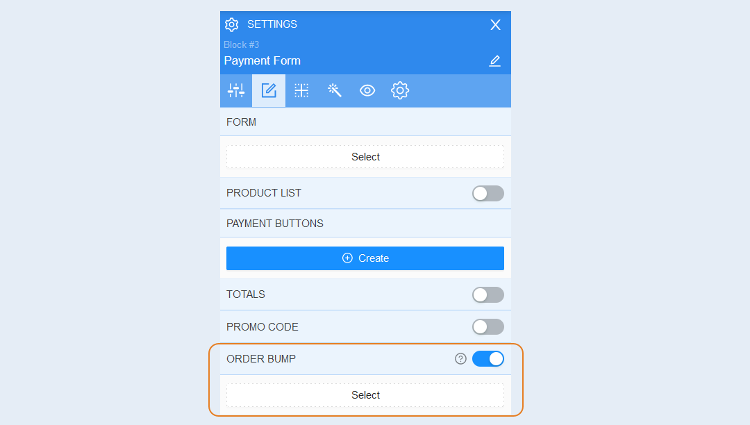
To learn how to set up the order bump component, read the article "Order Bump component". After you have completed the component settings, click the "Back to Payment Form" button.
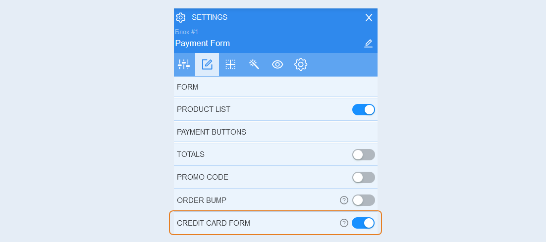
Сredit card form. Move the slider to the active position to add fields for entering credit card data to the order form. At the moment, the credit card form only supports Stripe. For more information about Stripe payment system integration, read the article "Stripe Settings".
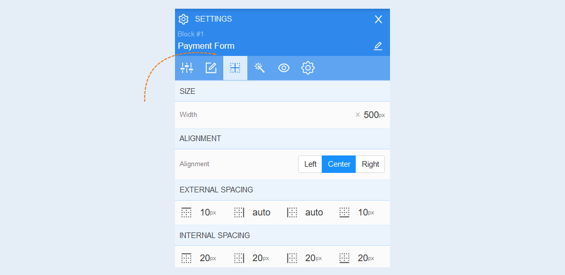
Positioning
Read more about the settings of this section in the article "Positioning".
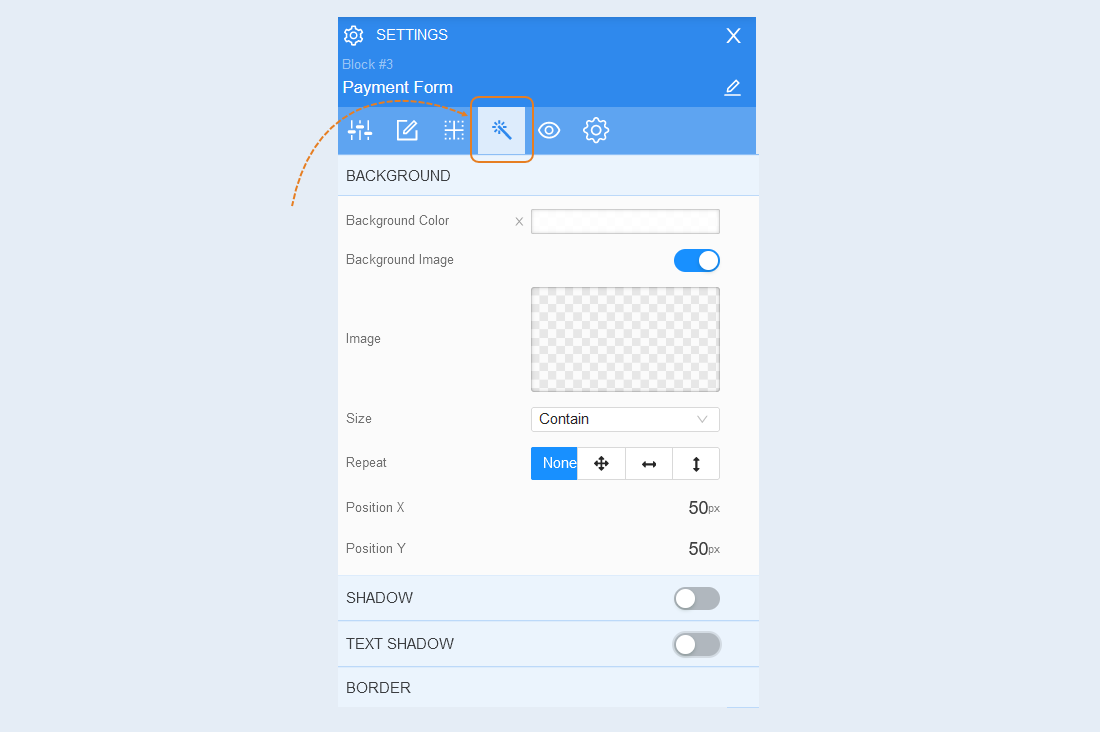
Style
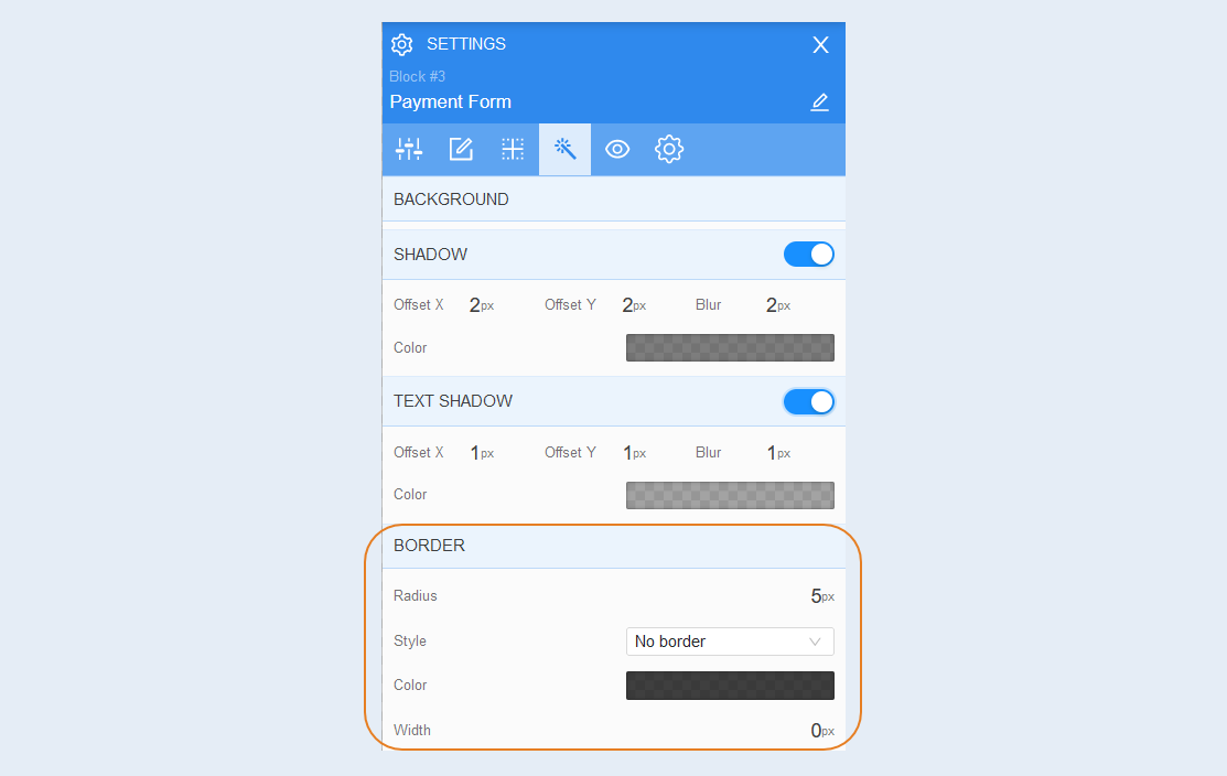
Background. You can change the background color of the payment form, as well as add a background image to the form. Additional image settings are opened for the background image: image selection, size, image repetition and image position inside the form.
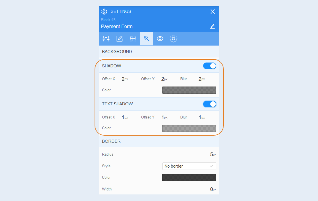
Shadow. Add a shadow around the payment form, you can adjust the shadow offset (left, right, up, down) and blur (bright or transparent shadow). And also the color of the shadow.
Text shadow. Add a text shadow, you can adjust the shadow offset (left, right, up, down) and blurriness (bright or transparent shadow). And also the color of the shadow.
Border. You can customize the fborder around the payment form: the radius of the border (rounds the corners of the fields), the color of the frame and the thickness.
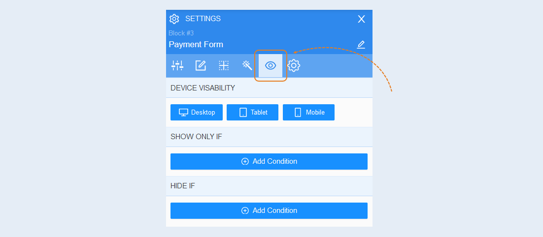
Conditional show / hide
Read more about the settings of this section in the article "Conditional show / hide".
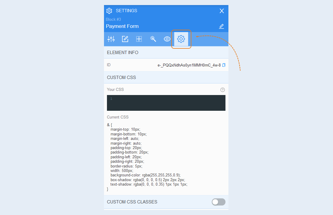
Advanced settings
Read more about the settings of this section in the article "Advanced settings".
Upsell Accept Button
Confirmation of an additional sale is a button that allows the user to purchase additional products after paying for the main product. Place the "Upsell Accept Button" button anywhere on the pre-sale page. It will work only after successful payment of the main order.
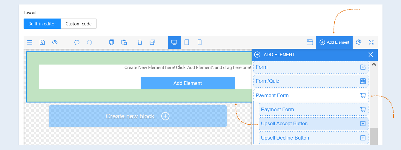
In the page editor, click the "Add Item" button. In the list of items, select "Payment form". Click on the "Upsell Accept Button" element, select the desired button from the suggested list by moving it to the field.
For more information about the settings of the additional sales page and the "Upsell Accept Button" element, read the article "Upsell page".
Upsell Decline Button
Refusal of additional sale is a button that allows the user to refuse to purchase additional products after paying for the main product. Place the "Upsell Decline Button" button anywhere on the pre-sale page. It will work only after successful payment of the main order.
In the page editor, click the "Add Item" button. In the list of items, select "Payment form". Click on the "Upsell Decline Button", select the desired button from the suggested list by moving it to the field.
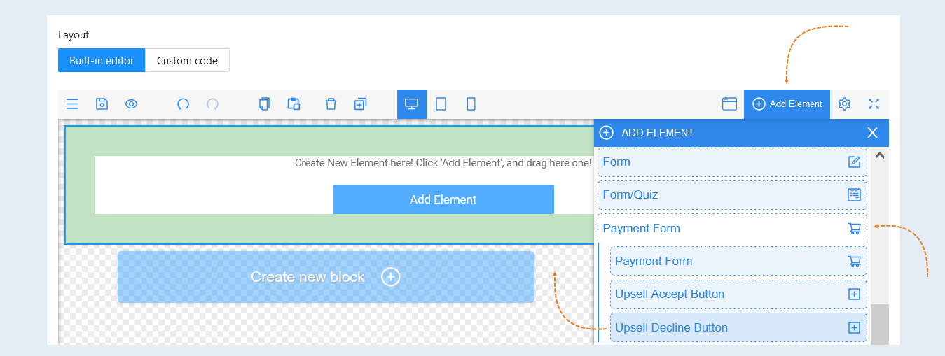
For more information about the settings of the additional sale page and the "Upsell Decline Button" element, read the article "Upsell page".