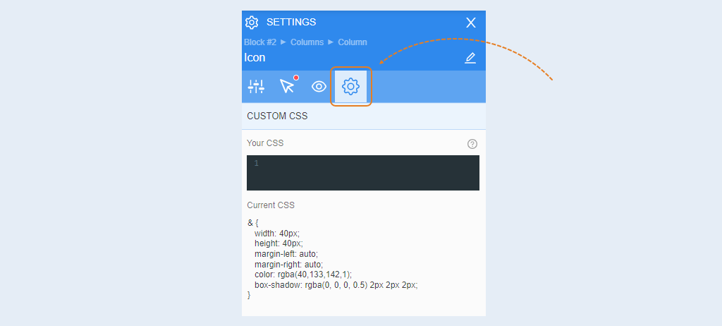
The Icon element is a ready-made element that you use for graphic design of a webpage. Icons are uploaded in the AXL editor and regularly updated. You can choose an icon that suits you from those offered on the website and use it on your webpage.
To open settings for a specific element, click on the element to highlight it, and the toolbar will appear on the right.
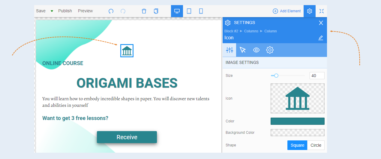
General settings
Picture settings. In this section, you can add or change an icon, set the size of the icon, choose the icon color and background color. You can also choose the shape of the icon: square or circle, round the corners, and align the icon.
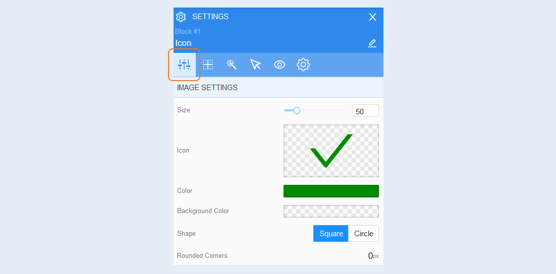
Positioning
For more information on the settings in this section, refer to the article "Positioning".
Style
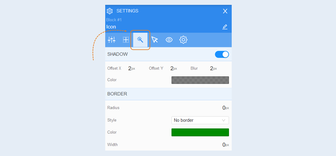
Shadow. In this field, you can add a shadow around the icon, adjust the shadow offset and blur, and choose the shadow color.
Border. You can adjust the border around the group – radius (rounding of corners), style (none, solid, dashed, dotted), border color, and thickness.
Interaction
Click. An icon is an interactive element where clicking on it will take the visitor to a link.
Click on the "Click Action" button and choose from the options provided:
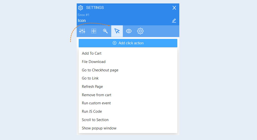
- Add to cart. When the user clicks on the element, the product will be automatically added to the cart. Specify the desired product by selecting it from the list of products. In order for the checkout process to start immediately after the user adds the order to the cart, move the “Quick Payment" slider to the active position.
File download. This action automatically starts downloading the selected file to the user's device. Attach the file by clicking the "Select on the server" button. And download the file from your computer.
Go to checkout page. The user will be instantly redirected to the checkout page. This action has no additional settings.
Go to link. When clicking on the element, the user will be redirected to the selected page. To select this action, paste the link into the field and move the "Open in a new tab" slider to the active position.
Refresh the page. When you click on the element, the user's page will be updated. This action has no additional settings.
Remove from cart. When the user clicks on this item, the product will be automatically removed from the shopping cart. Select the desired product and turn the slider to the active state to completely remove the product from the basket.
Run custom event. You can create any event that will trigger the script. In the configuration settings, write the name of the event. To learn how to set up a custom event, read the article "Types of events in the scenario".
Run JS function. A JS function is a block of code designed to perform a specific task. When the user clicks on the element, the configured JS function will be launched.
- Scroll to section. This action redirects the user to another block on the same page where this button is located. Select the required block from the list to which the user will be directed.
Show pop-up window. When you click on this element, an additional window will be displayed on top of the web page. To learn how to set up a pop-up window, read the article "Pop-up windows".
Choose the action to be taken when a website visitor clicks on the icon.
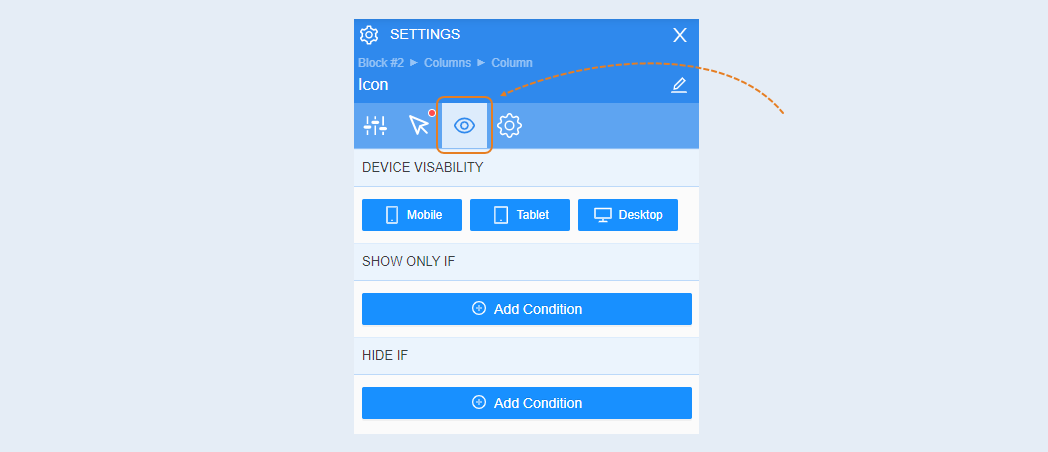
Conditional show / hide
For more information on the settings in this section, refer to the article "Conditional show / hide".
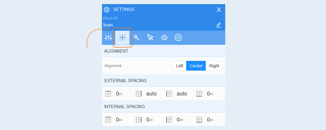
Advanced
For more information on the settings in this section, refer to the article "Advanced settings".