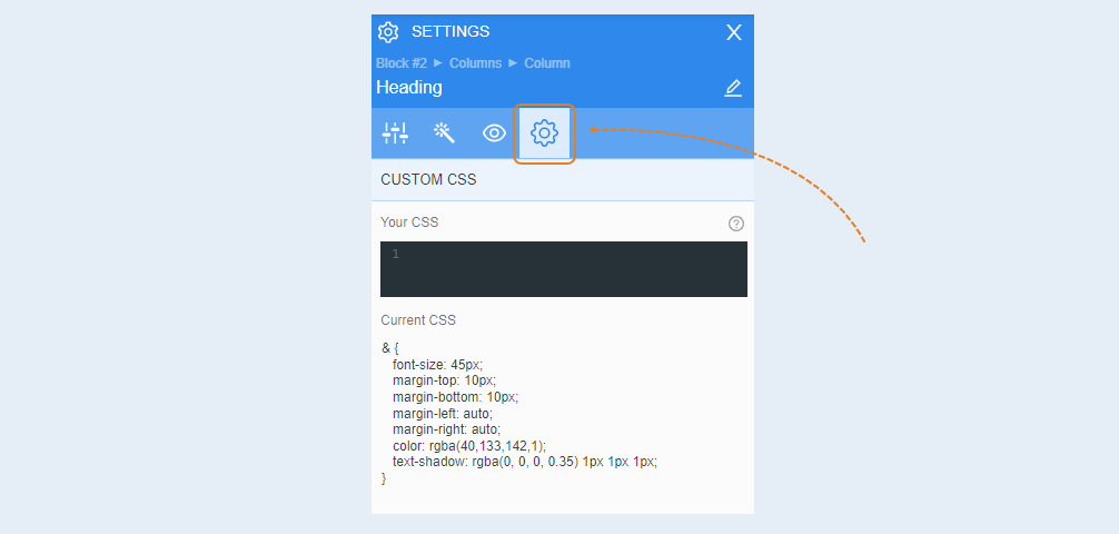
A heading element is a text element that differs from simple text in size settings - a heading is made larger and more prominent.
Highlight the element to open settings for that element. A toolbar opens on the right.
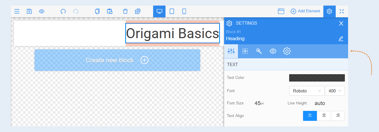
Element Settings
Text. You can change the text color, font, font size, line height. The default line height is set to auto. By moving the slider up and down, you regulate the height. Or you can set a numerical value. By clicking on the cross, you reset the numerical value to auto.
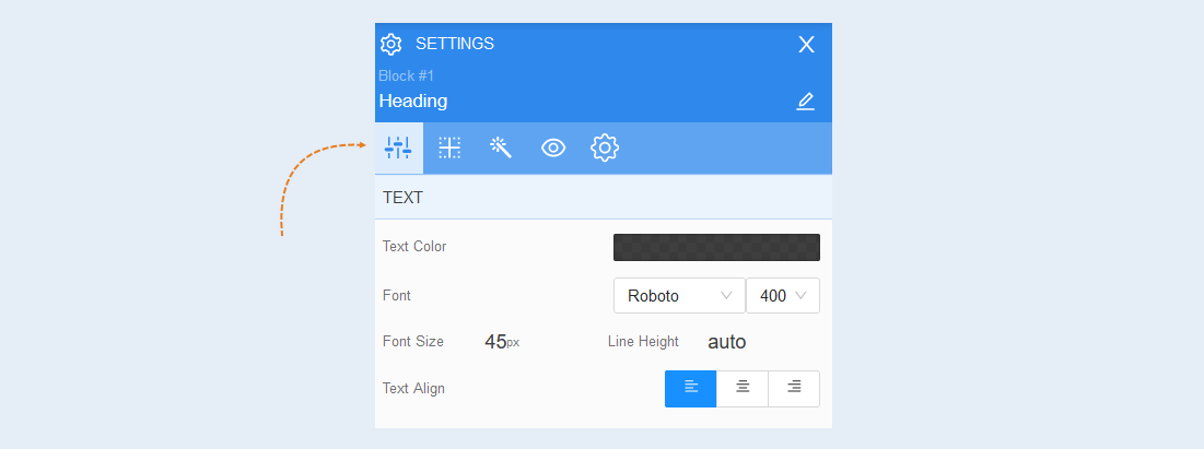
Positioning
For more information on the settings of this section, read the article "Positioning".
Style
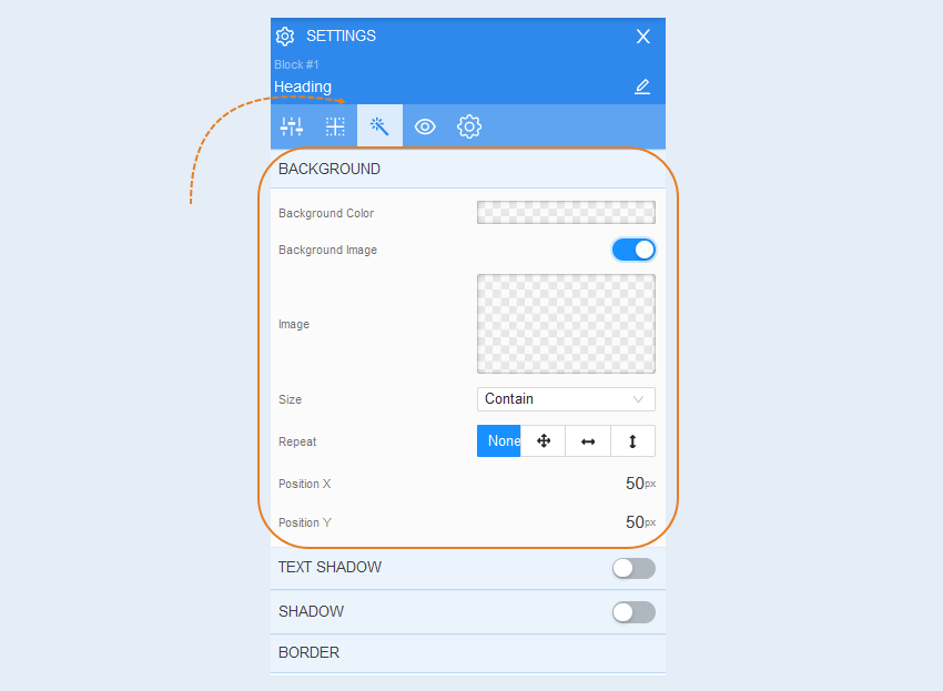
Background. In this field, you can change the background color of the text field and add a background image to the text field. Additional image settings are opened for the background image: image selection, size, image repetition, and image position within the text field.
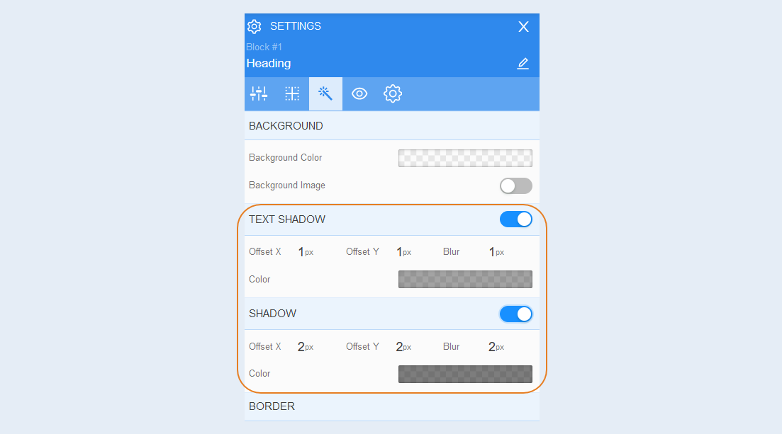
Text shadow. Choose the color of the text shadow, the direction of this shadow (left, right, up, down), and the blur (make the shadow bright and clear or transparent). This effect is used in case the background is uneven and the text is difficult to read in some places. Also, to make the text more voluminous.
Shadow. You can add a shadow from the heading, adjust the offset and blur of the shadow. Also, the shadow color.
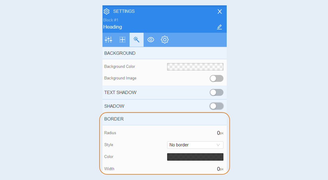
Border. You can customize the border around the heading: radius (rounding the corners of the border), border style (no border, solid, dashed, dotted), border width, color.
Conditional display/hide
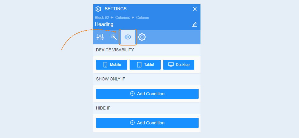
Conditional show / hide
For more information on the settings of this section, read the article "Conditional show / hide".
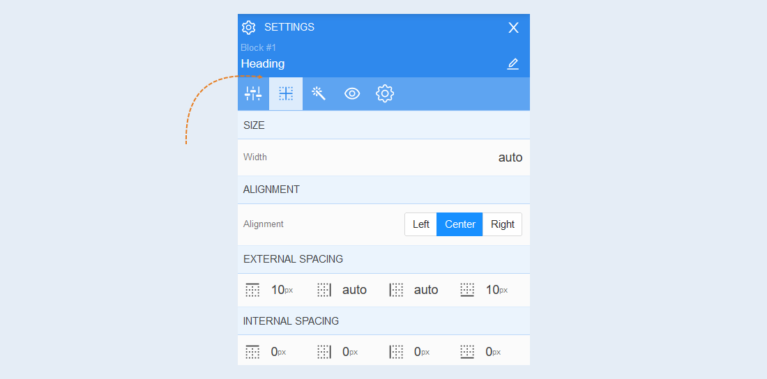
Advanced
For more information on the settings of this section, read the article "Advanced settings".