The "Forms" block is a block for creating data entry forms (for example, for course registration). It allows you to collect data from users, such as name, email, etc. This block is used on registration pages, newsletter subscriptions, or in feedback forms.
To add the block to a site page, navigate to the page editor. Click the "Create New Block" button and select the "Forms" block. You will be presented with several block options designed in different styles. Click on the corresponding block variant.
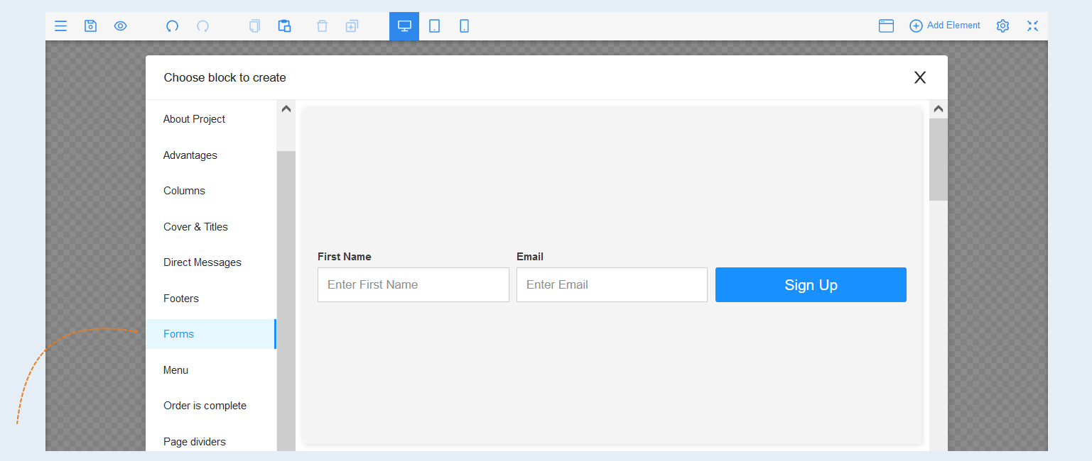
Select the entire block to open the settings for this element. A toolbar opened on the right.
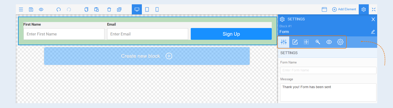
Element Settings
Settings. In this section, specify the name of the form, a message for the site visitor and the url address for redirecting the contact after filling out the form. When the visitor fills out the form, he will receive a message (for example: "Thank you! Form has been sent").
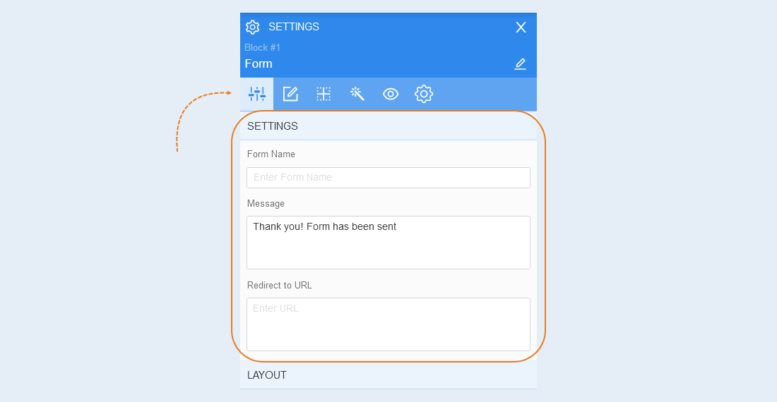
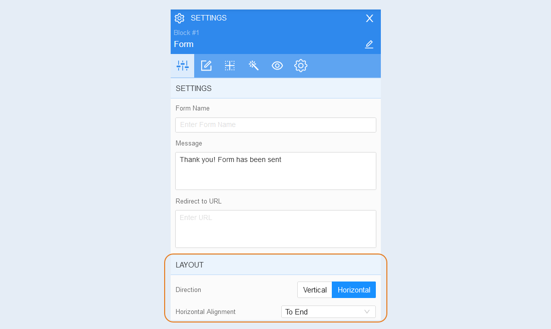
Layout. Select the layout of the form fields: vertically or horizontally.
And also adjust the horizontal alignment: to start, to center, to end.
Fields
In this section, you can customize the form fields. By default, you have two fields: contact name and e-mail. You can remove fields or add new ones, as well as customize them. Each field has identical settings.
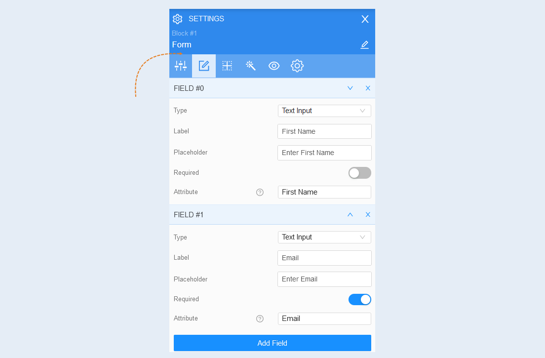
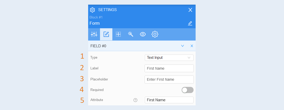
Field # 0:
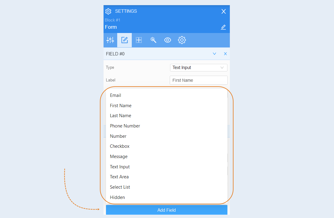
- Type. Select the type of field from the list provided: e-mail, first name, last name, phone number, number, message, text input, large text input, selection from the list, hidden.
- Label. Next, write the name of the field - this is a label that will be displayed outside the boundaries of the field.
Placeholder. Write a placeholder - this is the text inside the field that the visitor of the page will see, and which will disappear when the field is filled.
Required. Set the required icon: if the icon is disabled, then the field is optional and the visitor may not fill it in; if the icon is enabled, then the field is required and the site visitor must fill it in to send the form.
- Attribute. Select from the list provided or enter a new attribute for the field.
Add Field. Click on the button to create a new field inside the form and select the field type from the list provided. This will open the field settings.
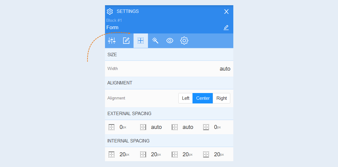
Positioning
Read more about the settings of this section in the article "Positioning".
Style
Background. You can change the background color of the form, as well as add a background image to the form. For the background image, additional image settings are opened: image selection, size, image repetition and position of the image within the form.
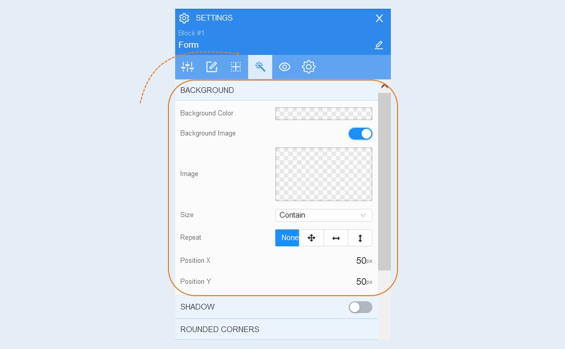
Shadow. Add a shadow around the shape, you can adjust the shadow offset (left, right, up, down) and blur (bright or transparent shadow). And also the color of the shadow.
Rounded corners. You can adjust the corner rounding for the entire shape.
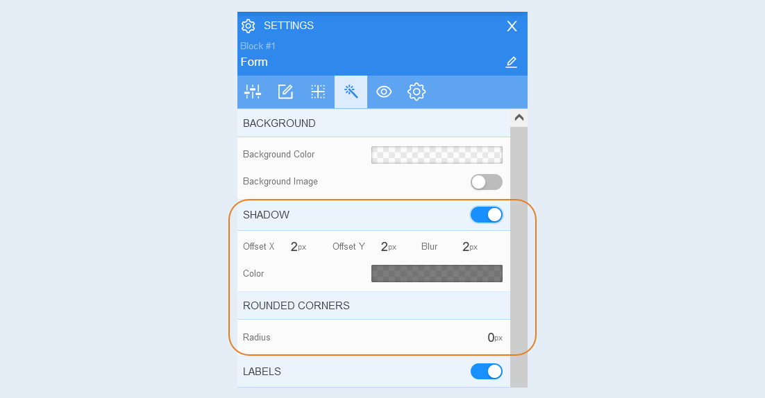
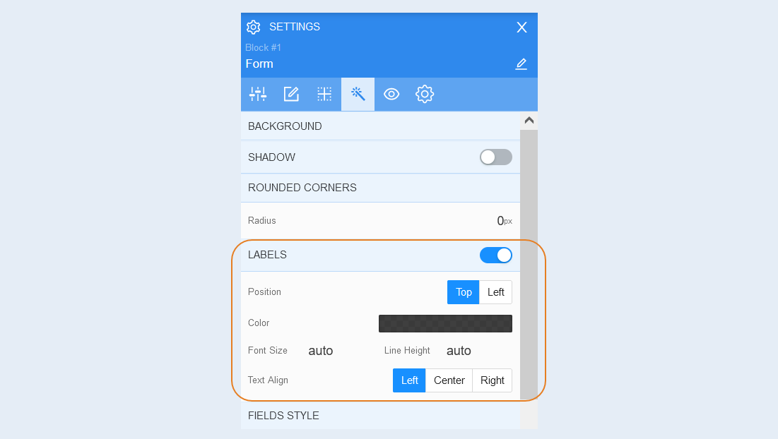
Labels. Labels are labels of fields inside the form: name, e-mail, phone number, etc. You can manage labels inside the form: change position (top or left), change label color, font size, line height, alignment (left, center, on right).
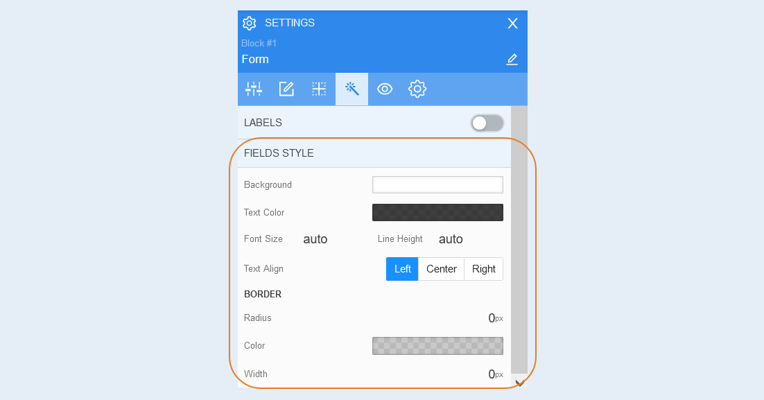
Field style. You can change the form fields: the background color of the fields, the color of the text inside the field, the font size, the line height and the alignment of the text within the field (left, center, right).
Border. You can customize the border around the shape: border radius (rounds the corners of the margins), border color and thickness.
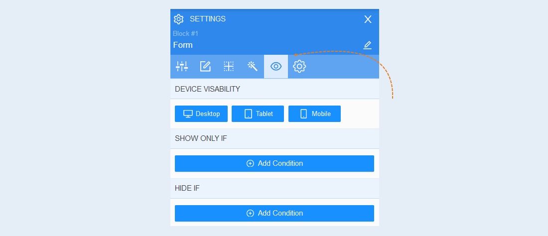
Conditional show / hide
Read more about the settings of this section in the article "Conditional show / hide".
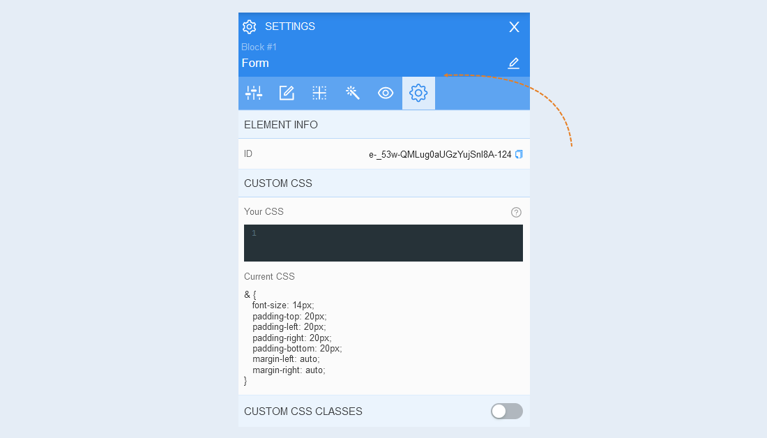
Advanced settings
Read more about the settings of this section in the article "Advanced settings".
For more information about the settings of each block element, read the articles "Element Button", "Element Form".